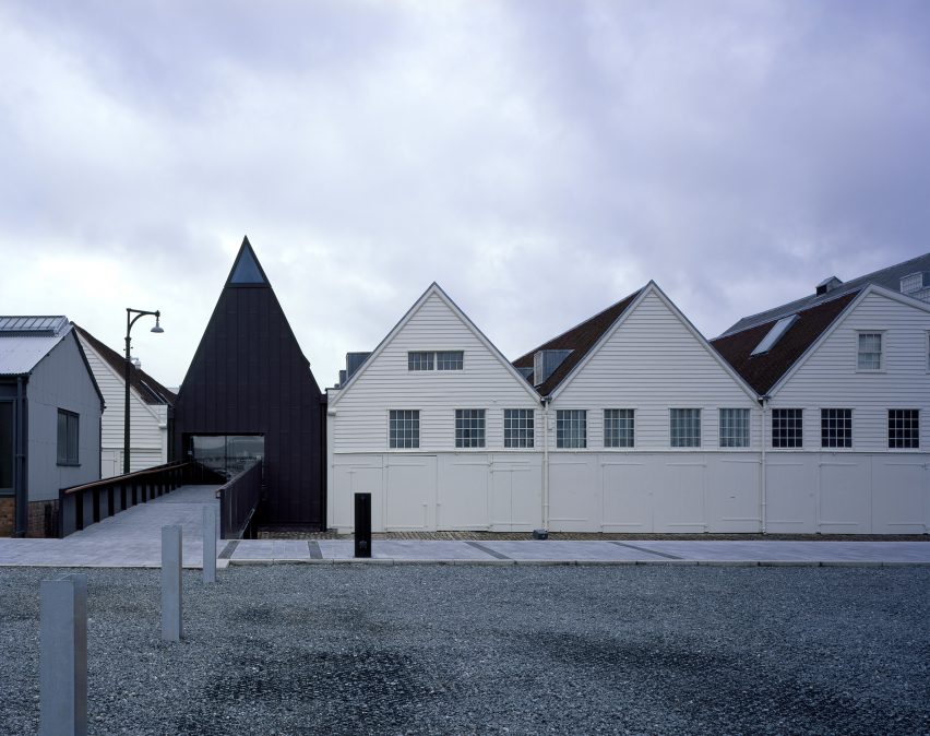
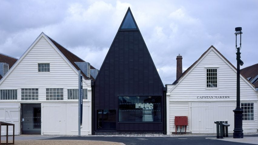
A pointy black entrance building has been added to the historic dockyards of Chatham, England, as part of a major expansion of the local nautical museum – one of six projects in the running for this year's Stirling Prize.
London studio Baynes and Mitchell Architects was employed by Historic Dockyard Chatham to overhaul its site on the River Medway in Kent, creating new galleries for the museum, as well as a new entrance and cafe spaces.
The architects have responded by carefully slotting new structures in amongst the historic buildings, which include a row of 18th-century mast houses.

Chatham Dockyard was a thriving dockyards from the 16th century until the yards closed in 1984. Since then, many of the historic buildings have been put to other uses, including by the museum.
An important part of the site's legacy is a row of 18th-century buildings constructed using timber salvaged from warships.
These buildings housed mast makers and shipwrights during the golden age of sailing, before being converted into workshops for some of the minor trades involved in warship construction.

The discovery in 1995 of the frame of an 18th-century warship called the Namur laid out beneath one of the buildings led to a lengthy excavation process. It was after this that Baynes and Mitchell Architects was brought on board.
The architects were tasked with carrying out an extensive restoration, to transform the site into a larger museum complex, called Command of the Oceans. They were asked to create a new building that functions both as an entrance and visitor centre for the museum, as well as a space for presenting the ship's remains alongside other exhibits.
Located facing the car park and the main walkways used by visitors when they arrive at the site, the new entrance occupies a gap between two existing buildings and provides a strong presence within the dockyards complex.
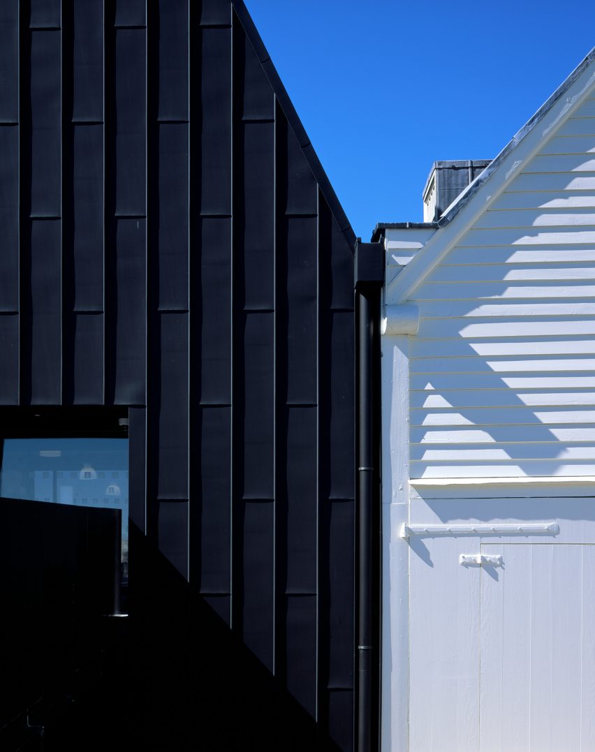
The sharply pointed gable complements the saw-tooth profile of the row of mast houses, but its height and the use of dark, galvanised zinc cladding mark it out as a contemporary addition.
"The two buildings on either side of this gap have a very traditional docklands profile with the saw-tooth roof," the studio's co-founder Alan Mitchell told Dezeen. "The idea was to continue that approach but change the rhythm by introducing a change in height."
"As people approach the site, often from a distance, this building needs to announce itself in this quite robust context by being bigger and a different colour to the adjacent buildings."
In addition to formalising the entrance to the museum, the main purpose of the narrow building is to create a circulation hub linking facilities including exhibition, catering and retail spaces in the renovated mast houses on either side.
The structure also connects the ground-floor areas with a semi-basement gallery that enables visitors to observe the frame of the Namur up close.
"We thought it was important that the visitor be able to inhabit the space the timbers were in," said Mitchell. "We needed to provide a way for people to get a sense of the scale of this archaeological find and experience it all at once."
A new floor inserted into the entrance building and the adjacent buildings, above the level of the archaeological site, is linked to the lower gallery by ramps and a short set of steps that create a gradual transition.
"We didn't want people to really notice they're changing level, apart from where we introduced specific punctuation points that help with orientation," said project architect Brendan Higgins. "We wanted it to happen in a natural way, rather than it being clear that you're descending into a basement."
The historic buildings on either side of the entrance feature traditional roof trusses constructed from large structural timbers taken from ships.
The studio wanted to evoke this construction and materiality but in a more lightweight, repetitive form, which led them to take the grid of the existing structures and halve it to allow the use of thinner structural members.
"The traditional king-post structure relies on purlins and rafters but ours just has trusses and a cross-laminated-timber deck spanning between it," Mitchell pointed out. "It's a more lightweight and simple structural system, but they both refer directly to one another."
The simple, robust material palette of the surrounding industrial district informed the use of a limited number of materials throughout the project.
The black galvanised zinc covers the whole of the exterior and is complemented by black limestone used for paving across the landscaped areas surrounding the building. These spaces serve to help visitors understand the arrangement and workings of the original dockyards.
Internally, polished concrete floors and board-marked concrete walls combine with timber used for the ceilings and structural elements to create a warm and tactile feel throughout the rooms.
The museum opened in May 2016. It was named on the shortlist for the RIBA Stirling Prize 2017 a year later, alongside projects including a studio for photographer Juergen Teller, the refurbishment of Hastings Pier, and a new wing at the British Museum.
Baynes and Mitchell Architects has also recently received planning consent for another project at the docklands – the transformation of a large naval storehouse into a new office building.
Photography is by Hélène Binet.

