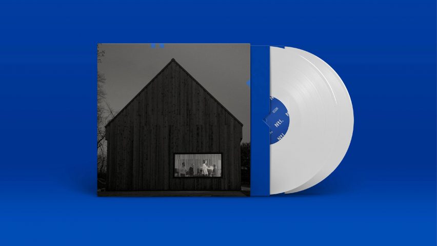
Pentagram gives The National's new album a corporate-looking visual identity as "a bit of a joke"
Pentagram's Luke Hayman has collaborated with American rock band The National to design the album cover and promotional material for new record Sleep Well Beast, out today.
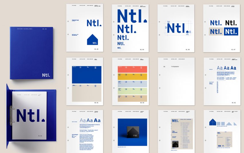
The project saw Pentagram design not only the album sleeve and typical tie-in merchandise like T-shirts and posters but also less conventional paraphernalia like staplers and tape dispensers. It marks The National's first time working alongside a large professional design firm.
"The band have spent years developing their music and their audience, starting at the very bottom and now finding themselves to be one of the most popular independent bands in the world," Hayman, who is one of the partners at Pentagram's New York-based studio, told Dezeen. "With this success comes more work and more complicated requirements for the album and tour marketing."

"Now they find themselves having to use a design agency to do something they've previously done themselves," he continued. "Two of the band members are former designers, and the bassist Scott Devendorf worked at Pentagram. They've embraced this by commissioning an identity from 'the largest independent design firm in the world', Pentagram, who happen also to be friends."
The visual identity is centred around a blue and white colour palette, chosen for its "retro, slightly monotonous" quality, reminiscent of 1970s corporate branding for British firms by designers like Ken Garland. This chimes with the theme of mid-life melancholia that recurs in the music of The National.
"It's a bit of a joke," confirms Hayman, who also said he looked to New Wave graphics, Beat poetry ephemera and new age iconography to develop his design.
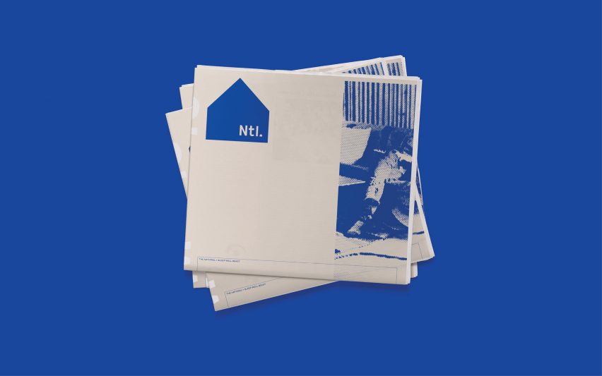
The album cover and the promotional logo both feature a five-sided house-like structure, inspired by a barn in Hudson, New York, where the album was recorded.
"The cover is a photograph of the rural New York State recording studio built on the property of one of the band members and shot by [photographer] Graham MacIndoe," Hayman said. "It became part of the mythology of the identity: it's the headquarters for the 'corporation' or organisation that produces the music-propaganda."
"The barn is broken down into two squares and two triangles that disassemble into a 'code' and – more practically – become a useful graphic across many of the applications."
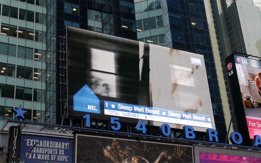
The agency added a corporate "Ntl" logo that appears on the band's merchandise. "It's a continuation of the corporate identity idea," Hayman explained.
"It's also useful to have an icon that stands up in small applications, for example, social media applications, mobile devices and so on – and lastly, we think it looks cool."
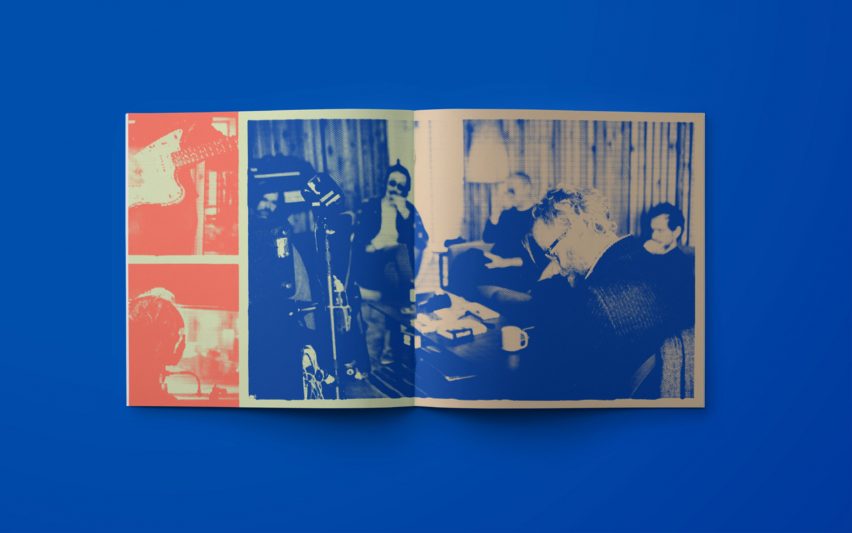
The record and CD inserts feature photographs by Scottish photographer Graham MacIndoe, who spent weeks photographing the band during recording sessions. The images, a collection of highly processed and personal shots, aim to give a zine-like feel.
"The covers are quite abstract, cold and conceptual," Hayman explained. "In reality, the band is more than that; they are a family an extremely proficient craftsmen."

"The photographer Graham MacIndoe has spent weeks with the band at recording sessions, and on the road over a period of 20 years. Graham's unique access allows a view into this intimate world which I think fans will appreciate."
Alongside the graphics and posters, the campaign includes transmission-style videos by Casey Reas that will appear on billboards in New York's Time Square, London and Copenhagen. A bespoke website was also designed by New York studio The Collected Works.

Pentagram is unusual in that it is run by 21 equal partners who come from disparate areas of design. The agency was established in 1972 in London's Notting Hill, and now also has offices in New York – where Hayman is based – as well as San Francisco, Berlin and Austin.
Earlier this year, the studio created new branding for the School of Architecture at Taliesin, formerly known as the Frank Lloyd Wright School of Architecture.