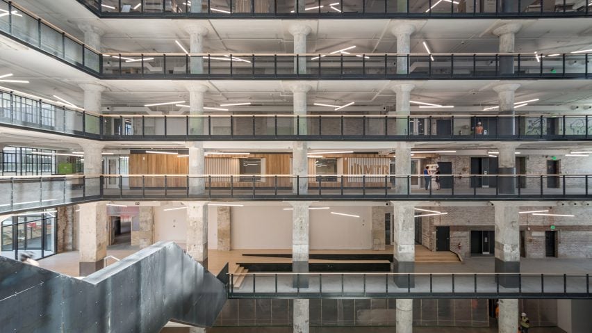
Tennessee studio Archimania paired modern wooden elements with "gritty concrete and textured brick" at this higher-education facility, which is housed within a former industrial building that sat abandoned for years.
The Memphis Teacher Residency is located within a massive, 10-storey warehouse in Memphis, Tennessee, which was recently converted into a mixed-use development called Crosstown Concourse.
Built in 1927 and listed on the National Register of Historic Places, the art-deco structure sat vacant for decades before being transformed into a "vertical urban village" with offices, restaurants, shops and apartments.
For one empty space within the building, Archimania created a new home for the Memphis Teacher Residency – a Christian nonprofit organisation that trains teachers to work in urban schools.
The 1,448-square-foot (1,993-square-metre) centre contains staff offices, flexible classrooms and communal areas for breaks and collaboration. The adaptive reuse project was completed for $85 (£64) per square foot.
The facility overlooks a vast public atrium, which is ringed with concrete columns and glass storefronts.
To give the school a distinctive look, the team designed a wooden unit for the front facade that is lined with white slats, some of which form signage. The firm carved seating alcoves into the unit, enabling visitors to relax and take in their impressive surroundings.
A similar unit was installed in the centre's entrance zone, adding visual warmth to the stripped-down space. "This component anchors the main entrance, while also providing opportunities for storage, gathering and retreat," the team said.
The centre is divided into two main programmatic areas – one for students and one for staff.
In the student zone, a long corridor is lined with classrooms and a wooden storage cabinet that is accented with strips of colour. The storage unit contains furniture, while also serving "as a procession element that leads patrons through the space".
In the staff area, the team placed long tables in the centre of a corridor, and hung wooden storage units from the ceiling.
"A central community table with overhead storage provides a place for collaboration, flexible gathering, and material preparation and distribution," the firm said.
The architects sought to preserve – and celebrate – original building elements wherever possible. Thick concrete columns are left fully exposed, with portions of the ceiling plane cut away to reveal the columns' capitals.
The architects also retained the concrete flooring and added graphics that evoke the facility's prior use as a warehouse.
"As a means to celebrate the existing structure and its contextual contribution to Memphis, the restrained material pallet greatly contrasts the gritty concrete and textured brick – including marks and scars documenting their history," the team said.
Other recent adaptive reuse projects in North America include the conversion of a Toronto industrial building into a residential complex for homeless youths, a project designed by LGA Architectural Partners.
Photography is by Hank Mardukas.
Project credits:
Architect: Archimania
Engineer: OGCB
General contractor: Grinder, Taber & Grinder

