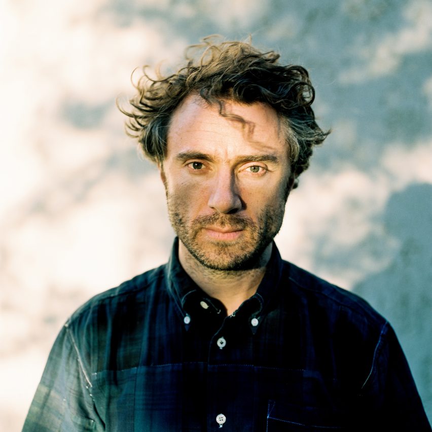
Thomas Heatherwick: "There was a real worry about whether we could get people to come inside"
In an exclusive interview with Dezeen, designer Thomas Heatherwick reveals how he overcame early fears that no one would visit the art galleries in his new Cape Town art museum.
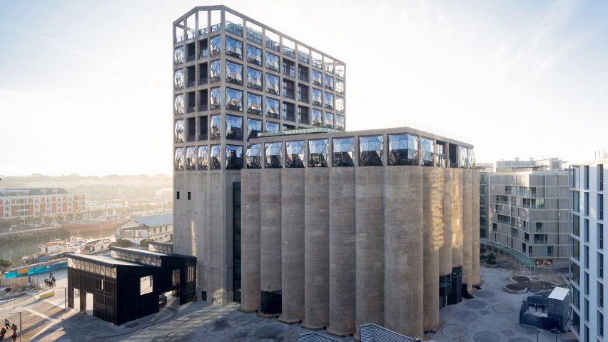
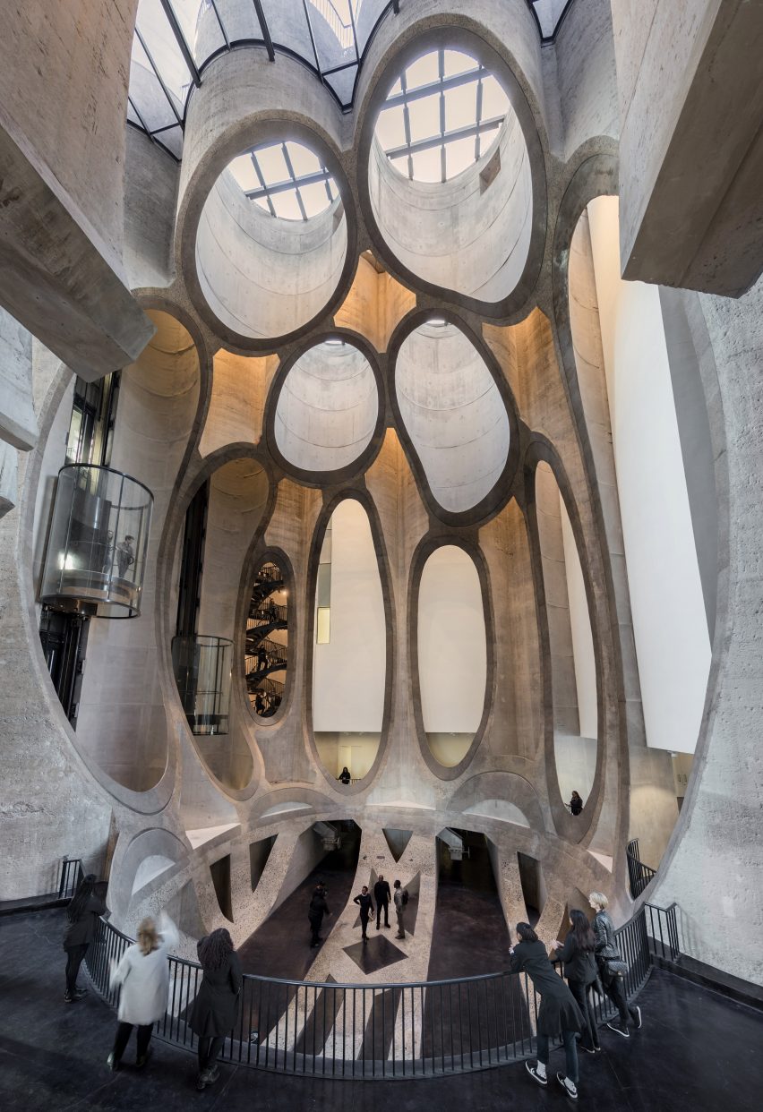
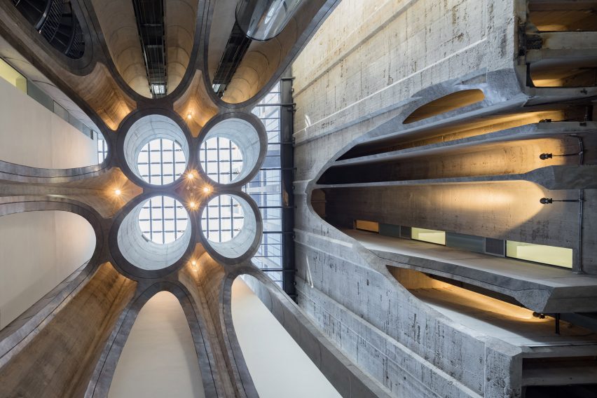
The Zeitz Museum of Contemporary Art Africa, or Zeitz MOCAA, opened last week and is now South Africa's biggest art museum. Located inside a converted 1920s grain silo, its centrepiece is a 10-storey-high atrium that has been carved out of the cellular concrete tubes that make up the building's original structure.
According to Heatherwick, this striking feature was borne in response to the worry that the building might struggle to get visitors through its doors – because visiting museums is not a typical activity for the average Cape Town resident.
"There was a real worry with his project about whether we could get people to come inside," he explained.

"Museum-going isn't a normal thing here, and there was a great risk that people would come, have their photograph taken outside, and then go home saying they had been," he said.
"So that was very motivating – working out how could we compel people to come inside and allow curiosity to do the rest of the work."
"We were interested in how we could give a heart to the building and whether that heart could be compelling enough that you couldn't say you'd been to the museum unless you'd gone inside it," he added.

The 93-year-old building is located on Cape Town harbour, forming part of the Victoria & Albert Waterfront district. It was once the tallest building in Sub-Saharan Africa, and was used as an international trade and export facility for more than 80 years.
Despite the challenges created by its "cellular honeycomb" interior – once used to store massive quantities of grain – Heatherwick said that demolishing the building would have been disrespectful to history.
"We're used to buildings having their iconicity on the outside, whether it's an Opera House or a Gherkin or a Shard. These building have very powerful identities, but it felt like there was already a structure like that here," he said.
"It was from an era when black people were oppressed, so you could make an argument for demolishing the structure completely, but you could also counter that, by treating it as a monument. From the top of the structure, you can see Robben Island, where Nelson Mandela was kept prisoner. So it felt that there was a lot of texture and soulfulness and character embedded in the concrete."

The London-based designer – who ranked 23rd on the inaugural Dezeen Hot List – described the process of creating space in the tubes as being "like archeology".
"We realised we needed to do something that your eye couldn't instantly predict," he explained. "Our role was destructing rather than constructing, but trying to destruct with a confidence and an energy, and not treating the building as a shrine."
Read the interview with Thomas Heatherwick below:
Amy Frearson: Let's start at the beginning. Can you tell me how this project came about?
Thomas Heatherwick: The project came about following the end of Apartheid and the advent of containerisation in the industrial handling of grains. This building made from gigantic concrete tubes suddenly stopped being relevant and became derelict in the Victoria & Alfred Waterfront in Cape Town.
Over the years, the whole of the waterfront was being regenerated and developed, and there in the middle was this strange problem structure with a question mark getting bigger and bigger, as office and residential buildings all got closer and closer to it.
We were asked six years ago to do a feasibility study to explore what could be possible. I think there was a sense that there might be some cultural use but no sense at that stage what that might be. So we began exploring what the building might do and how it could integrate into the public landscape of the Victoria & Alfred Waterfront, which is the most-visited public pedestrian area in Africa. It's still a working port as well, so there is this mix of residential buildings and office space being built, but also big Chinese ships being welded and having barnacles removed.
We found ourselves making Africa's first ever African contemporary art museum
While we were working on that, looking at how to repurpose the site, there was a group of people who came together with a conviction. The world of contemporary art has, in a way, exponentially expanded in the last couple of decades and almost every major city in Europe and Asia and North America has fallen over themselves to have their own contemporary art museum. There are so many now, and that's a real mark of the success of projects like Tate Modern and Guggenheim Bilbao. Yet the whole continent of Africa, which is the same size as Europe and North America combined, didn't have a place for the African imagination, a public institution to bring it all together. So it was very galvanising – they were looking for a way to create a building and we had a building looking for a purpose.
Amy Frearson: Where did the money come from?
Thomas Heatherwick: There was a man called David Green in charge of the waterfront. Green is very forward-thinking, and somebody willing to dare to create an institution. There was no national money – there is not the same culture of philanthropy there as there is in the US or even in the UK – so the waterfront took it upon themselves to say: "We have a duty to the city and the country to be creating more than just shops here."
So we found ourselves making Africa's first ever African contemporary art museum. The art eco system already existed – there are incredible artists with amazing work, but no major public place to bring that together. Many artists from the continent have been sending their work abroad for some time, or relocating themselves to other parts of the world.
The budget by global standards was minuscule, just over £30 million, but in the African context that's a serious amount of money. So we really focused our work and tried to look at how we could make that go the furthest.
Amy Frearson: Can you explain the design you came up with in response?
Thomas Heatherwick: There was a real worry with his project about whether we could get people to come inside, to get over the inertia of a threshold, and the apprehension of a contemporary art museum.
We could have knocked this structure down and just built an extraordinary spaceship. But museum-going isn't a normal thing here, and there was a great risk that people would come, have their photograph taken outside, and then go home saying they had been. So chief curator Mark Coetzee asked us: "How can we make someone have to come inside?"
The budget by global standards was minuscule, just over £30 million
In our studio, we are passionate about public interaction, so that was very motivating – working out how could we compel people to come inside and allow curiosity to do the rest of the work. Because once someone's inside, curiosity will make you explore the galleries.
We're used to buildings having their iconicity on the outside, whether it's an Opera House or a Gherkin or a Shard. These building have very powerful identities, but it felt like there was already a structure like that here. It was from an era when black people were oppressed, so you could make an argument for demolishing the structure completely, but you could also counter that, by treating it as a monument. From the top of the structure, you can see Robben Island, where Nelson Mandela was kept prisoner. So it felt that there was a lot of texture and soulfulness and character embedded in the concrete of what was the tallest building in Sub-Saharan Africa for half a century.
It is an early example of a slip-formed building. It had a shaped mould on the ground that was filled with concrete and slid upwards to make this compartmentalised, cellular structure. It had more than 100 tubes – there were square tubes, circular tubes, cruciform tubes, rectangular tubes – for the different grain sections. So unlike an old, disused power station, which has spaces for giant turbines, this had no space, it was just a cellular honeycomb.
We were interested in how we could give a heart to the building and whether that heart could be compelling enough that you couldn't say you'd been to the museum unless you'd gone inside it, unless you'd gone into that heart, whether you thought you were interested in art or not.
Amy Frearson: Can you tell me more about this interior?
Thomas Heatherwick: The curator was quite clear that the tubes were pretty rubbish for showing art in, so [the challenge] became how we could retain the spirit of this tubularity but also give functionality, to create an A-grade gallery space. The galleries have a job, not just to make shows for here in Cape Town, but to also make shows that could travel the world, so they needed to have a simplicity.
So we just did simple, really high quality, calm spaces with great lighting. The whole project really was about creating a platform for the work, to see it for the first time in a space at this kind of scale. Because many institutions have a contemporary African art area, but this was about having a place that is only that. There are more than 80 galleries here and we saw our job as stitching them together.
Once someone's inside, curiosity will make you explore the galleries
When we first visited this building full of pigeon droppings we had been completely lost in the bewildering honeycomb maze of cellular spaces, so we could see that we needed to carve it out. It became like archaeology, like excavating out gallery spaces, but not wanting to obliterate the tubularity completely.
The galleries are dropped in, almost like very pure class-A gallery boxes dropped into the space we carved out. Then, in the heart, we tried carving rectilinear spaces, spherical spaces and even ovoid spaces. We knew that tubes would do something very interesting if you carved through with a curving plane, but that if you juxtapose very pure forms with a very geometrical grid, the two seem to sterilise each other. We realised we needed to do something that your eye couldn't instantly predict.
There was then this sort of funny synergy when we then managed to get hold of some of the corn that had been stored in the building. The building had been used to store trillions of grains of corn. We took one of these original grains, digitally scanned it to get the exact form and then enlarged it to be 10 storeys high. It made this extraordinary geometry.
Our role was destructing rather than constructing, but trying to destruct with a confidence and an energy, and not treating the building as a shrine.
Amy Frearson: How much have you changed the exterior?
Thomas Heatherwick: So we put these new windows in, but we were interested to see if we could somehow avoid the clinical, two-dimensional flatness by making them like pillows – as if the building was breathing. The building has so much pressure inside, because the grain behaved like a liquid, and these tubes were designed to take those hydrostatic pressures. So we felt like manifesting some of this pressure in the glazing.
From a budget point of view, it's just flat glass. But by making three-dimensional pillows with the glass, they act slightly like mirror balls. You look up at them, they're reflecting back at you, but the side part reflects Table Mountain, the other side part reflects Robben Island and the top part reflects the clouds in the sky.
It became like archaeology, like excavating out gallery spaces, but not wanting to obliterate the tubularity completely
The other part of the project that felt important to us was to take the magnolia gunge off the outside of the building and strip it back to the raw concrete, because that raw concrete has this warmth to it, like carved stone. The stone within the aggregate is from Table Mountain nearby, so it is a different quality of concrete then you would now be able to buy. We're so used to the world around us being covered in cladding – global procurement has driven buildings with a very smooth, polished feel – and in that context, this raw material has an almost prehistoric feel to it, like raw adobe.
Amy Frearson: Did you ever feel uncomfortable about the fact you were a British designer working on a building that is so closely tied to African heritage?
Thomas Heatherwick: The studio does projects all over the world and in each place we focus on trying to make a project specific to that place. We take a different perspective everywhere we work – our passion is public projects, wherever they are.
The Waterfront had been looking at proposals from people from throughout Africa and South Africa, so there had been many proposals for the building. What we developed was something that chimed with them. We were certainly not pushing anyone else aside. It was African decisions driving what the project became.
Amy Frearson: Did the class divide in Cape Town influence your approach in any way?
Thomas Heatherwick: For me, this was a thrilling project to be involved with, because it is going to expose work from this continent that has never been seen. I think this is the first project out of many that will happen – a telling moment. So I see this as a beginning, not an end. It is a platform that will evolve over many years and be something. Our role was to make the platform, but we're not determining the contents of that. It is a tough building that can be appropriated and changed and shifted as the years go by, as the foundation running it grows and as the whole ecosystem moves forward.
Photography is by Iwan Baan, unless otherwise indicated.