Dropbox criticised for colourful new visual identity
Dropbox has rebranded to promote itself as a creative platform rather than simply a file-sharing service – but the design has attracted criticism for its use of clashing colours.

The California-based file-hosting website worked with New York agency Collins to design its new visual identity, described as the biggest change to the company's image in its 10-year history.
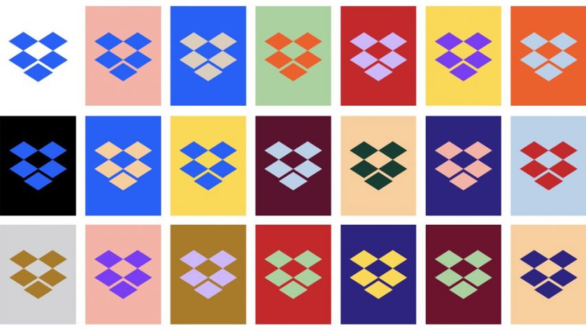
The design is based around a simplified version of the old logo, designed to look more like a collection of platforms rather than a literal box, "to show that Dropbox is an open platform, and a place for creation".
This logo comes in a vibrant spectrum of shades, as well as the original blue and white, and users are encouraged to choose which colour combination they prefer, to customise their interface.
This change has prompted a outpouring of criticism on Twitter, with one user describing the experience as making him feel colour blind.
"Whoever came up with this horrid icon colour update?" asked another user, while others shared images of flashing colours to express their dislike.
According to Dropbox creative director Aaron Robbs and vice president of design Nicholas Jitkoff, the redesign is intended to show that the Dropbox is "a living workspace that brings teams and ideas together".
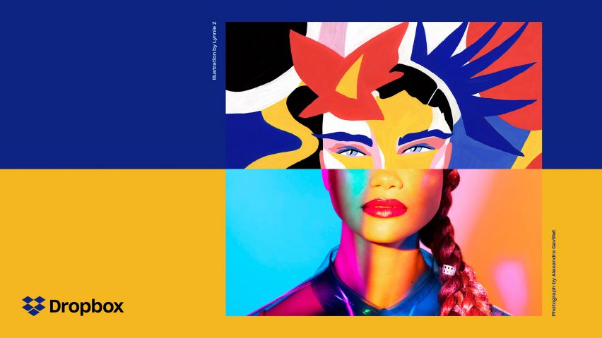
"Our new design system is built on the idea that extraordinary things happen when diverse minds come together," they said. "We communicate this visually by pairing contrasting colours, type, and imagery to show what's possible when we bring ideas together in unexpected ways."
"Our new system lets us pick the right amount of expressiveness for the situation," they added. "Colour can go from a standard Dropbox blue to 'whoa'."

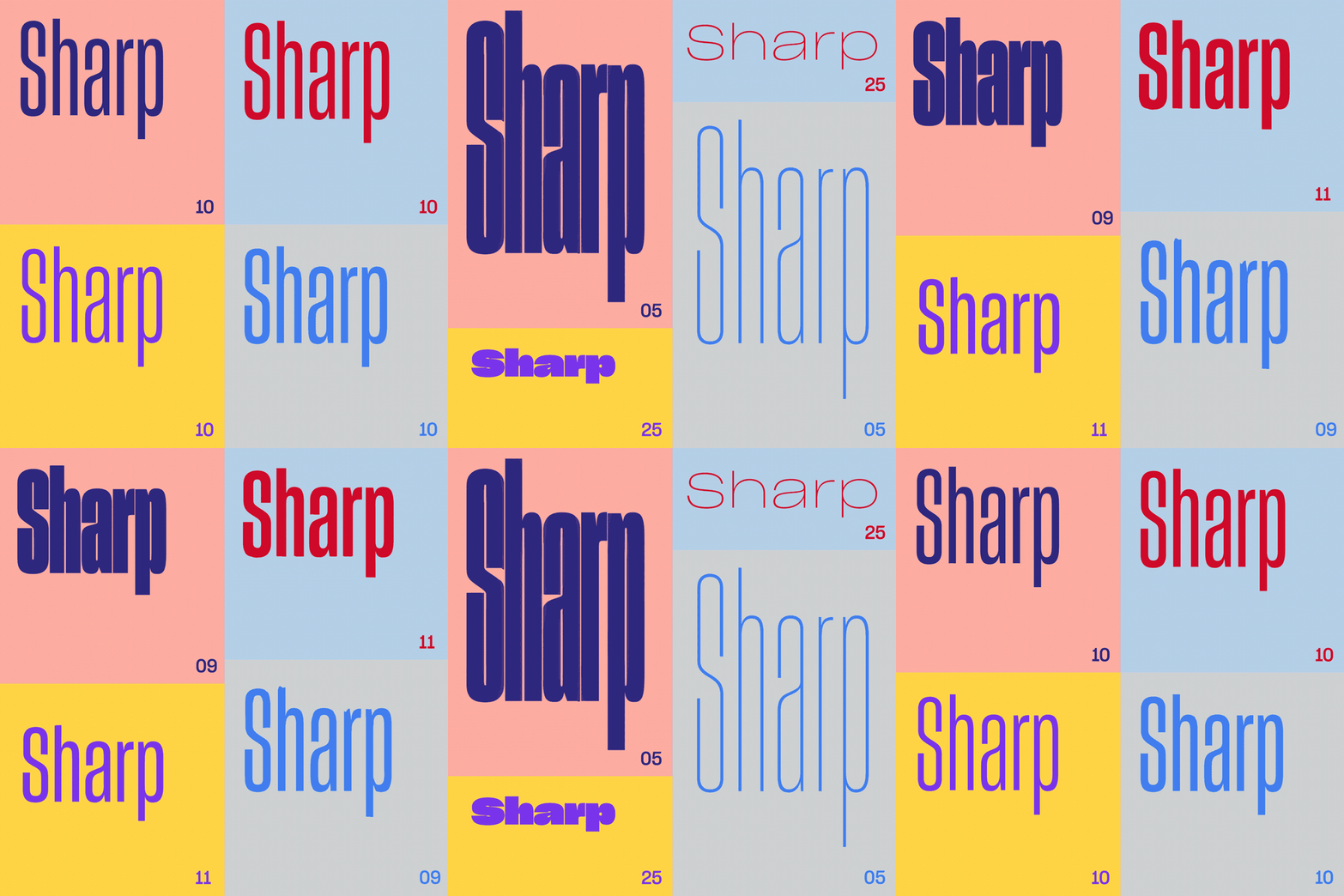
As well as the new logo and colour schemes, the visual identity includes a change in typography. Collins chose Sharp Grotesk, which includes 250 different fonts, to offer the brand more versatility.
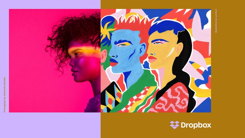
The rebrand also includes a series of playful illustrations, which will accompany notifications on the website. For the campaign, these were used to create a 60-second film that asks: "What does creative energy mean?"
"We've used illustration to bring life to our product and brand since Dropbox started over 10 years ago," added the duo.
"Our new illustration style picks up where our earliest style – loose, handmade, witty – left off. We create rough sketches using graphite, then pair them with colourful, abstract shapes to bring the creative process to life."
Based in San Francisco, Dropbox was founded in 2007, by MIT students Drew Houston and Arash Ferdowsi. Other designs commissioned by the brand include an industrial-style cafeteria, created at its headquarters by US studio AvroKo.