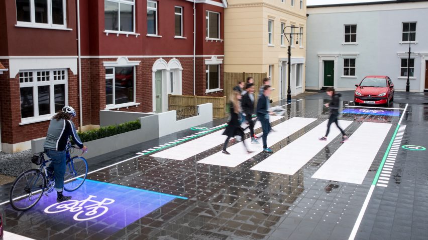
Bright LEDs flash warning signals to smartphone users who veer onto this interactive road surface, which is designed to disappear during the dead of night and reappear only when needed.
Designed by London-based software company Umbrellium, the Starling Crossing aims to update the Zebra crossing for the 21st century.
With the use of smartphones and heavier traffic, more prompts are needed for pedestrians, drivers and cyclists to make road crossings safer, explained Umbrellium founder Usman Haque.
"The pedestrian crossing that we know hasn't really be updated since the 1940s, and these days we inhabit our cities in quite a different way." Haque told Dezeen. "We have mobile phones in our hands that distract us, and our relationship to the city is very different."
"The pedestrian crossing one of the most complex moments of interaction that almost everyone experiences on a daily basis," he continued. "It's that one moment where you're actually negotiating with others as well as potentially as with big chunks of metal."
LEDs embedded in the surface of high-impact plastic panels that form the road surface are triggered by cameras monitoring the scene. The cameras anticipate the next movements of the vehicle, pedestrian or cyclist and the patterns of the crossing are adjusted accordingly.
Held together by a metal framework that ensures the surface doesn't pull apart under the weight of vehicles, the matt panels are also designed to be slip-resistant in the rain.
In the middle of the night, when there are few pedestrians, the crossing may disappear completely, but during peak times it is designed to reappear and adjust its size, orientation, markings and colours to accommodate the number of people needing to cross.
"In the early morning, say 5am, there may not be that many people looking to cross, so the crossing might only appear as somebody needs it. Once they've crossed, it can disappear again – and for all intents and purposes it just looks like a normal road," explained Haque.
"But later in the evening after the pubs close when there's lots of people trying to cross, the crossing can actually widen automatically to accommodate all these extra people."
The design aims to reduce the number of accidents occurring at road crossings, and also includes signals intended to alert smartphone users who wander into the road and oncoming traffic.
"We're trying to create pattern sequences that unfold quite calmly so nobody's surprised, it's definitely not about distracting people, and the graphics themselves or notions on the surface look very familiar," said Haque. "They look just like the road markings that you probably already understand but they're geared towards people being more aware of each other."
"What we've tried to avoid telling people is that you must go here and that this is your area, but instead highlight the relationships between the people that are present in and around the crossing."
Umbrellium installed a full-scale prototype of the Darling Crossing system at a TV studio in South West London to test user experience.
For this version, level changes between pavement and road were mitigated to create a "shared space" for vehicles and pedestrians. But Haque said texturised indicators for people with visual impairments would be deployed in the final version of the system.
Last weekend, a taxi driver veered into crowds of visitors to museums on London's Exhibition Road – one of the capital's earliest prototypes of shared space – attracting heavy criticism of the concept.
"The concept of shared space has lots of benefits and lots of difficulties as well. I see this as an extension of a similar kind of experimentation, which is to say, 'how do we make our cities more pedestrian friendly?'" said Haque.
"If shared space as a physical configuration can be made viable then how can we make that physicalisaton more responsive to the real-time situation," he added.
"What I'd really like to do is bring together learnings from shared space to this interactive version. It warrants further investigation."

