Eight design responses to a turbulent political climate
The past year has seen more and more designers responding to shifts in the political landscape, from the Brexit vote to the election of Donald Trump. Ahead of our Good Design for a Bad World talk series, here's a look at eight designs used as tools for change.
Good Design for a Bad World takes place as part of Dutch Design Week in Eindhoven on 21 and 22 October 2017, and looks five global issues: climate change, pollution, refugees, terrorism and politics.
Moderated by Dezeen founder and Dutch Design Week international ambassador Marcus Fairs, the panel for the politics discussion will include political scientist Rudy van Belkom; Design Indaba founder Ravi Naidoo; Jan Boelen, artistic director of Z33 House for Contemporary Art; and Lennart Booij, co-founder of campaigning bureau BKB.
The event is free to attend. It takes place at the People's Pavilion at KetelHuisplein 1, in the Strijp-S district of Eindhoven, at 3:30pm on Sunday 22 October.
Ahead of the talk, here are eight examples where design has been used to influence politics, including a hat with cat ears, an iconic poster and a huge model city.
Pussyhat by Jayna Zweiman and Krista Suh
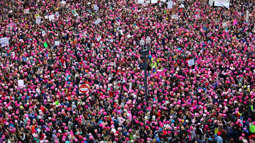
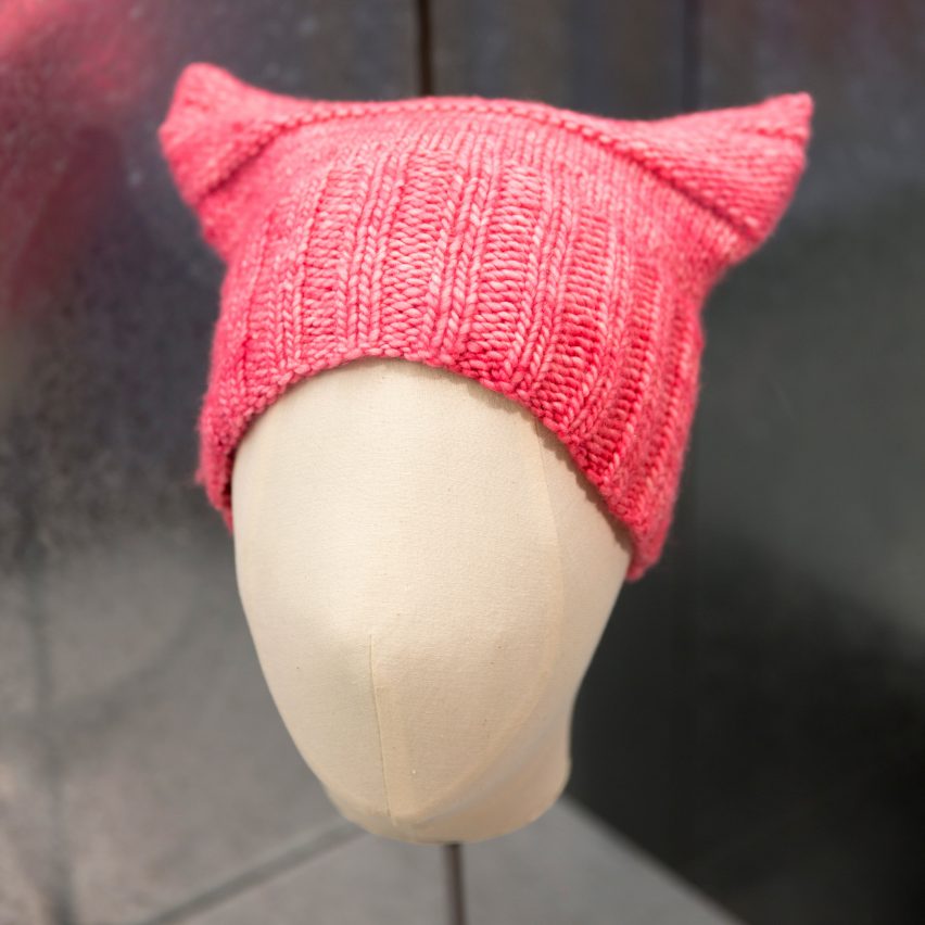
Designers Jayna Zweiman and Krista Suh created this pink hat with cat-shaped ears as a symbol of protest for women's rights.
The hat was worn by hundreds of people who took the streets of Washington the day after Donald Trump was inaugurated as president of the United States. Its pointy ears are a reference to a recording of Trump released during the election campaign, in which he claimed to grab women "by the pussy".
Find out more about Pussyhat ›
Obama Poster by Shepard Fairey
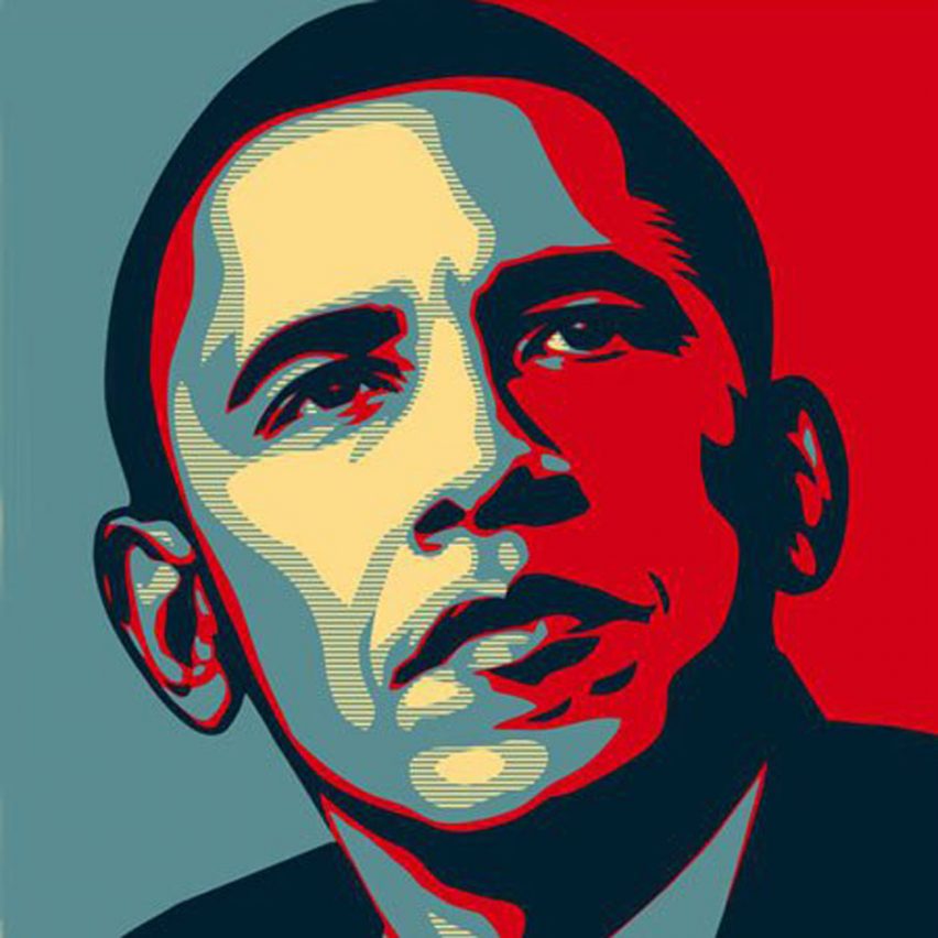
A previous winner of the Design of the Year prize, this poster that American graphic designer Shepard Fairey created for the 2008 election campaign captured the spirit of hope that the Barack Obama hoped to embody – and went on to become an icon.
Donald Trump was able to achieve similar success in the most recent election, with his red baseball cap emblazoned with the slogan "make America great again". Meanwhile, Hilary Clinton's own campaign graphics were widely criticised, and are believed to have contributed to her loss.
Find out more about Obama Poster ›
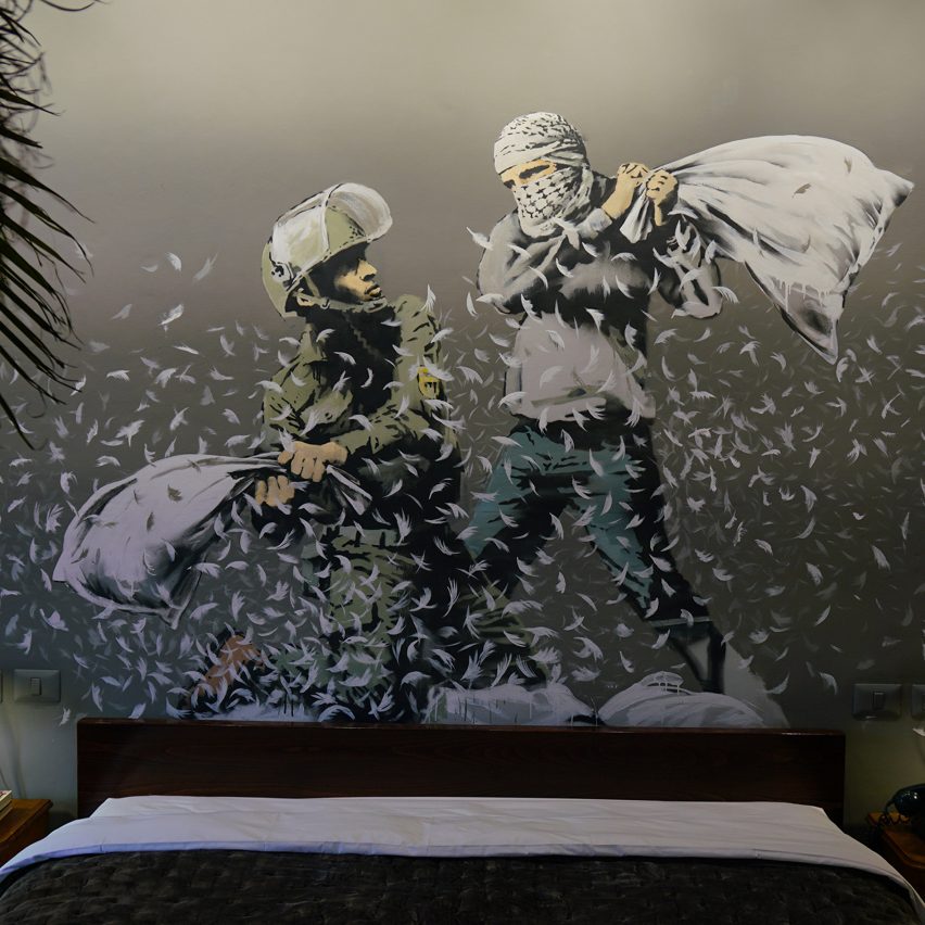
Artist Banksy drew huge attention to the Israel-Palestine conflict with this "all-inclusive vandals resort", built beside the West Bank border wall.
Billed as an "open-hearted community resource" that is not allied to any political party or pressure group, the hotel is decorated with an assortment of provocative artworks.
Find out more about Walled Off Hotel ›
EU Referendum Posters by Wolfgang Tillmans
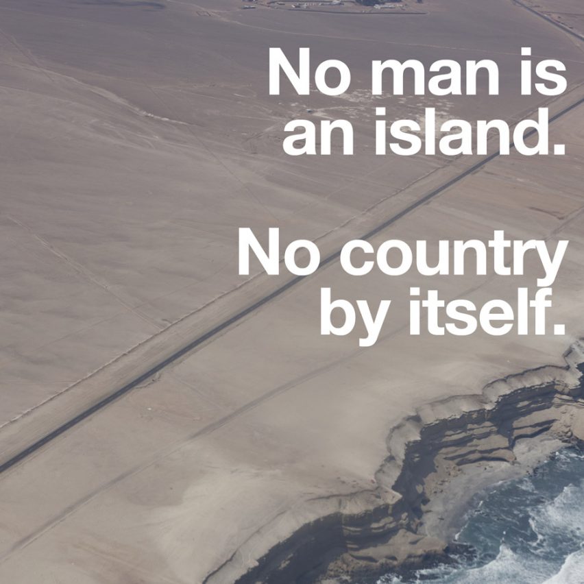
One of the most powerful campaigns during the UK's EU referendum was this series of 25 posters by German photographer Wolfgang Tillmans.
Tillmans felt that the official campaign posters were "lame", so created his own using emotive text in bold fonts, upon either plain or photographed backgrounds. However, in the end, the UK still voted for Brexit.
Find out more about EU Referendum Posters ›
Visual Identity for the Republic of Serbia by Vladan Pavlović
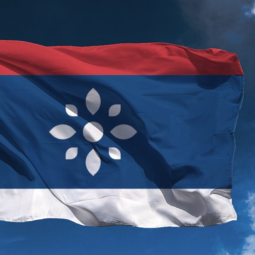
This ambitious proposal by graphic designer Vladan Pavlović creates a new visual identity for the Republic of Serbia, presenting the Balkan country as one of "peace, democracy and tolerance".
Pavlović felt that country was misunderstood by the rest of the world, so developed a new flag and crest that ditches the traditional coat of arms in favour of a rosette, which he describes as a symbol of unity, peace and stability.
Find out more about Visual Identity for the Republic of Serbia ›
Beautifying the Border by DOMO Architecture + Design
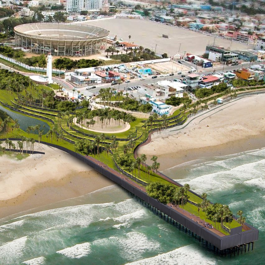
Donald Trump's pledge to build a wall at the US-Mexico border has prompted a wide array of satirical and protesting responses. One of the most ambitious is this vision by DOMO Architecture + Design to create a huge park.
DOMO's ideas vary for the different types of terrain and climate. Verdant areas could be separated by a ha-ha – a turfed slope that declines to meet a vertical retaining face – while desert areas could feature a canyon that snakes through the landscape.
Find out more about Beautifying the Border ›
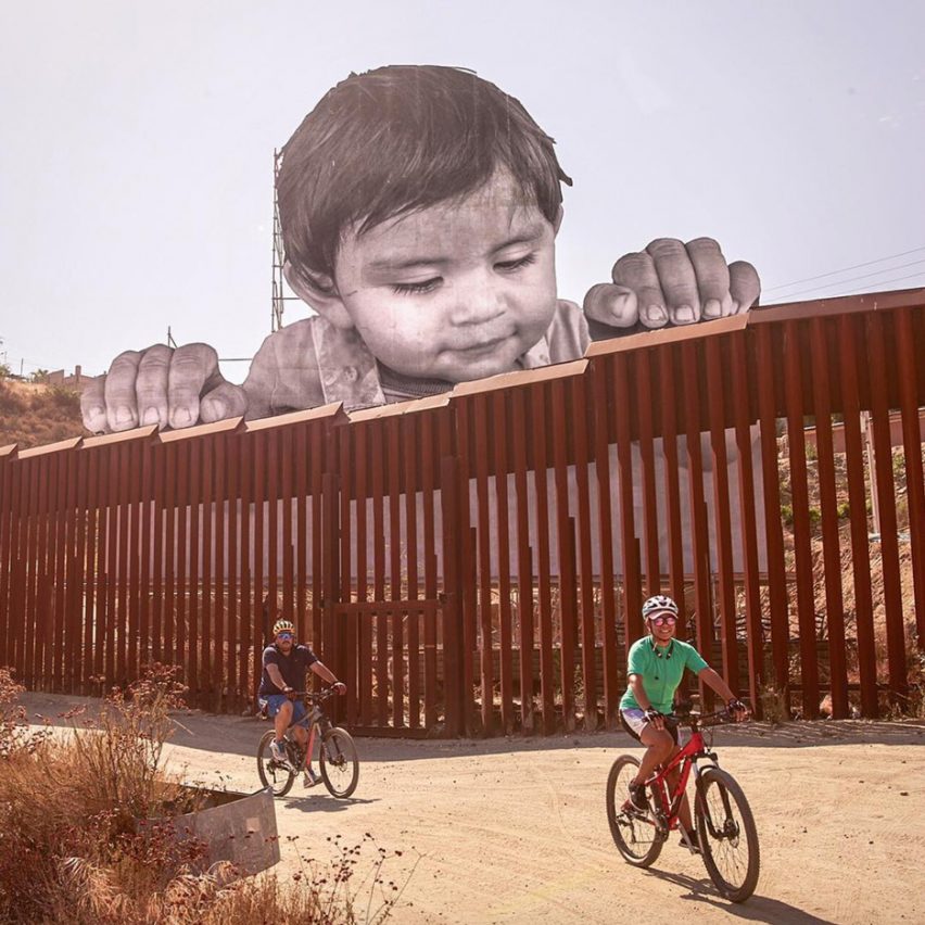
While many architects and designers have been developing designs for the US-Mexico border, artist JR decided to make his idea a reality.
He erected a huge billboard-style image of a child peering over the border fence, to protest Donald Trump's proposed repeal of the DACA programme, which protects children of undocumented immigrants. His aim was to provoke an emotional response, to spur people into action.
Find out more about Dreamers installation ›
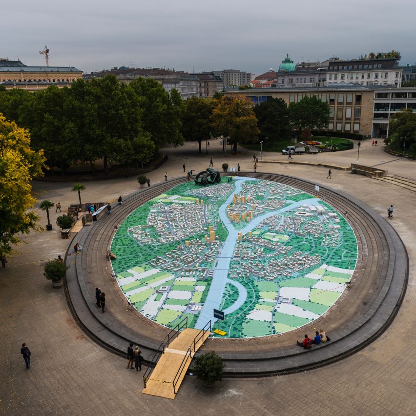
Hypotopia by Technical University of Vienna students
In 2014, the Austrian government decided to use €19 billion to bail out a local bank. In protest, a team of students from the Technical University of Vienna created a model city in the heart of Vienna, to show how much housing and infrastructure could have been built with the money.
Their aim was to make the amount of money understandable, tangible and visible for everyone, to encourage more people to speak out against it.
Find out more about Hypotopia ›