Schemata Architects creates red-toned interior for Tokyo grocery store inside skinny tower
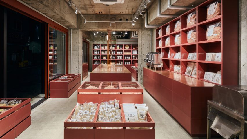
For the interior of this dried food store in Tokyo, Schemata Architects painted fixtures and fittings the same shade of red as the skinny building it is set inside.
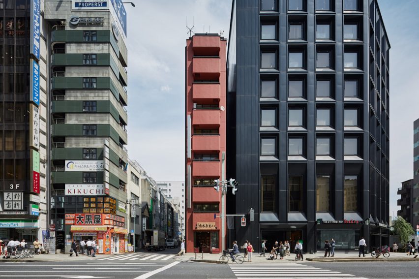
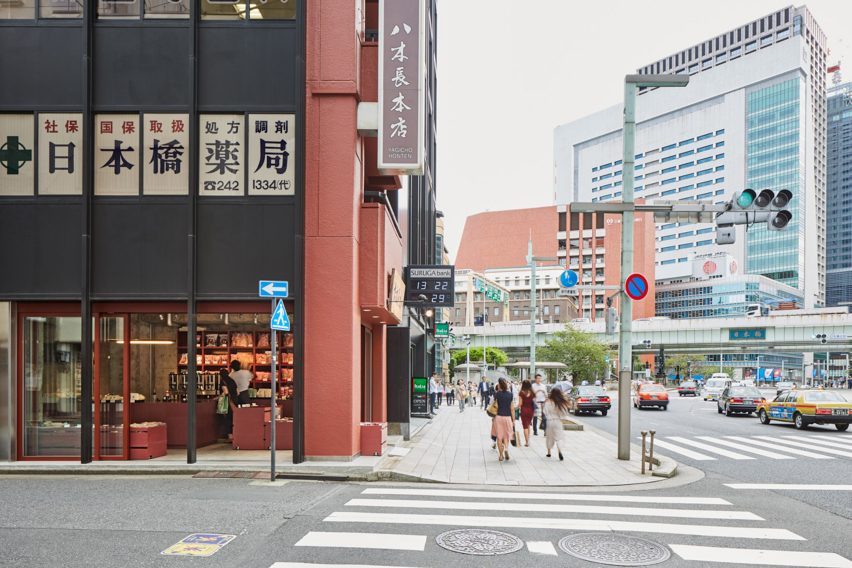
Called Yagicho, the store occupies the ground floor of a slim, nine-storey office block in Nihonbashi, Tokyo, that was designed and built by the Hishida Construction Company in the late 1970s.
Yagicho has a 280-year history of selling traditional Japanese dried foods including katsuobushi (dried bonito), konbu (kelp), and shiitake (Japanese mushroom) – the three basic ingredients that are used to make dashi, a soup stock that forms the base of Japanese cuisine.
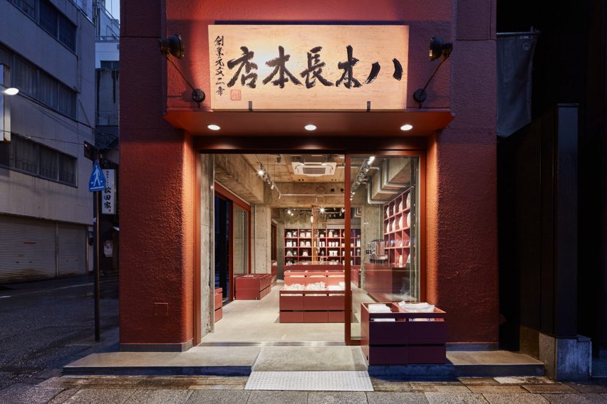
Measuring just 3.65 metres wide, the store has been completely renovated by Tokyo-based studio Schemata Architects, which began by painting the interior the same colour as the building's original red facade.
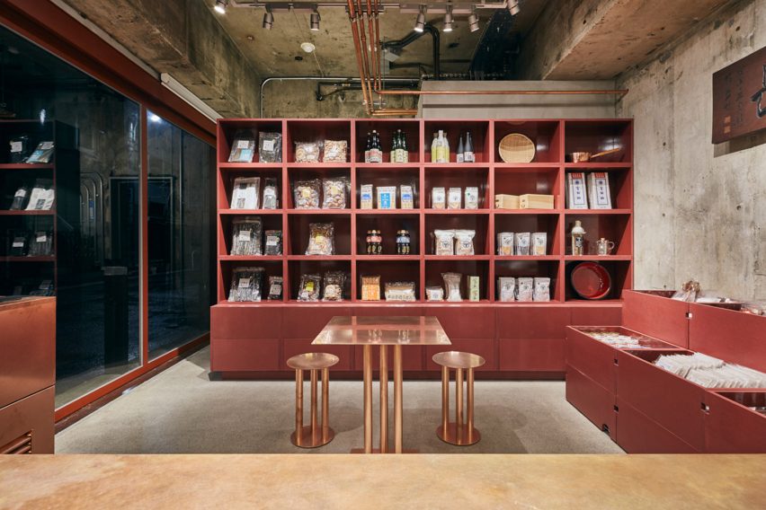
"Observing that the red resembles the colour of dried bonito, we decided to use it as the base colour representing Yagicho's identity," explained the studio.
"We made wooden boxes for display in the main store space out of MDF in the same colour, and placed them in stacks to create a space resembling a marketplace."
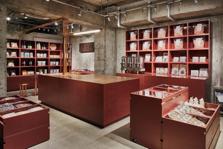
A cash counter island in the centre of the store doubles as a demonstration kitchen where shop assistants show how to make ichiban-dashi (soup stock).The architects said they positioned the counter in the centre so as to create a "non-hierarchical communication between hosts and guests".
The architects said they positioned the counter in the centre so as to create a "non-hierarchical communication between hosts and guests".
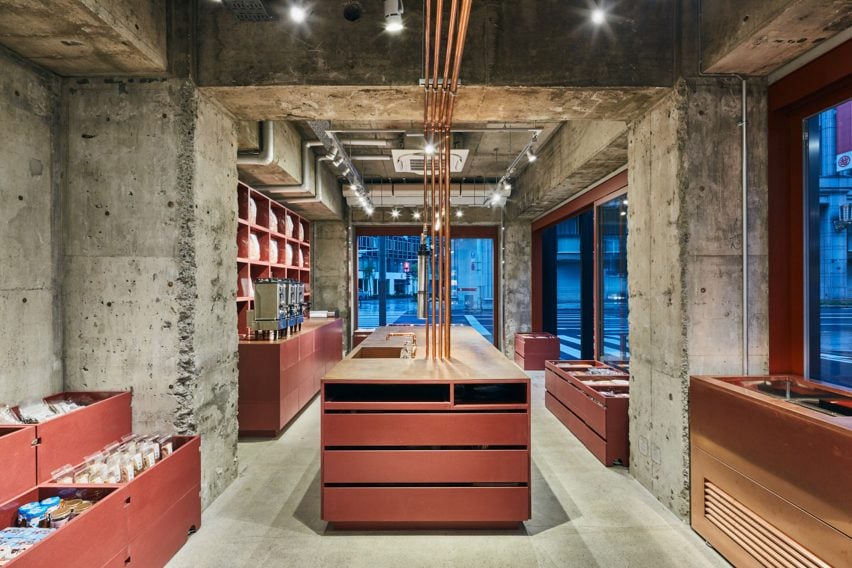
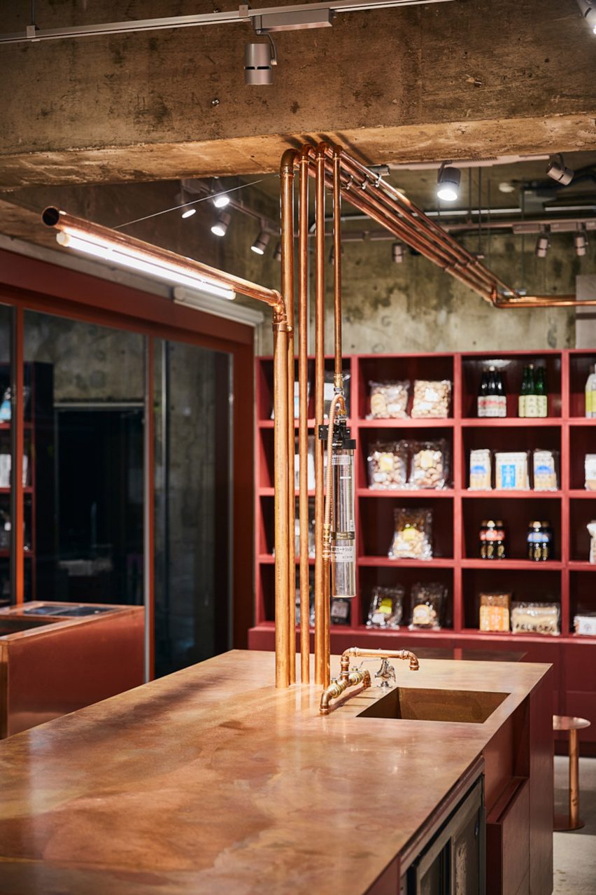
A series of copper water pipes snake across the store's ceiling and down into the central island, where there is a sink for food preparation.
A bespoke lighting fixture made also made from copper tubing sits alongside the water pipes, while a series of tables and stools provide a seating area where guests can sample the soup.
Positioned on a street corner, the shop benefits from two glazed facades with large doors that can be opened up to the street. The architects explained, "On sunny days, the store opens all doors and closely connects itself to the city. People constantly flow in and out, while generating a vibrant atmosphere spreading to the city."
"On sunny days, the store opens all doors and closely connects itself to the city," said the architects. "People constantly flow in and out, while generating a vibrant atmosphere spreading to the city."
Schemata Architects has designed interiors for a number of retail stores across Japan. Last year, the studio completed the design of a Tokyo coffee shop that uses plywood panels to conceal storage, as well as the renovation of a Japanese eyewear brand's store in Ageo, Saitama Prefecture, where walls were removed to create a more open-plan and welcoming space.
Photography is by Kenya Chiba.