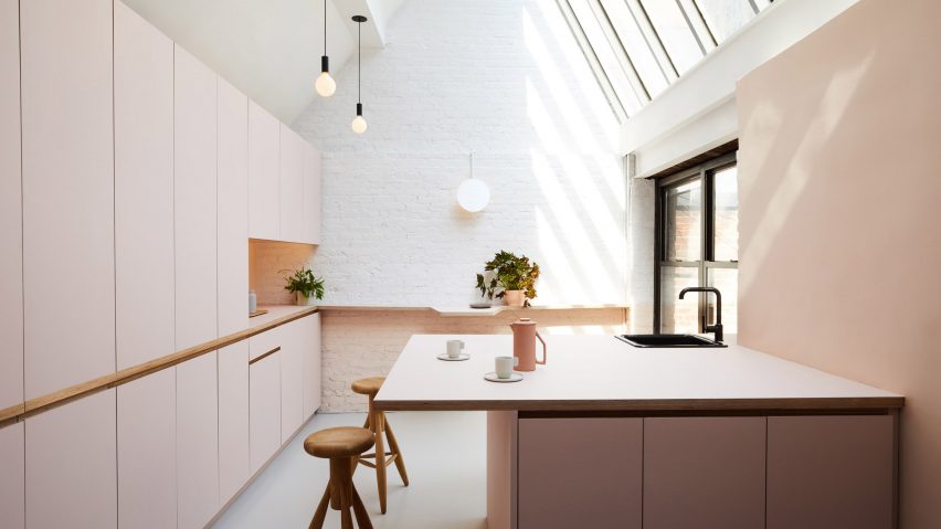
New York studio GRT Architects has renovated spaces at the top of a 19th-century building in the city, creating an office for a UX design firm that looks more like a home than a workplace.
The local studio designed the interiors for Objective Subject, a digital identity agency based in the Flatiron district. The office takes up a series of gabled spaces that cover the building's roof, and these existing rooms were used to guide the layout.
"When adapting 19th-century buildings to new functions we more often than not find ourselves removing walls to accommodate new users' needs," said GRT Architects. "In this case we found that radically accentuating the differences between existing rooms and playing up the separation uniquely suited our client's desire for an intimate work space designed more like a home than an office."
Each of the three areas is painted a different colour — pink, blue, and grey — and has tall pitched skylights reaching 16 feet (4.8 metres) to flood the rooms with natural light.
"Into this triptych we decanted the functions of a creative office," said the studio. "One enters through a working kitchen with generous counters at standing height, designed for editing large format printed materials but usable also for informal dining and events."
The kitchen features white walls, light grey floors, and linoleum cabinetry coloured soft pink – a shade that has come to be known as "millennial pink" for its recent prevalence. Other interiors in the same hue include a hummus deli in Paris, a Dig Inn restaurant in Boston and a champagne bar in Kiev.
In the New York office's kitchen, a sizeable island provides plenty of counter space for eating, working and hosting after-hour parties.
A nearby coloured dark blue is referred to as the "nap room". Covered in carpet, a tiered stepped unit creates an area for resting and/or sitting. The space also serves as a place to hold client meetings and has a smaller room attached.
"Poured over with light from the room-sized skylight above, the space envelopes you with an absorbing depth, texture, and acoustic isolation," said the firm. "Openings between rooms were left deliberately modest to accentuate the sense of departure when passing from one to the next."
A third, larger room acts as the main working area and is painted in a soft grey. Matching custom-made desks wrap around the perimeter, and light floods in through the high windows to create a greenhouse feel.
Photography is by Nicole Franzen.

