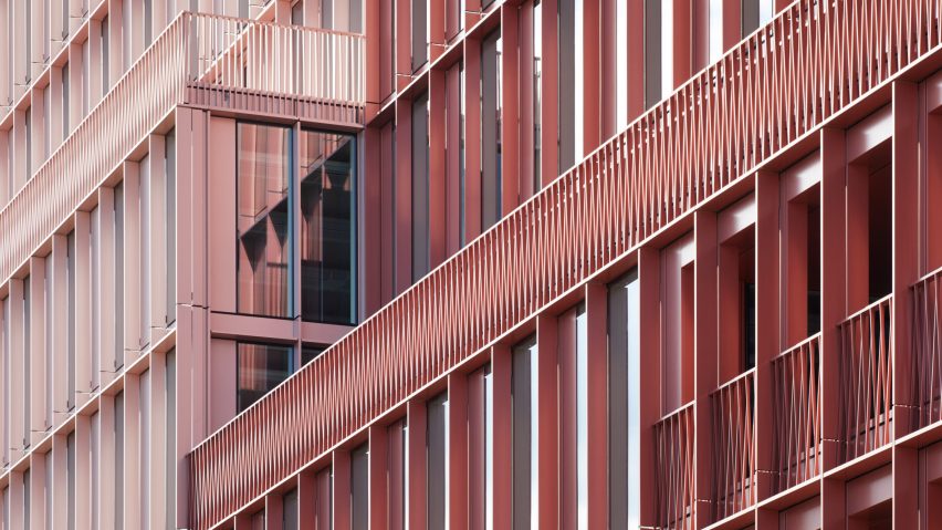
In this week's comments update, readers are debating whether Duggan Morris Architects was right to finish its new office building in this year's trendiest colour, millennial pink.
Tickled pink: the 11-storey-high R7 building, located in London's King Cross, both irritated and charmed readers with its pink-hued aluminium facade.
Castillo Matone felt the architects had got the design right: "Beautiful, subtle facade. And so great it's not just another brick building akin to many of its apparently contemporary neighbours."
Armand Tamzarian didn't agree: "The most interesting thing about this snooze of a building is the colour. Drab, austere, forgettable and cheerlessly bright, it functions perfectly as a bookmark in time for 2017."
"Using a flavour-of-the-month colour is problematic, as it is bound to fade unevenly. Without it the building is forgettable," added Claos.
Stephen Mallory wasn't as offended, but felt he had seen it all before. "If anything it's Pomo pink. Michael Graves et al used those pastel shades in the late 70s already and defined a decade with those colours," he wrote.
This reader suggested a broader colour palette:
Should architects follow colour trends? Have your say in our comments section ›
Copycats: Dutch architect Winy Maas sparked a discussion about design inspiration after he claimed that current architects should copy each other more to speed up innovation in his new book.
Diki Smaber felt that the claims had validity when looking through history: "One of the reasons classical architecture is good is because they were basically just copying, refining the basic design with each step, making improvements only where necessary."
But Jclaytonshaw argued to the contrary: "The problem with copying is that it brought us a half-century of flat-roofed buildings that were god-awful to look at but whose styles were enforced and lionised by architectural schools."
But Amsam felt the discourse was necessary: "Great thinking, and great to see it in Dezeen. The comments section here can be a plague of people pointing out similar projects from the past as if it were a failing of a building to resemble any other building."
Despite the debate, one reader was no closer to the truth:
Read the comments on this story ›
Plenty of fish: Snøhetta's plans for "Europe's first underwater restaurant" in Norway were put under scrutiny by commenters this week.
William Austin refused to let the potential achievement cloud his analysis of the design. "Their eagerness to be the first underwater restaurant in Europe mattered more to them than finding a quality design," he said.
Moving Forward felt that there was an air of hypocrisy about the proposal: "Europe loves to criticise the premise of outrageous developments in Dubai or China, and yet when it comes to absurd projects like this, the discussion narrows down to the quality of design."
"Ridiculous, if I wanted to observe sea creatures, I'd go to the aquarium," commented an unimpressed Egad
In this vein, Geofbob had an idea for the prospective chefs: "Observing fish and other sea creatures in their natural environment while eating them seems rather obscene, so perhaps they should be off the menu."
That was not the only suggestion for the menu:
Read the comments on this story ›
Can't see the forest for the trees: Stefano Boeri's latest suggestion, for a city on Mars made up of vertical forests, failed to excite Dezeen readers.
Spadestick clearly felt it was time for new ideas from the architect: "Truly, a one trick pony. What next, trees in Antarctica?"
"Does anyone know of a forest that is not vertical?" asked a mischevious Misha.
AnnaLuteLady had an even simpler question: "Please stop me if I'm suggesting something crazy, but why don't we just, you know, not make the earth uninhabitable?"
This reader seemed to summarise the general feeling across the board:
Read the comments on this story ›

