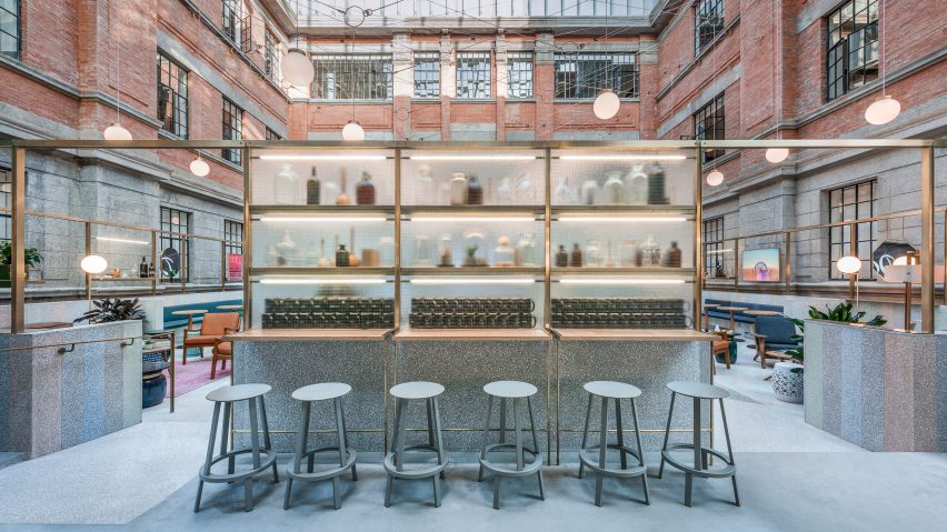
10 architecture photographs that could have come from a Wes Anderson film
The dreamy cinematic style of director Wes Anderson informs this week's roundup of popular images from Pinterest. From a colourful tennis court to a flying house, the list features 10 buildings and space that favour pastel hues and symmetry.
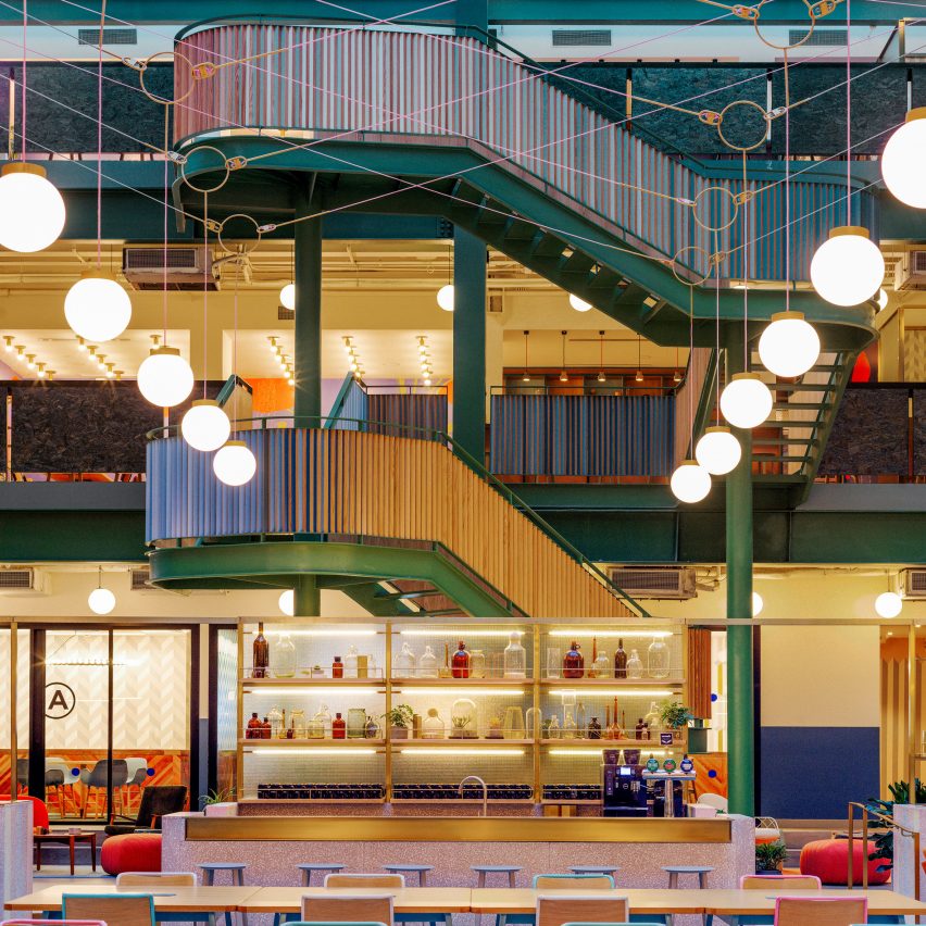
WeWork Weihai, China, by Linehouse
This grand interior of this co-working space in Shanghai features vibrant colours and patterns. Intended to give occupants an experience of "whimsy, voyeurism and festivity", it features neat rows of spherical lighting globes and golden details.
Find out more about WeWork Weihai ›
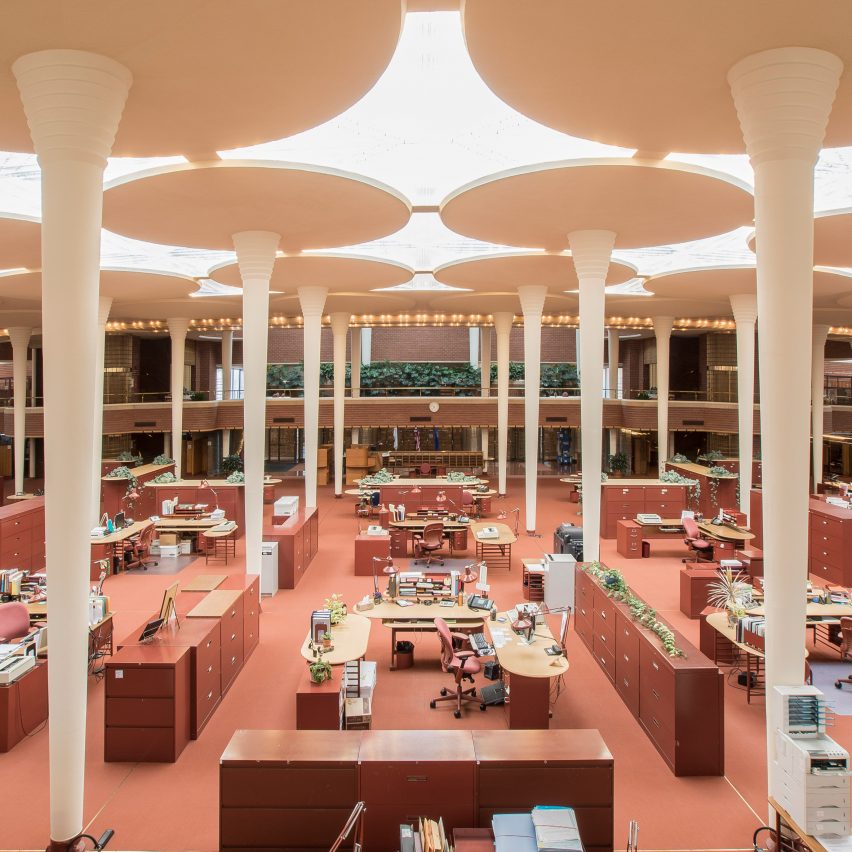
Johnson Wax Headquarters, USA, by Frank Lloyd Wright
An interior that should need no introduction, this Wisconsin office was completed by Frank Lloyd Wright in the 1930s. The late architect chose earthy red tones to complement the sculptural columns – echoing Anderson's own use of colour and form, in films like The Grand Budapest Hotel.
Find out more about Johnson Wax Headquarters ›
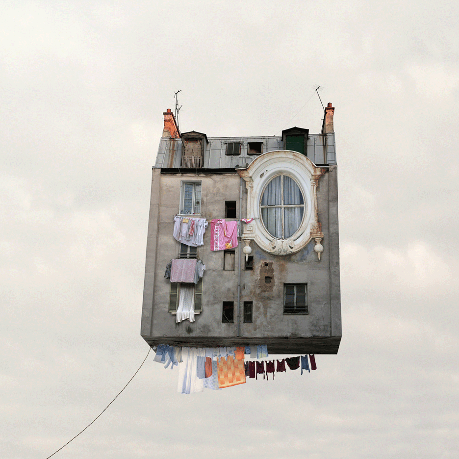
Flying Houses by Laurent Chéhère
French photographer Laurent Chéhère attempted to recreate "old Paris" with this series of impossible images that embrace whimsical eccentricity. This one feature a house that is being flown like a kite, with a washing line hanging underneath and an abnormally huge window.
Find out more about Flying Houses ›
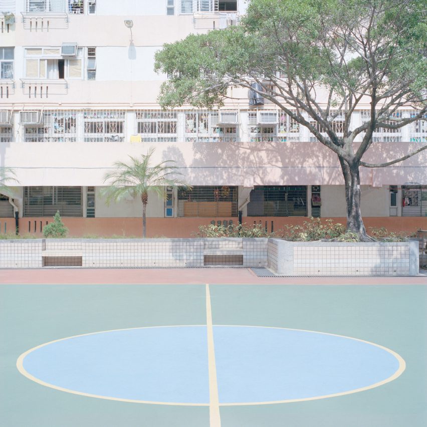
New York-based photographer Ward Roberts trekked around the world in search of pastel-coloured sports courts, which he showcased in the photo series Courts 02. The soft colours of this one are reminiscent of scenes in Moonrise Kingdom.
Find out more about Courts 02 ›
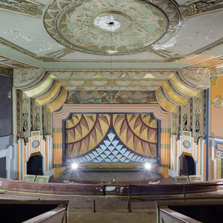
After the Final Curtain by Matt Lambros
After the Final Curtain is a book by American photographer Matt Lambros that celebrates abandoned cinemas. It is filled with images of lavishly decorated movie theatres that are now in ruin, such as this one in Maine.
Find out more about After the Final Curtain ›
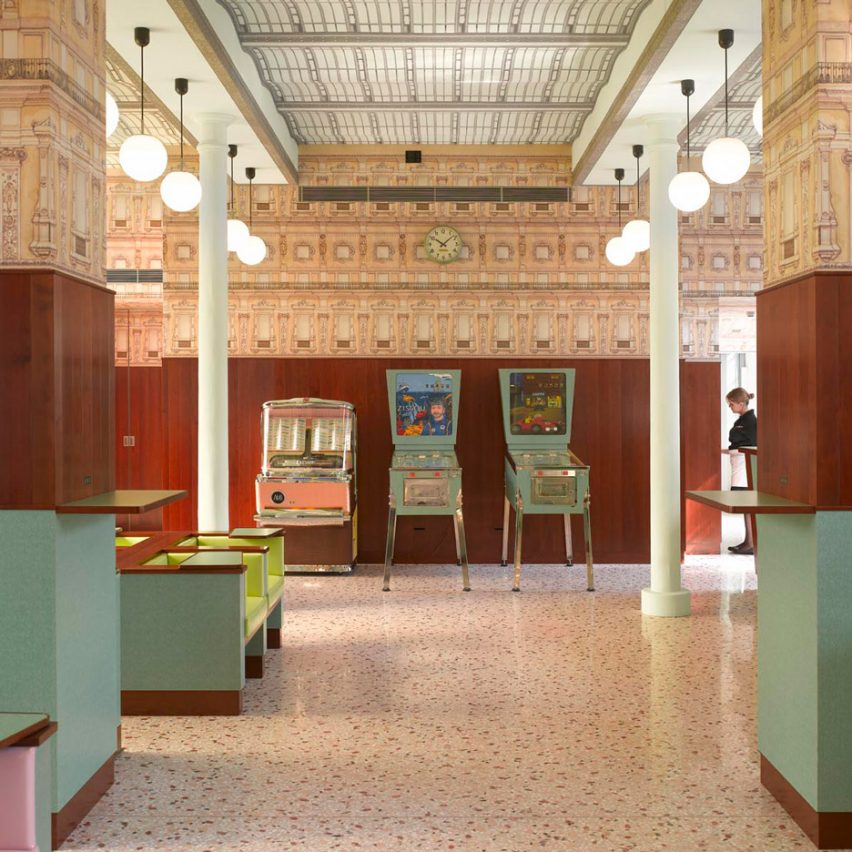
Bar Luce, Italy, by Wes Anderson
An unsurprising addition to the list, this Milan bar was designed by Anderson himself. Intended to reference Milanese cafes from the 1950s and 60s, Bar Luce combines pastel-toned surfaces with Formica furniture. It even includes a pinball machine dedicated to The Life Aquatic with Steve Zissou.
Find out more about Bar Luce ›
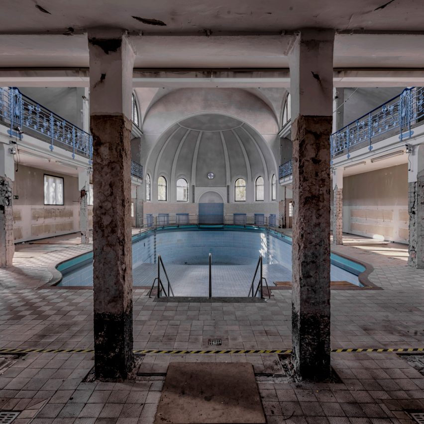
Abandoned by Christian Richter
German photographer Christian Richter captured a selection of dilapidated and decaying buildings for his Abandoned series, but this swimming pool scene is particularly similar to one of Anderson's sets.
Find out more about Abandoned ›
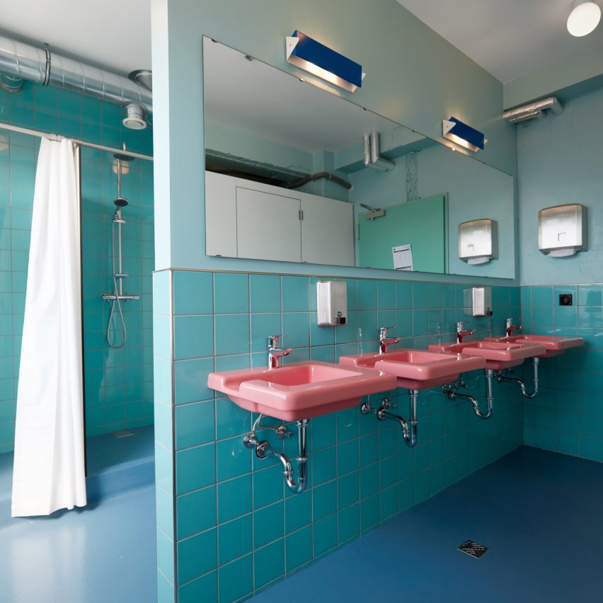
Oddsson Ho(s)tel, Iceland, by Döðlur
This hotel-cum-hostel on Reykjavík's waterfront was designed by Icelandic studio Döðlur. It features a range of spaces that boast contrasting colours – but the 1950s-inspired bathrooms most closely match Anderson's aesthetic, with their candy-floss-pink sinks, turquoise tiles and light blue flooring.
Find out more about Oddsson Ho(s)tel ›
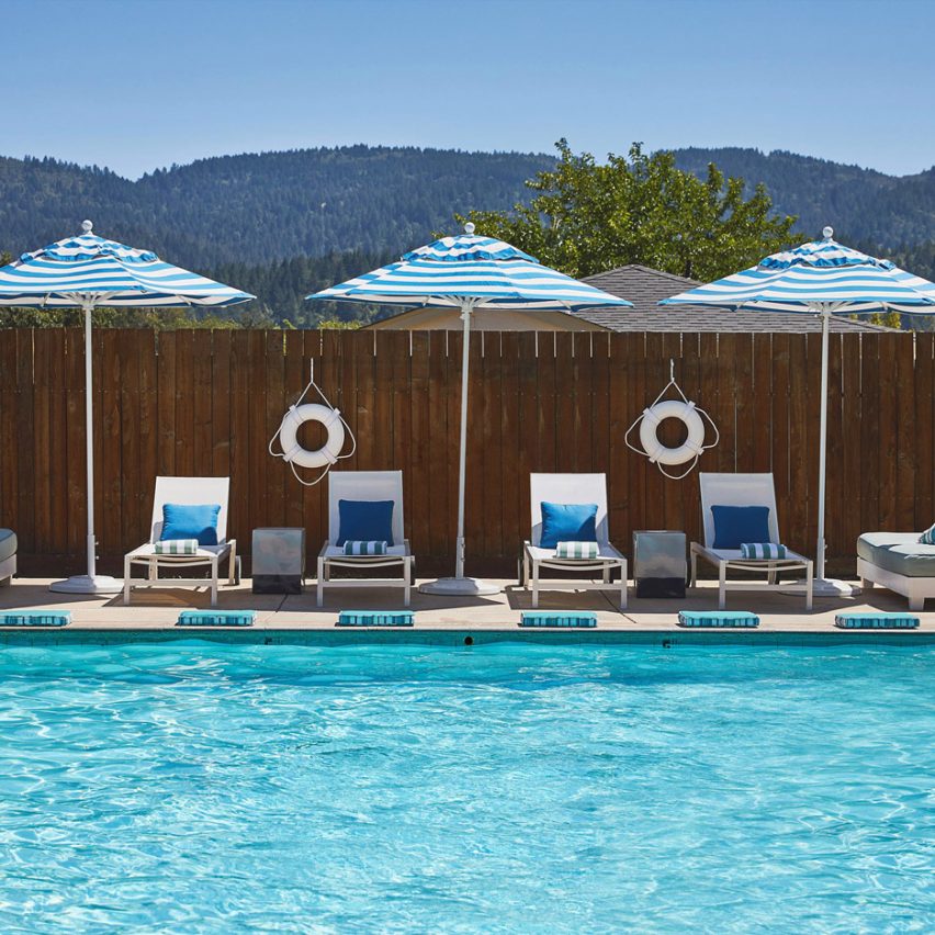
Calistoga Motor Lodge and Spa, USA, by AvroKO
American studio AvroKO specifically designed the pool of this hotel and spa in California to make guests feel like they are in a Wes Anderson film. The designers achieved this by combining elements that are mundane with glamorous and retro additions.
Find out more about Calistoga Motor Lodge and Spa ›
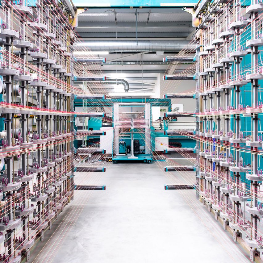
Wooltex by Alastair Philip Wiper
This image by photographer Alastair Philip Wiper shows a factory where textile manufacturer Kvadrat produces fabrics. The endless reels of mustard-yellow and cerise-pink threads – colours strongly associated with Anderson – lead the eye to the centre of the shot.