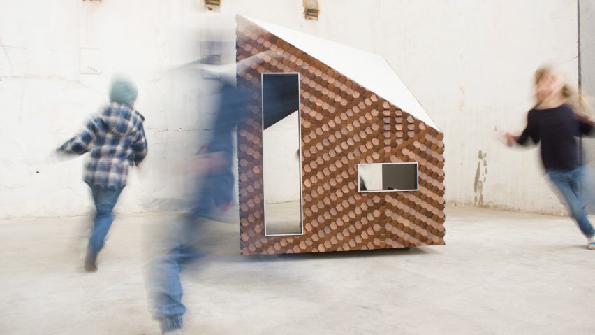
Giles Miller creates textured facade for children's playhouse
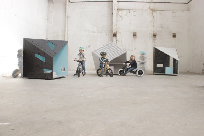
London designer Giles Miller has used hexagonal wooden tiles to cover the surface of this children's playhouse by cabin company Koto Design.
Designed an alternative to the traditional playhouse, Miller's Grace cabin is one of three structures by Koto Design that are aimed specifically at children.
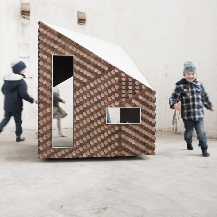
Through his surface design, Miller wanted to reference the cabin's geometric framework while also creating a "dramatic" pattern.
As per a request from Koto Design founder Johnathon Little, the cabin also needed to suit both indoor and outdoor environments, as well as rural and urban contexts.
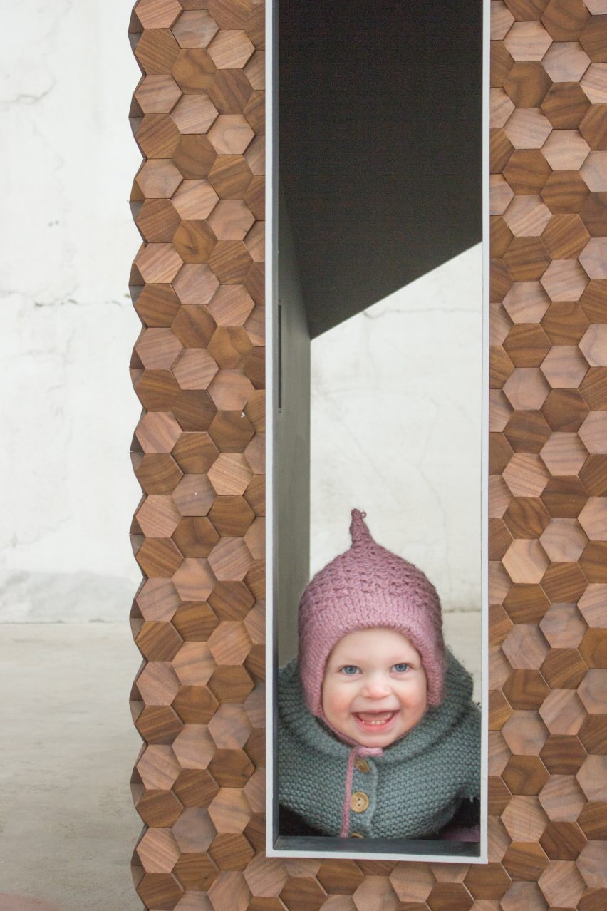
To achieve this, he used a hexagonal-shaped walnut tile, named the Alexander. Each piece was positioned at alternating angles to give the surface a three-dimensional, textured quality.
"Our brief was to come up with a design that references the geometry of the architectural structure, but in a natural finish so that the piece could sit conformably in either a rural or an urban context," Miller told Dezeen.
"In much the same way that a brick type, colour and composition can have a dramatic effect on a building, the surface design was prioritised by Koto Design and considered a key feature of the design."
"The Alexander tile gave us a method of creating surface imagery using angled geometry, but also a system that could potentially be adapted for further cabins or 'characters' and also for bespoke versions for individual clients or contexts," he continued.
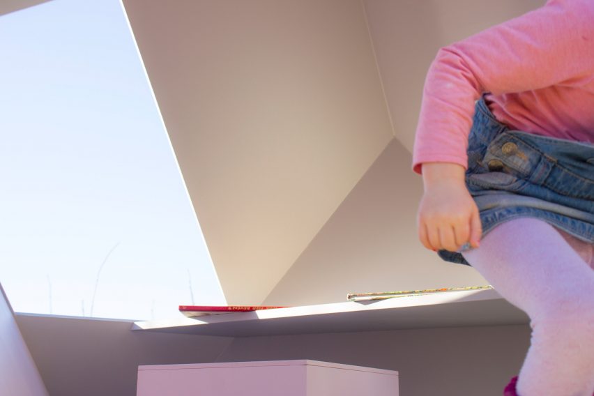
Inside the cabin, walls are covered in chalk paint – allowing children to draw on its surfaces.
Simple furniture items, including seats with hidden storage and a small table, give them a space to sit down and read a book.
This is the first time Miller has partnered with Koto Design. Previous projects by the London-based designer include a spherical sculpture formed from hundreds of reflective "pennies" and a shingle-covered pavilion for the English countryside.
For this year's Clerkenwell Design Week, he worked with watch brand Shinola to create a pavilion made from 8,000 lightning-bolt-shaped pieces of plywood.
Photography is by Koto Design.
Project credits:
Kirstie Little
Giles Miller Studio
Liam Woolley
Prototyper
Johnathon Little