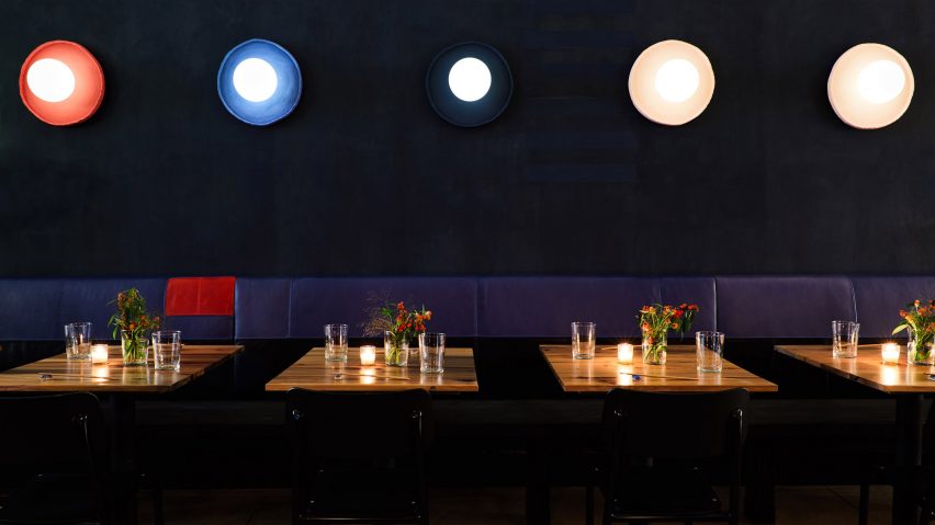
Indigo walls and furniture form dining areas for this Japanese restaurant in Midtown Manhattan, while geometric-patterned wall surfaces match the menus and tableware.
Tonchin New York is the latest in a chain of family-run eateries. But is the brand's US debut, and brothers Anan and Toi Sugeno's first venture on their own.
They asked Brooklyn-based creative studio Carpenter + Mason to guide the aesthetic for the restaurant, located just north of the Empire State Building, to "design a Japanese restaurant that didn't feel traditionally Japanese".
"Our material and formal choices were inspired by traditional Japanese textiles, colours and techniques (Boro, Kintsugi, Shou Sugi Ban), but with a sense of playfulness to keep our references from feeling too heavy and too literal," said Carpenter + Mason co-founder Sarah Carpenter.
Fronted with translucent polycarbonate, the lofty space on 36th Street is long and narrow, and organised in a linear succession. The bar is reached first, followed by the main dining area, then the kitchen at the back.
A small table with seating is also tucked into the corner by the front window, to create a waiting area during busy times.
Indigo was chosen as the dominant colour – following a trend for dark-toned interiors that first emerged at Stockholm Design Week earlier this year.
The shade is used as a stain for timber posts and beams that form a row of dining booths, opposite an upholstered bench seating line that is also coloured deep blue.
"Since ramen is such an all-hours meal, we created a variety of seating typologies so that anyone can feel great eating Tonchin ramen, regardless of the situation and time of day," Carpenter said.
Plasterwork in the same hue covers the lower half of the walls, visually breaking up the room's height.
Contrasting the rest of the dark furniture, wooden tabletops with a particularly prominent grain were chosen to add warmth, along with pink tones in the aggregate that forms the bar counter.
Carpenter + Mason brought on LMNOP Creative to design the branding for the restaurant, which also ended up informing graphics used on the walls.
The studio's Leigh Nelson looked to the work of Japanese artist Kumi Sugai, who became well-known for the paintings and prints he completed after leaving his home country and adopting a more Western style.
Nelson's graphics in bold red and blue tones were used to create eight different menu backs, as well as to pattern the ramen bowls – custom-made in Japan – and scarves worn by the servers.
"The idea behind these patterns is that they can come together forming endless combinations, much like a bowl of ramen," said Nelson.
The colour palette also carries through to the light fixtures, created by potter Helen Levi. Her ceramic dishes with uneven lips form sconces for globe-shaped bulbs that are mounted above the bench, and pendants hung in the booths. Red stools pop against the bar area's blue and white tiles.
One of Nelson's graphics was turned into a textile wall hanging, hand-stitched by artist Alison Charli Smith, which sits above the kitchen door. The LMNOP team also designed a mural of swirling noodles for the bathrooms, which also feature bright red doors and circular mirrors folded to fit into the corners.
Other features include a polished concrete floor and exposed ductwork that lend an industrial feel. Paired with the craft elements, they create an atmosphere that Carpenter described as "Tokyo meets New York".

