"It's like walking through some bizarre toy village"
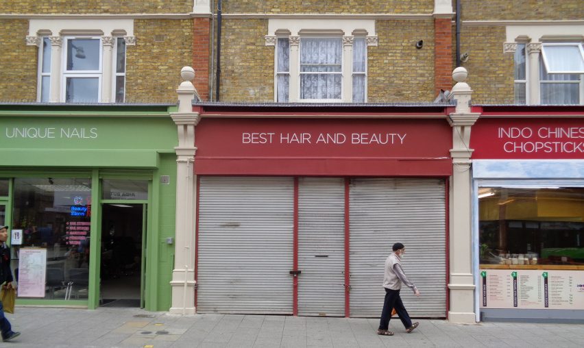
In this week's comments update, an opinion piece arguing against the homogenisation of shop signs on a northeast London high street started a debate among readers around aspirational politics and gentrification.
Past it: Owen Hatherley's recent article lamenting a council decision to replace old shop signage on Walthamstow High Street with sans-serif typeface led to a discussion about the suitability of future makeovers in other areas of the capital.
"The standardisation of fonts is one step too far but I think it generally looks lovely," opened a positive Dafydd Morgan.
"I'll bet there are more than one or two unfilled potholes in Walthamstow. Priorities?" asked one guest commenter, who felt the money could have been used for more pressing issues.
But local reader Tom applauded the decision: "I live in this area and to be honest it's overwhelmingly supported here. For many shopkeepers, it's the chance to overhaul their shopfront without huge expenditure, it creates a lovely feel of cleanness and coherence."
Daniel Brown worried it might be the start of a new London trend: "Like the Barbican – amazing as the documentation of a social experiment, but I certainly wouldn't want the whole city to look like that."
"I experienced a sense of unease when I first saw these shopfronts. It was like walking through some bizarre toy village. Everything about it felt wrong. It's a bit like Stepford Wives," wrote Anne, echoing the sentiment.
This reader pointed out a clever missed pun opportunity:
Would you like your local high street to get a sans-serif makeover? Have your say in our comments section ›

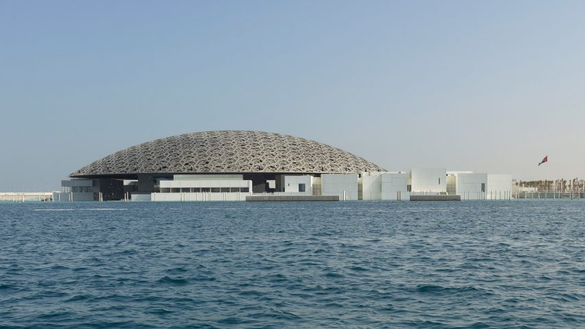
Look of Louvre: with the first official photographs of the Jean Nouvel-designed Louvre Abu Dhabi released this week, commenters had plenty to say about the new domed art museum.
"Yet another new museum that is all about the architecture and not the art," complained We R One.
"An excess of kitsch and bling where isolated pieces of art fade into an insignificant summary of art history. This is not a museum," continued TEI.
HeywoodFloyd felt the project just missed the mark: "Irregular cladding on the small buildings underneath the dome has been done literally hundreds of times before. Disappointing to see such an off-the-shelf aesthetic concept in what is otherwise, on the whole, a pretty unique design."
"Oh no! Something I have seen before, next to something I haven't seen before! How awful," fired back Zga.
One reader had a condensed view of the project:
Read the comments on this story ›

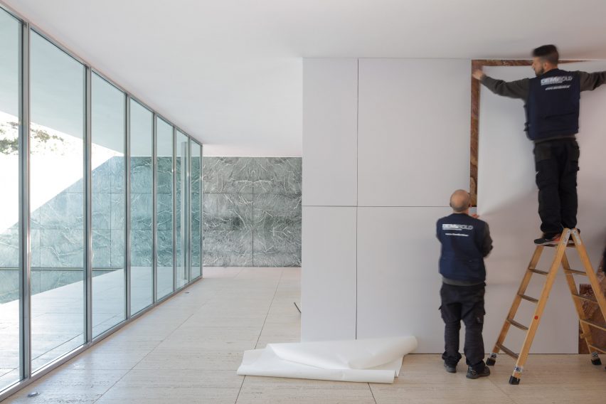
Money man: emotions were running high in response to Spanish architects Anna and Eugeni Bach's project to transform Mies van der Rohe's Barcelona Pavilion into a full-scale model by covering its walls with white vinyl panels.
"This is so stupid, I can't believe it! I live in Barcelona and I'm embarrassed by this ridiculous project," wrote Nina Strauss.
"Sacrilege. Vandalism," raged an upset CaptRichie. "This is just wrong," agreed commenter J.
Jorge saw positives in the concept: "I think it's a nice thought-provoking installation."
But one Guest commenter felt it was a taint on Mies van der Rohe's legacy: "When will they ever stop messing about with it? It's as if they can't bear its perfection. Disrespectful in the extreme."
Ever the pragmatist, Geofbob reminded readers to stay calm: "Keep a sense of proportion everyone – this is just an 11-day intervention. And keep in mind that the Barcelona Pavilion is not the original, but a recreation."
This reader was worried about people missing out due to the alterations:
Read the comments on this story ›

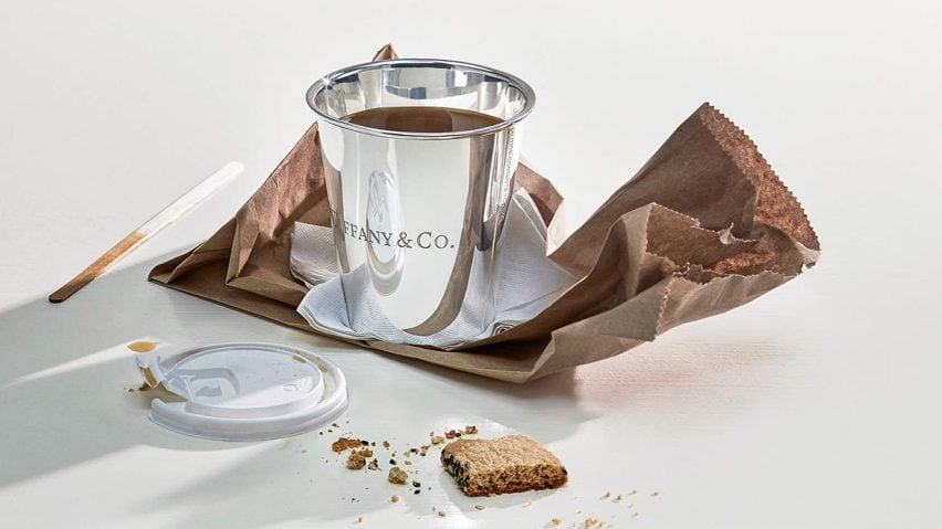
A fool and their money: a new range of everyday items made with costly materials – including a £945 tin can – from New York jewellery brand Tiffany & Co left some readers gobsmacked this week.
"When designers run out of new ideas to sell expensive things to dumb people," stated Jaxe.
"The tin can is the perfect accessory for holding designer Paul Smiths £3,000 mechanical pencil!" joked Daniel, referencing another recent Dezeen story.
Geofbob found the entire premise offensive: "'Reimagining common or garden objects in opulent materials is a favourite trope of designers – possibly because it doesn't actually require them to design anything, just upgrade the material."
"Would have been interesting as an artwork, as a Tiffany & Co product it's just dumb," sighed Was.
This reader had the range eyed up as a stocking filler.
Read the comments on this story ›