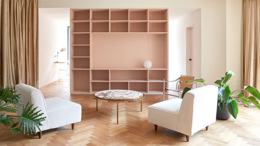
Pink and teal hues accent storage units in this family home in Montreal, converted from a shop by local firm Atelier Barda.
Résidence Villeneuve used to be a commercial space with a pair of apartments on the levels above, but its owners wanted to turn the building into a two-storey house and a separate rentable flat. They asked Atelier Barda to reorganise the layout to accommodate their wishes.
The plot in the Canadian city's Plateau-Mont-Royal neighbourhood also boasts a side yard, previously for unloading stock, and a long garage. A new living area was constructed above the garage to provide extra room, while the remaining portion of the roof was designated as a terrace.
Originally the yard was to be turned into a garden and the side wall used for extra windows, but issues of privacy arose due to sight lines from the street and neighbouring properties.
Views into the home were also a concern from the large wood-framed storefront windows on the front facade. However, the architects decided it was worth retaining the glazed frontage for its character and natural light benefits, so took an unusual approach.
"The first idea was to present the clients as the protagonists of the project, revealing fragments of their narrative to passersby while ensuring their privacy at specific times," said the studio. "The direct relationship between the clients and passersby would be highlighted rather than ignored."
A light-pink block was built in the centre of the ground floor, in front of the windows. Housing cupboards, a powder room and a bookshelf, it shields the private living, dining and kitchen spaces behind from view.
Passages on either side lead back to these areas, which can also be obscured by floor-to-ceiling curtains that give "a theatrical look".
"The entire redesign was guided by two complementary themes: a play between seen and unseen and cinematographic framing," Atelier Barda said. "The former storefront windows were conserved, not only to let in light, but also, importantly, to create some ambivalence between what is shown and hidden."
A wooden parquet floor laid in a herringbone pattern runs between the ground floor spaces. Walls are painted white and furnishings are minimal.
"Although the facade is largely permeable, the entire living area on the ground floor is not visible from the street, other than the passageways and interstitial spaces," the studio said.
Tucked to one side, the kitchen features an island and units coloured teal and topped with marble. A skylight brings extra light into this darker space, and a planter mounted high on the walls adds extra green, while doubling as an cooker hood.
A terrazzo-style concrete floor further differentiates the kitchen from the sitting and dining room. Leading to the first-floor bedrooms and bathroom, a delicate white balustrade curves up the staircase.
The architects also created a small office space in the front of the property, which becomes more animated after dark due to subtle lighting.
"When the space is being used in the evening, it accentuates the cinematographic framing of the large front window, evoking the painting Nighthawks, by Edward Hopper," they said.
Atelier Barda was founded by Antonio Di Bacco and Cécile Combelle, and recently completed another renovation in its home city, using a black and white palette and custom finishes.
Photography is by Maxime Desbiens.

