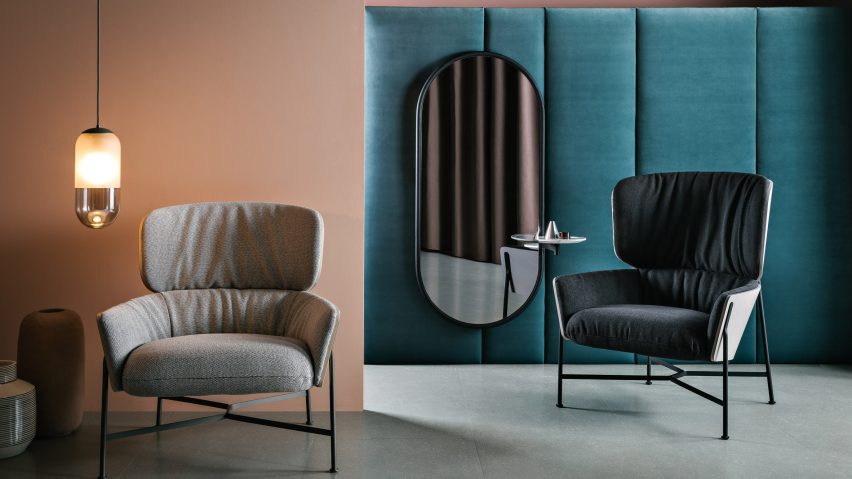
Tim Rundle stripped-back traditional furniture typologies to create this collection for Australian brand SP01, which pairs plush fabrics with exposed metal frames.
The London-based industrial designer described the collection as possessing an Antipodean design approach, in the way it distils influences from different eras and design traditions.
"We're not hampered by long design traditions in the same way an Italian or Danish studio might be, so we can appreciate and take [inspiration] from lots of other cultures," Rundle told Dezeen.
"[SP01 founder] Matt Lorrain and I began by talking about different designs and historical reference points that we thought were relevant to the brand, then reinterpreting them."
While the collection takes its cues from a number of sources, each piece is unified by the use of a prominent metal frame.
Rundle described the frames as being "almost like sketches describing the whole volume of the product", which would still be recognisable, even if the upholstery and surfaces were removed.
The Caristo chair, which is inspired by the classic wingback, has been given a more contemporary feel by removing the upholstery from the back to expose the plywood shell.
The upholstery on the inside of the shell has been padded and gathered to create a soft contrast to the chair's metal frame.
"The frames are quite architectural and linear, while the inside surfaces of the chairs are soft, and this reinforces the idea that furniture is the point of interaction between people and architecture," said Rundle.
Where the frame attaches to the chair's shell, the tubular structure has been flattened to form a bracket.
"The bracket that holds the shell onto the frame is inspired by a really rudimentary engineering technique of crushing the tube to make a fixing point," Rundle said.
"We've used the same process, but refined it to make it suitable for a high-end furniture piece – it's a practical, straightforward way to join a frame to a volume."
A series of mirror frames incorporate small side tables and, in the floor mirror design, this extends to the ground, ending in a marble ballast that allows it be freestanding.
The table designs are equally graphic, juxtaposing different shapes in fluted glass and marble to resemble nesting tables.
"We wanted the mirrors to look like sketched archways, so they just draw a line in space and it looks like you could just walk through into another room," Rundle said.
SP01 launched in 2016, and the collaboration with Rundle marks its third collection.

