"Nice to see a new contender for the Carbuncle Cup"
In this week's comments update, news that a 228-metre-high skyscraper with Matisse-inspired facade patterns will be built in London's Croydon is met with heavy criticism.
United by hate: the "spectacularly tall" One Lansdowne Road tower by architecture studio CZWG is set for construction in early 2018, much to the disdain of commenters.
"Spectacularly tasteless, more like. Matisse, my foot. Only if those facade lines are symbolic of how the man is turning over in his grave," fumed Jon.
HeywoodFloyd also took issue with the design's apparent nod to the important French artist: "Tasteless, banal, elephantine and sophomoric. And then you get to a Matisse reference. Words fail me."
"Great example of established political power mixed with a total lack of talent, "added Federico Nassetti.
Geofbob half-managed to find a redeeming element to the design: "It's an old joke, but the best feature of the viewing platform will be that you can't see the tower from it."
"I find it utterly embarrassing. What a terrible design. Croydon needs improving not making worse," wrote an angry Chris.
Malgorzata was the only commenter to go against the grain: "Everybody is writing that this building is extremely ugly and tasteless. In my opinion, some of Hadid's skyscrapers are much more ugly and not criticised. Different standards for a star and non-star architects?"
One reader suggested that the project will eventually be named UK's worst new building:
Were readers too harsh on One Lansdowne Road? Have your say in our comments section ›

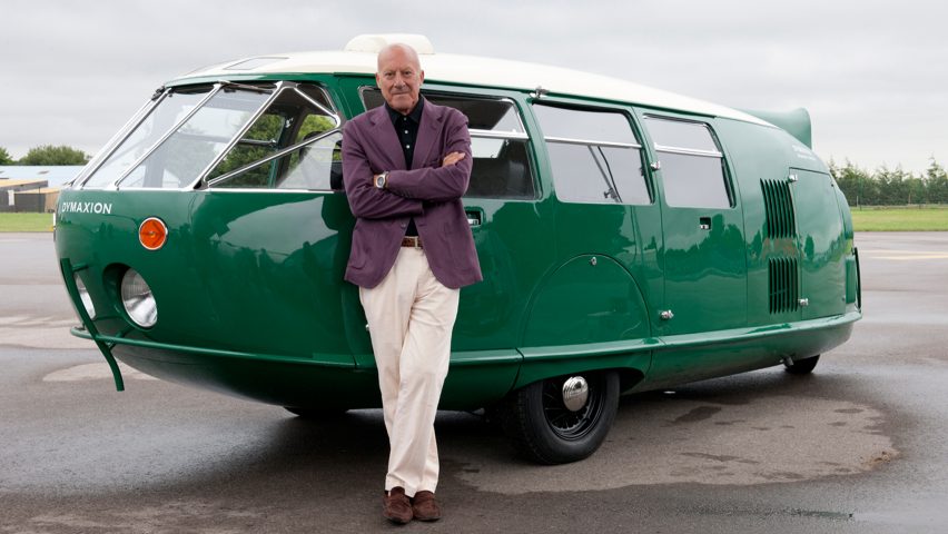
Can EU not: British architect Norman Foster annoyed the staunch Brexiteers amongst Dezeen commenters with his decision to highlight the diversity of his firm's employees in the face of the EU referendum result during a WAF speech.
None felt the architect had no reason to make the point:"Sorry Norman mate, aren’t you still a national of Spain? Why do you even care?"
"It may have something to do with the attitude of architects to analyse problems and then design a solution to that problem," pointed out Johannes Renken.
"What solution did they design for the excesses of the European bureaucracy, the lack of democracy and transparency, and the rigidity of the Euro?" countered Clunking Fist.
This Guest was tired of the one-way flow when it came to this debate: "It would be so uplifting to hear an eminent architect say they're behind Brexit and fully up to the challenge of whatever it may bring, but not one of them is daring to break ranks."
One commenter was mainly happy to see both sides of the argument represented:
Read the comments on this story ›

Letter of the law: the first images of Renzo Piano's recently completed tiered Tribunal de Paris, set to become the largest law complex in Europe, divided readers opinion this week.
She Grabs The Curtain seemed to think the design was pleasant enough: "I think it will be a nice place to work, with all the natural light and the little rooftop parks."
Spadestick agreed: "Love the way the solar panels are expressed. Tired of our ilk trying their darndest to hide them. Why not celebrate their intended purpose more?"
But Onboard was not as their username suggested: "What is worse than a soulless building? Stacking four of them on top of each other."
"This monstrosity should be against the law," added Claos strongly.
"Isn't that a direct quote of what they first said about the Eiffel Tower?" fired back Geofbob
One reader felt the Italian architect was treading familiar ground:
Read the comments on this story ›

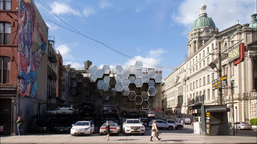
Many sides: a proposal from creative agency Framlab to house New York's homeless in hexagonal honeycomb-like pods attached to empty walls was met with mostly horror this week.
"I think the goal is sincere, and the concept is well thought-out, but this project lacks some fundamental human empathy" stated Rob Daurio.
SteveLeo was in agreement: "Designers need to stop thinking of homeless people as parasites, and therefore designing edgy parasitic architecture to house them. They need real, normal homes for real, normal people."
Redgeweather applauded the proposal, to an extent: "Beautiful project, beautiful renderings, beautiful idea. However, this is pure ignorance. This is an ad for luxury futuristic micro-housing."
"How are they supposed to go up there?" asked J, bringing up an entirely different problem.
This reader couldn't help but troll those with serious concerns:
Read the comments on this story ›