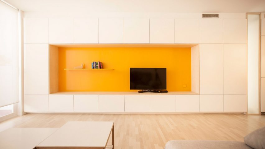
This apartment in Alicante has had its interior walls removed to create a bright and spacious living space punctuated by brightly coloured niches inspired by the palette used by Danish design brand Hay.
A newly married couple asked Diego López Fuster Arquitectura to refurbish the derelict apartment in the Spanish city to create their home.
They requested a combined living, kitchen and dining area, and came to the architects with a recent wedding gift as reference material for the colour scheme – a set of Hay's geometric Kaleido trays.
A secluded study area and a master bedroom were also key for the clients. To achieve this, Diego López Fuster divided the building into two longitudinal sections: a "luminous daylight space" and a private zone for the night.
The living space spans 19 meters in total and is illuminated by natural light from three directions – through a window at the front of the house, the outer terrace and the back garden.
Wanting to create distinct spaces for each particular living function, the architects chose to give each zone its own unique colour. A niche in the living area is orange and one in the kitchen is yellow.
"We were looking for a colour scheme that defined each main space of the dwelling," said the architects.
Each individual space is fitted with a modular storage system that surrounds the coloured accents, creating a sense of continuity between each section of the living area. These ample storage spaces help to keep the common spaces as uncluttered as possible.
"IKEA modular kitchen base cabinets were a low cost and functional solution to complete the length of the wall with a lot of storage space," explained the architects.
A folding glazed partition gives the option of separating the study from the main body of the living space. This provides the possibility for quiet study and allows the area to double as a guest room.
"[The client] is a paediatrician and has to study continuously to keep updated," explained the architects.
The bedroom and a walk-in wardrobe are situated on the adjacent longitudinal section of the flat and together form the private, night-time quarters.
"In a complementary way, the rest of the private spaces are placed in the opposite half," said the architects. "The two bedrooms fall to each of the facades, providing all the rooms with ventilation and natural lighting."
The muted palette of Hay's products is used throughout the brand's range of interior design and homeware accessories. COS and Hay's Spring 2016 collection of homeware items features shades of green, blue and pink.
A collection of matchboxes by Shane Schneck and Clara von Zweigbergk for Hay also picks up the same colouring.
Photography by Pablo Pacheco.

