
Muji is not just about minimalism and simplicity, says art director Kenya Hara
Working for Muji is like "spinning circus plates" according to Kenya Hara, who discusses the hugely popular Japanese retailer's aesthetic and approach to products in this exclusive interview.
Muji is known worldwide for its pared-back designs and simple branding, across homeware, furniture, fashion, office supplies and more.
Japanese designer Hara, who has worked as the company's art director for more than 15 years, told Dezeen that balancing such a broad product line is what makes the company so successful and unique.
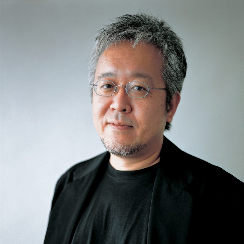
"Muji itself is a special existence, and it is like spinning circus plates – you have to keep moving the sticks in order for the plates to spin," he said.
"I'm not interested in the popularity of the products in that sense," Hara continued. "What's unique about Muji is people don't go there with a specific item in their mind. I don't think that there are many other brands like that."
Established in 1979, Muji is commonly referred to as a "brandless" company, as its products bear no logos. Its simple aesthetic, which has become synonymous with contemporary Japanese design, allows its products to fit into a variety of homes and lifestyles – one of the reasons the brand has become hugely popularity in recent years.
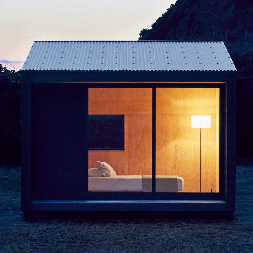
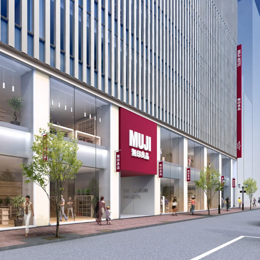
But Hara was keen to point out that Muji is much more than a trend. He insisted that the company's main aim is to continue to improve the way people live. The brand recently launched a prefabricated holiday cabin, and plans to open hotels, and Hara said he often jokes with his team about creating Muji travel brands or sports teams.
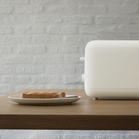
"A lot of people think that Muji's products are very simple, cutting out the heavy decoration and the flamboyant things," he said. "But minimalism and simplicity are not Muji's only features. Muji is always changing and Muji is a huge question I think. Muji is not a trend."
Hara worked as a curator and graphic designer before taking on his role at Muji in 2001, replacing previous art director Ikko Tanaka. He spoke to Dezeen during the celebration marking the 10th anniversary of Muji's first two stores in the US – one in New York's SoHo and the other on Fifth Avenue.
The company plans to aggressively expand across America, beginning with the recently opened store in Brooklyn neighbourhood Williamsburg.
This move has been largely overseen by Hara, who poetically compared the company's global domination to water slowly trickling into gaps it finds.
"Muji is like water, so if there is an indentation, there is Muji," he said. "So there may not be a major flood, but as long as there are those spaces, we can be present."
"In my mind, it's like somehow Muji got there without anyone realising that it got there," he added.
Read on for an edited version of the transcript from our interview with Kenya Hara, who partially spoke through a translator:
Eleanor Gibson: How did you get involved with Muji?
Kenya Hara: In 2001, the first art director Ikko Tanaka – who was a very important person for Muji and founded its concept – asked if he could pass the baton of art director over to me.
I was very surprised because I had not so much in relation with him. I don't know why he asked me such a very important cause. And on the other side, Muji had already succeeded at that point, maybe already 300 or 400 shops in Japan. Everyone knew about Muji in Japan, so I thought that there was nothing for me to do for this successful brand.
But I think the reason why Ikko Tanaka passed the baton to me was to explain Muji's concept to the world. That is a very important role for me I think. That is the first thing I do for Muji.
Emptiness is the concept I use to explain Muji's philosophy to the world. Muji's products look very minimal I think. A lot of people think that Muji's products are very simple, cutting out the heavy decoration and the flamboyant things. But I think that Muji's path is different from simplicity.
Eleanor Gibson: Why did you think he chose you for that role?
Kenya Hara: He was at an exhibition I did called Redesign. Redesign is an exhibition that I produced in 2000 to redesign the ordinary things. I called talented architects and designers, and asked them to redesign ordinary things. For example, I asked Shigeru Ban to redesign toilet paper and I asked lighting designers Karou Mende to redesign matches, and fashion designer Kosuke Tsumura to create a diaper for adults.
It was the first time that I realised a fantastic creator can change the basic situation of boring daily products. I think Shigeru Ban created a square toilet paper – the centre core of toilet paper is usually round. When the centre core is changed to a square, this toilet paper is very useful because you can stack them up easily. That's a very fantastic idea I think.
Karou Mende created matches by using normal twigs. Natural twigs fall down on the ground and just become normal soil, this makes the natural matches look very fantastic. It reminds man, as a human being, of the importance of the real fire. The lighter and electric power don't remind human kind of the importance of the power of the fire like the twig matches do.
That exhibition is very fantastic for me. That exhibition changed my mind.
Ikko Tanaka saw that exhibition and he understood my intention of designing. He was very pleased with that idea I think, and he decided to pass the baton over to me. I have never talked about his decision but after passing the baton of Muji to me, he died sadly.
Eleanor Gibson: How do you approach design at Muji?
Kenya Hara: We sometimes talk about if Muji created the new hotel, what kind of hotel would Muji create? Not just the cheaper one, Muji is kind of a counter to both the cheapest hotel to the highest hotel. And if Muji landed a baseball team, what kind would we get? And if Muji was an airline, what kind of service would we provide? If Muji was a tourism company, what kind of service could we create?
By questioning this kind of joke, we are always thinking about future situations.
Muji's product is very minimal. But minimalism and simplicity is not Muji's only features. So making people awaken to today's situation is Muji's role.
Muji is always changing and Muji is a huge question I think. Muji is not an answer, Muji is not a trend. Muji is not a result of a creation of super designers.
I don't do anything special for Muji, I don't create a brilliant advertising message, but I will think about package design. Muji's package design is very normal, but it is very difficult to control.
Eleanor Gibson: What are the brand's most popular products and why do you think that is?
Kenya Hara: That's a complex question because I don't really know. I do hear from time to time, the food items are popular, or clothes are popular, or furniture is popular.
But I think that Muji itself is a special existence, and it is like spinning circus plates – you have to keep moving the sticks in order for the plates to spin.
I'm not interested in the popularity of the products in that sense. What's unique about Muji is people don't go there with a specific item in their mind. I don't think that there are many other brands like that.
Eleanor Gibson: What instigated Muji's planned expansion across the US?
Kenya Hara: In my image, Muji is like water, so if there is an indentation, there is Muji. So there may not be a major flood but as long as there are those spaces, we can be present. In my mind, it's like somehow Muji got there without anyone realising that it got there.