A moody grey-toned apartment in Taipei and a pastel-hued flat in Stockholm are among the most impressive home interiors to emerge over the past 12 months. Continuing our review of 2017, editorial assistant Natasha Levy selects 10 of the best.
Hidden Tints, Sweden, by Note Design Studio
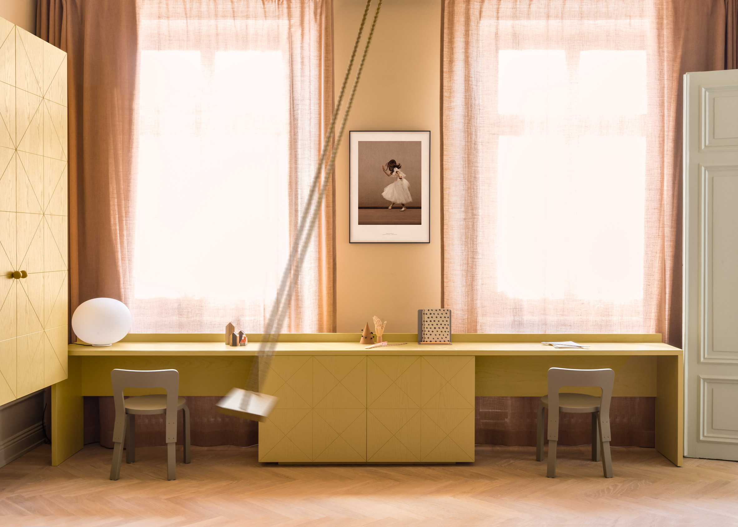
Note Design Studio traded the restrained aesthetic of Scandinavian minimalism for pastel hues of yellow, green and pink when turning this former Stockholm office into a family home. Colourful walls are complemented by patterned cabinetry, sculptural lights and a swing.
Find out more about Hidden Tints ›
The Cubes apartment, Belgium, by Arjaan De Feyter
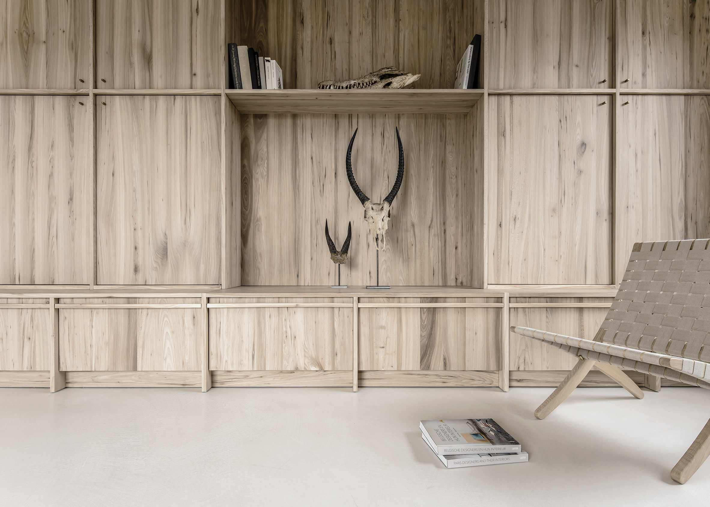
Interior architect Arjaan De Feyter added warmth to this otherwise stark Antwerp apartment by integrating grained wood units and brass hardware fixtures. Gauzy full-height curtains also ensure that the space is flooded with natural light.
Find out more about The Cubes apartment ›
IN 3, Canada, by Jean Verville
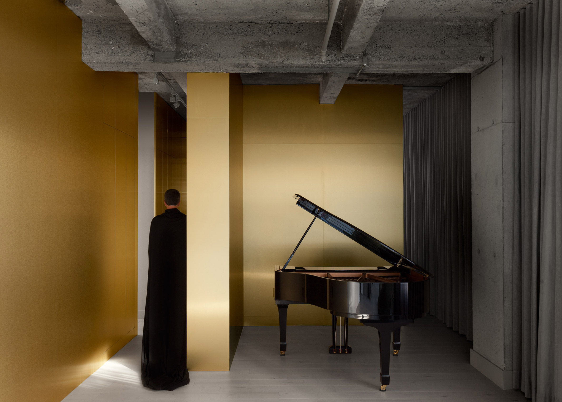
Jean Verville balanced minimalism with theatrics when revamping this apartment in Montreal. The Canadian architect incorporated a "golden ribbon" by threading a full-height panel of brass throughout the home, but restrained the rest of his material palette to concrete and marble.
Duplex Tibbaut, Spain, by Raúl Sánchez Architects
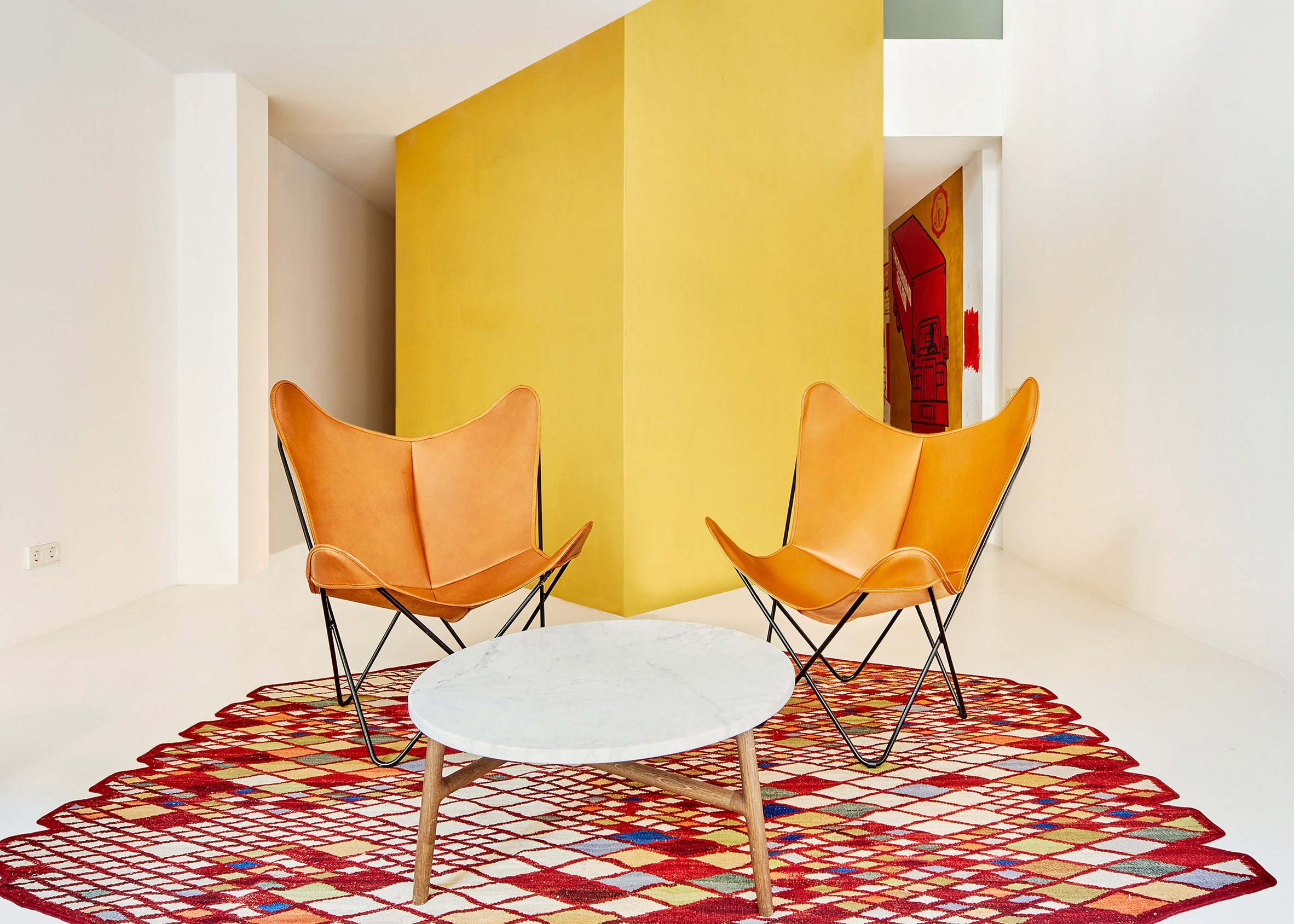
A pair of gold cubes sit at the centre of this duplex apartment in Barcelona, one housing a stairwell and the other a sleeping pod. The building was formerly derelict but had three vibrant artworks painted onto its walls – and the client chose to keep these in place.
Find out more about Duplex Tibbaut ›
13 Square Metre House, UK, by Studiomama
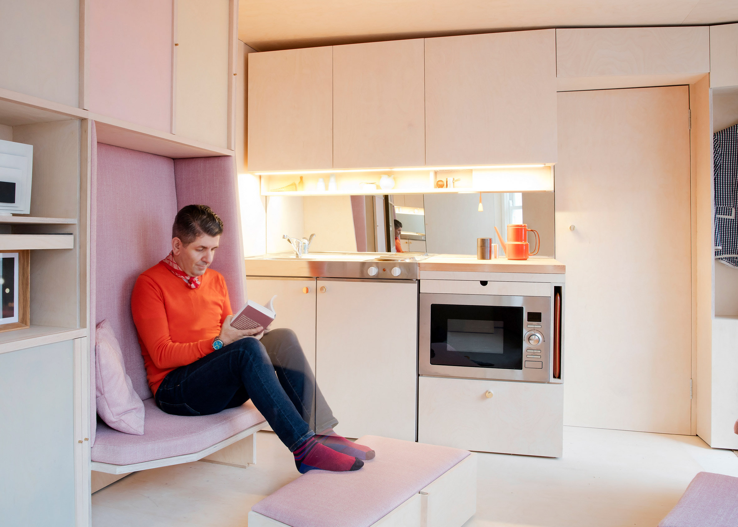
Studiomama had just 13 square metres to play with when overhauling this London home, which was formerly a mini-cab office. It features a host of space-saving plywood furniture, including a fold-out bed, standing desk and extendable dining benches kitted out with pink cushions.
Find out more about the 13 Square Metre House ›
Taipei apartment, Taiwan, by Wei Yi International Design Associates
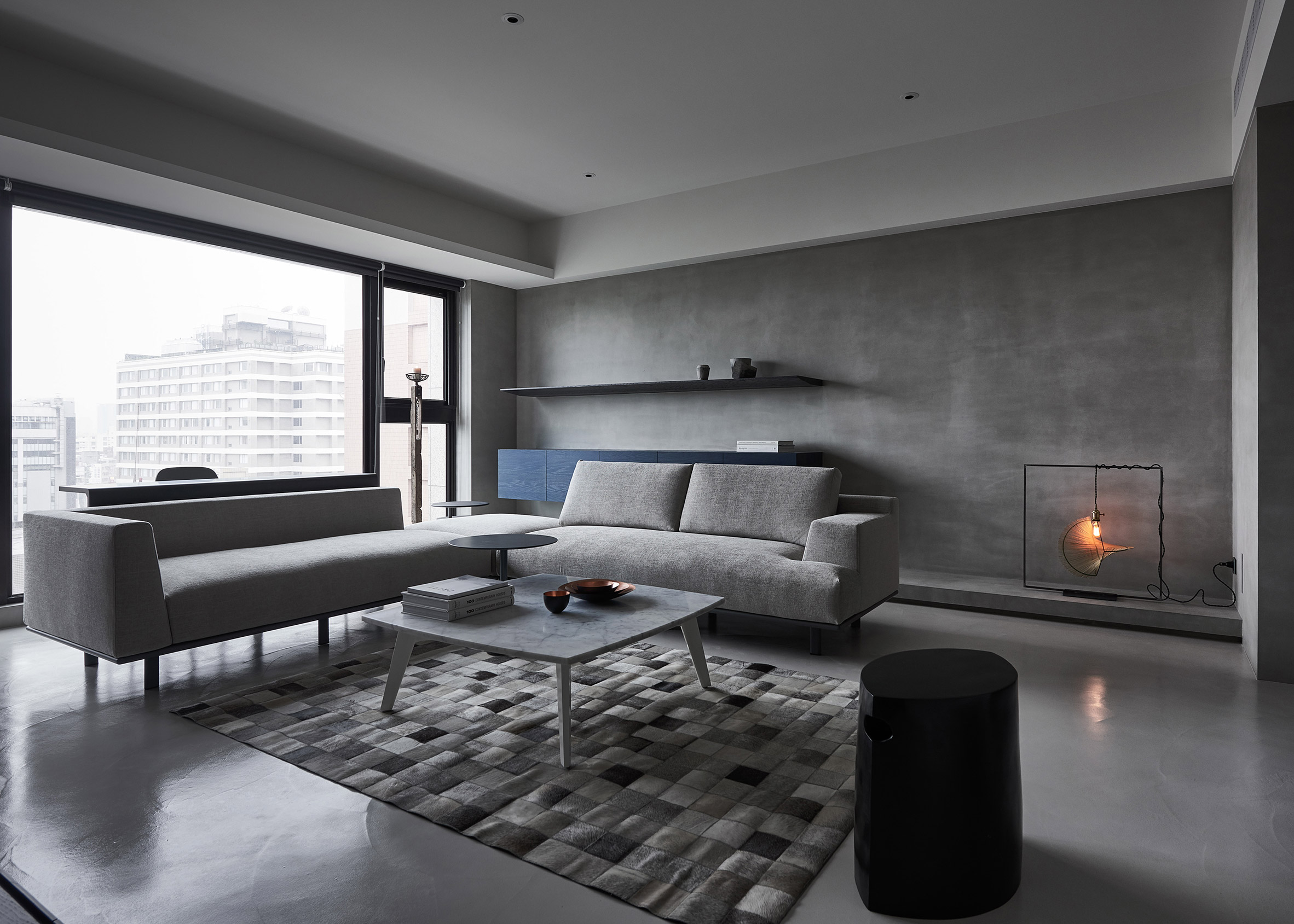
Wei Yi International Design Associates picked up on this year's trend for moody interiors, by combing cement flooring, grey tiles and dark stained wood furnishings in this Taipei apartment. A flash of colour is provided by an unevenly finished deep-blue wall.
Find out more about the Taipei apartment ›
Porto apartment, Portugal, by Atelier In Vitro
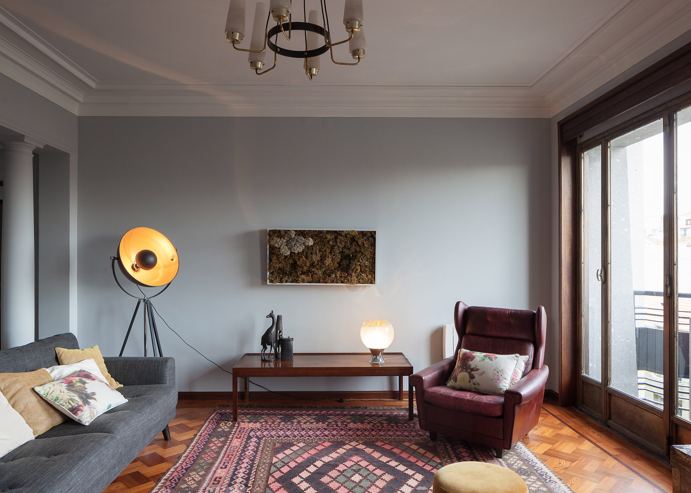
Atelier in Vitro let nostalgia drive the redesign of this Porto apartment, in homage to the building's 1940s origins. The studio restored original features like the wooden parquet floors, and added retro decor details including decorative rugs and colourful chairs.
Find out more about the Porto apartment ›
The Hide Out, USA, by Dan Brunn
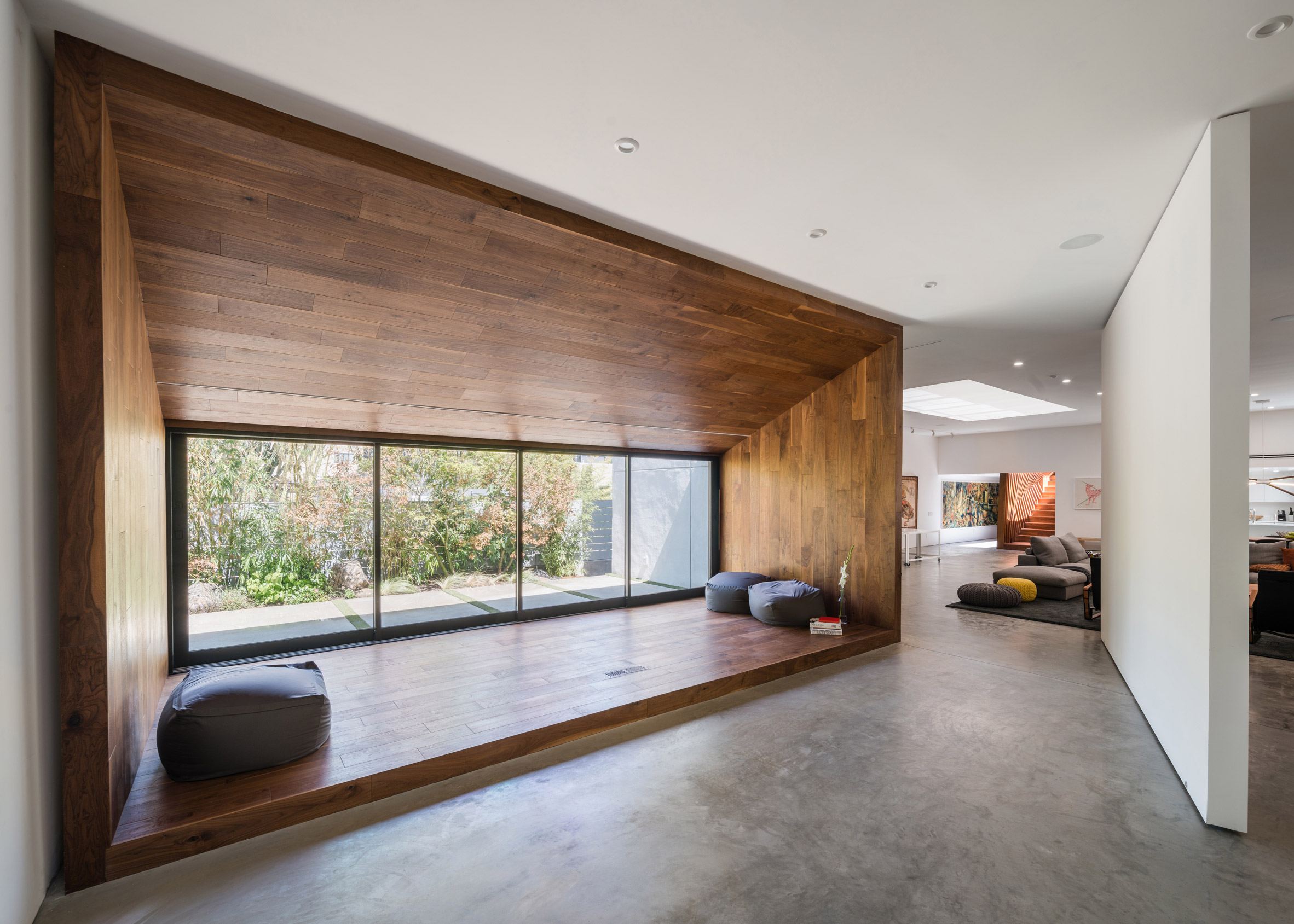
Studio Dan Brunn referenced traditional Japanese tea rooms when overhauling this 1970s Los Angeles home, which features a slanted wooden volume on its ground floor. Acting as a space for inhabitants to read, meditate, and conduct musical performances, the nook overlooks a bamboo-filled garden.
Find out more about The Hide Out ›
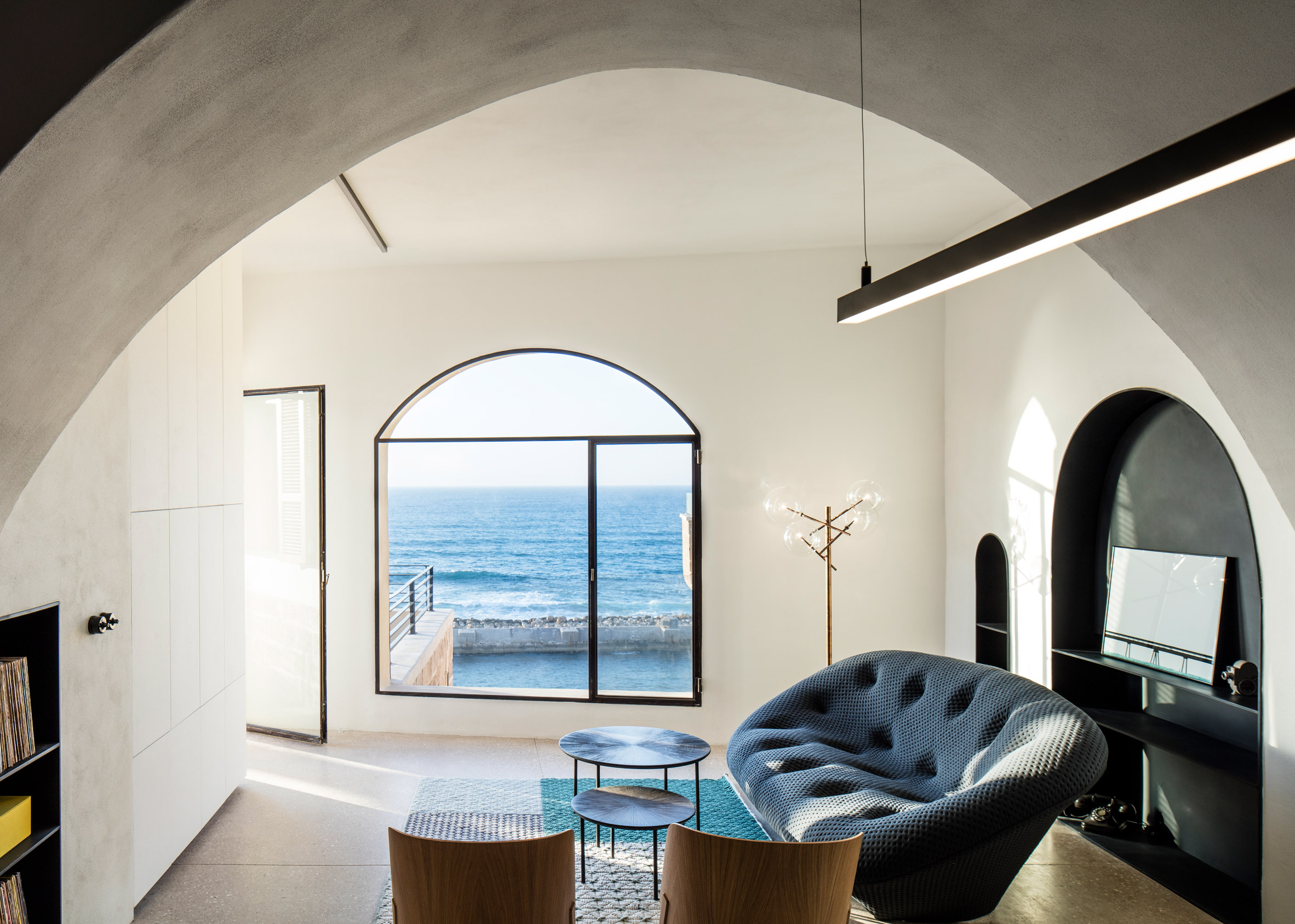
Old Jaffa House 3, Israel, by Pitsou Kedem
Israeli architect Pitsou Kedem created contrast in this Jaffa apartment by pairing black iron surfaces with white plaster walls. His studio also introduced a series of arched doors and windows – some framing views of the Mediterranean sea – to match the home's traditional domed ceiling.
Find out more about Old Jaffa House 3 ›
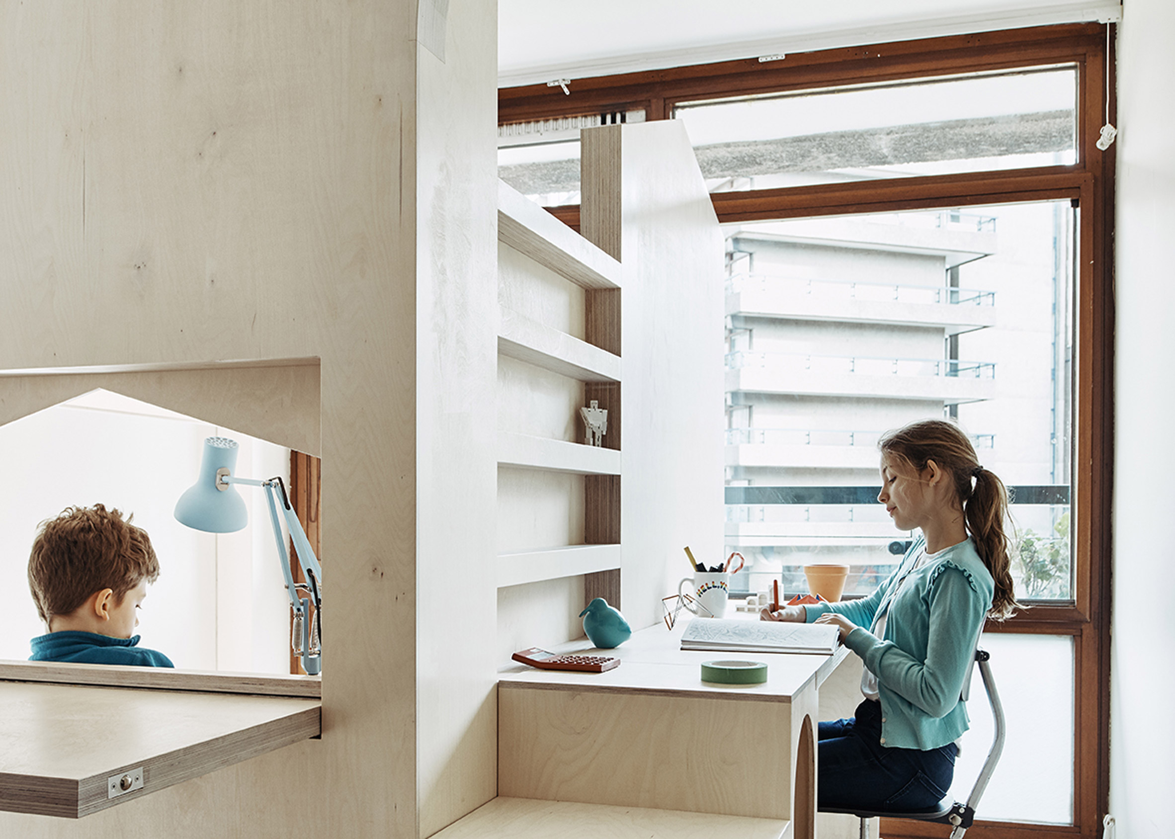
A Room for Two, UK, by Studio Ben Allen
There's space for rest, work and play in this plywood structure that Studio Ben Allen added to the children's bedroom of a flat at London's Barbican Estate. Complete with storage units, cosy sleeping nooks, and desks, the insertion's arches are meant to mimic the barrel-vaulted shape of the terrace apartments nearby.
Find out more about A Room for Two ›

