Modular furniture allows Shanghai home by RIGI Design to evolve with its family
A 1940s house in Shanghai has been reconfigured by RIGI Design to create a light-filled family home with a steel staircase, adaptable modular furniture and playful house-shaped elements.

Studio founder Kai Liu reconfigured a home in a densely built neighbourhood to suit the needs of a young family.
Called A White House, A Growing Home, the redesigned property caters to the evolving needs of family living with adaptable furnishing and design elements that appeal to both children and adults.
"A house is not equal to home, home belongs to us and our family," Liu explained. "A house is like a container to carry our growth, experience and hope."
Originally built in 1947, the three-storey residence was typical of its era and had, in Liu's words, paid "witness [to] the lives of generations", but it suffered from poor lighting and layout due to the depth of the building.
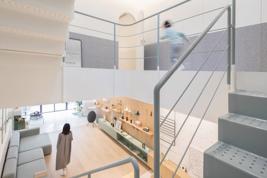
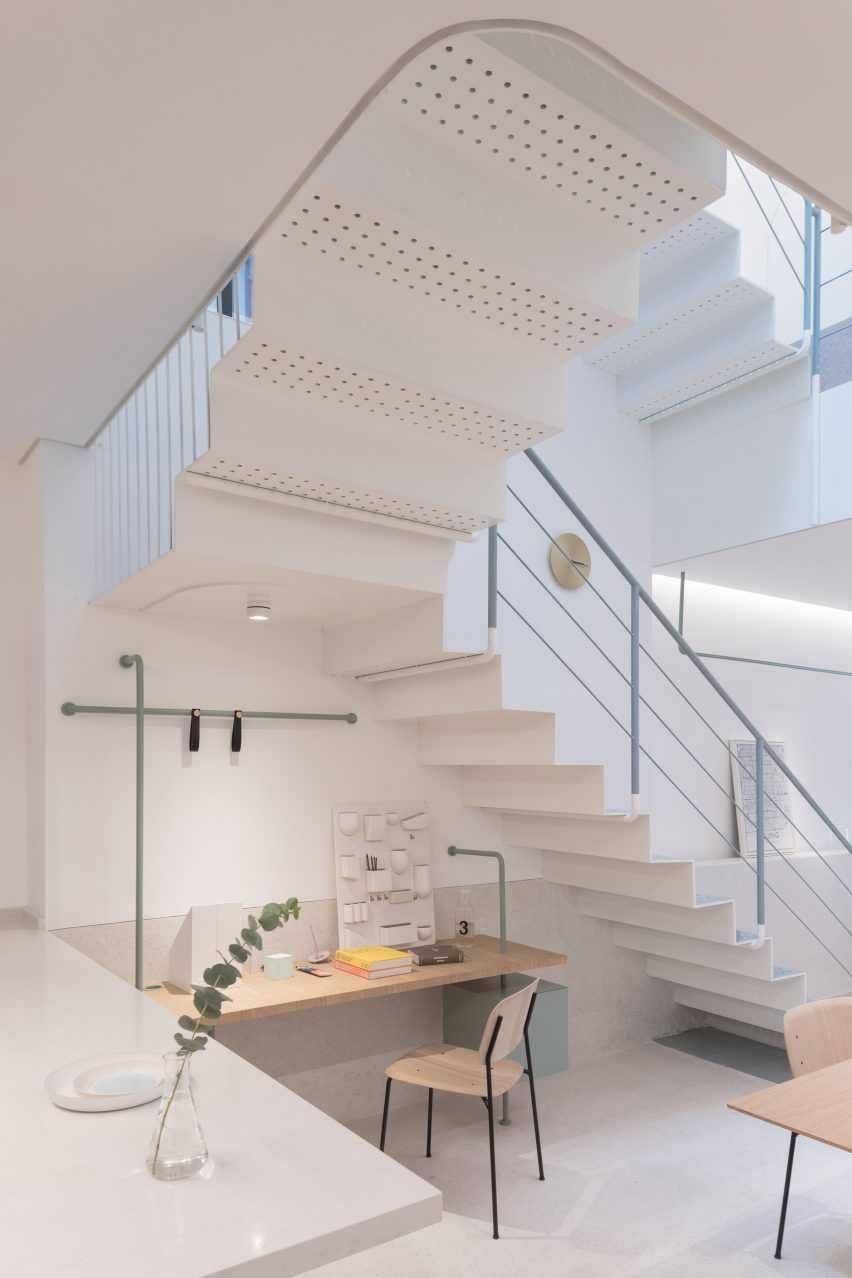
To introduce natural light to the core of the building, the old walled-in staircase was ripped out and a new, open stairway running through the triple height building put in its place.
"This is the area we modified most," Liu explained. "The whole building starts from light and vertical space."
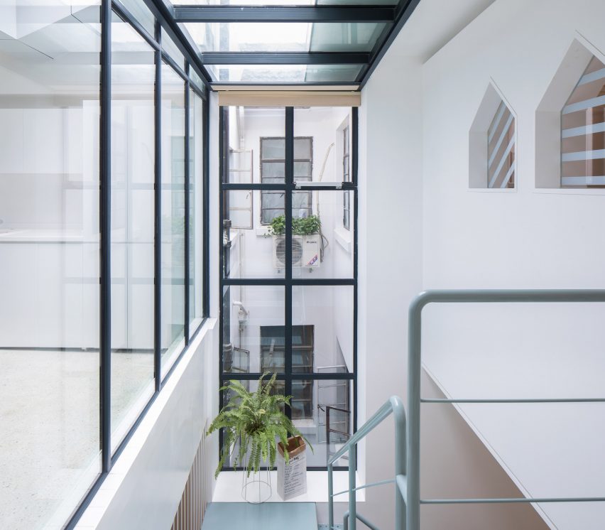
A large skylight now sits above the stairway, filtering down to each level through holes punched in to the steel plates of the new suspended staircases.
The footprint of the stairway was expanded to allow for roomy landings, and the structure was further improved by evening out the floor levels on each story to unify ceiling heights.
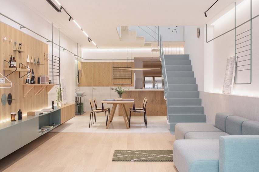
Internal walls on the ground floor were taken out to create an open-plan kitchen, living and dining area for the family, who spend most of their time here.
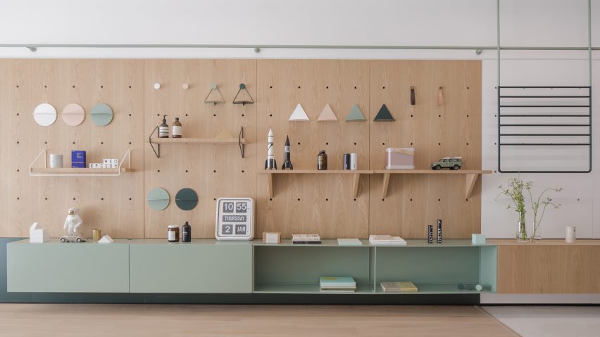
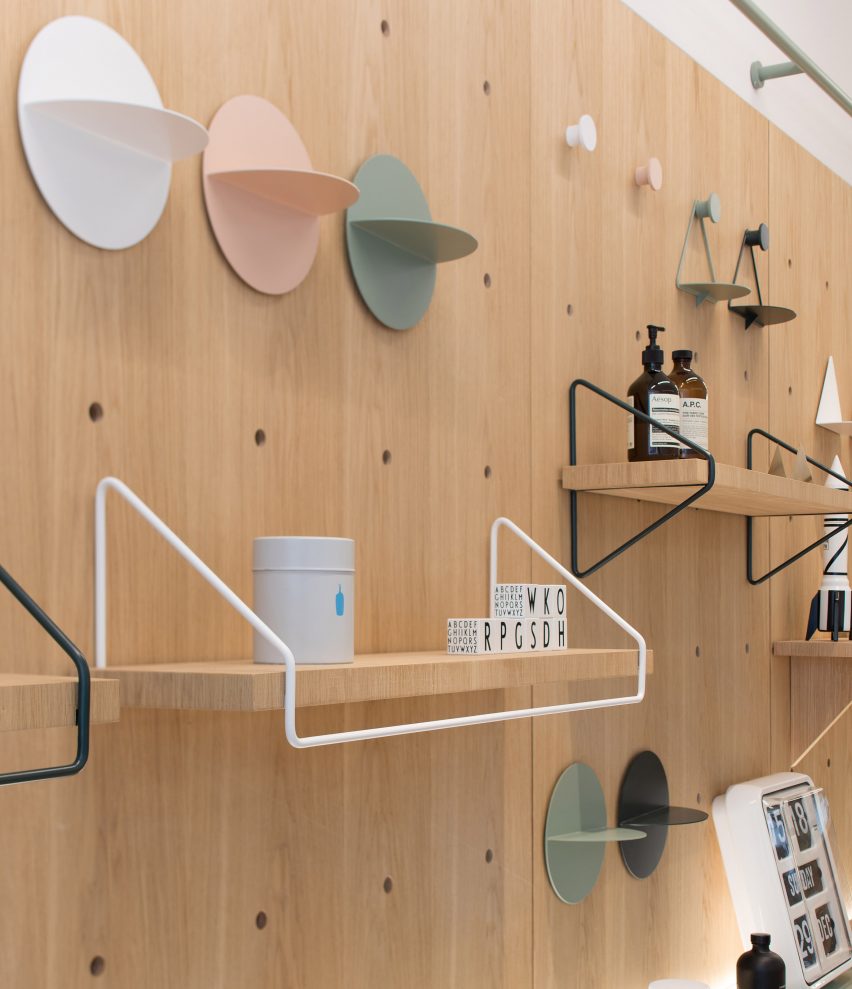
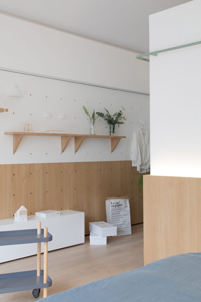
Liu also designed a modular furniture wall, called the "life board". Holes punched in the wood in a grid pattern allow shelves and accessories to be easily placed and rearranged to match the family's evolving needs.
"We want to design something carrying beauty and happiness," said Liu. "Having seen so many houses, the only concept we believe is that a person cannot be stuck with a settled life, whether in the house's values or style."
Suspended cabinet units below in muted green and wood provide storage space and an extra surface for displaying objects. Under the stairs there is space for a desk next to the breakfast bar.
Slim railings run along the top of the walls with racks hanging down over the sofa, the life board and the kitchen cabinets for items to be suspended from. A mirror has also been attached over a stand alone sink in the kitchen area.
Space-saving and flexible, modular furniture is becoming increasingly popular in urban homes and offices. Swedish furniture company Blå Station's modular sofa system Bob has cushioned slices that can be joined together as everything from armchairs to bendy benches.
Beijing-based studio People's Industrial Design Office designed its Tetris tables to snap together in various configurations to accommodate the fluctuating needs of modern workplaces.
In A White House, different materials denote different zones of the open plan space. Pale wood floorboards have been used for the living area and kitchen.
The walls are all white, with a light grey used on the lower half for the living area, while the kitchen is tiled with small white hexagonal tiles with dark grouting.
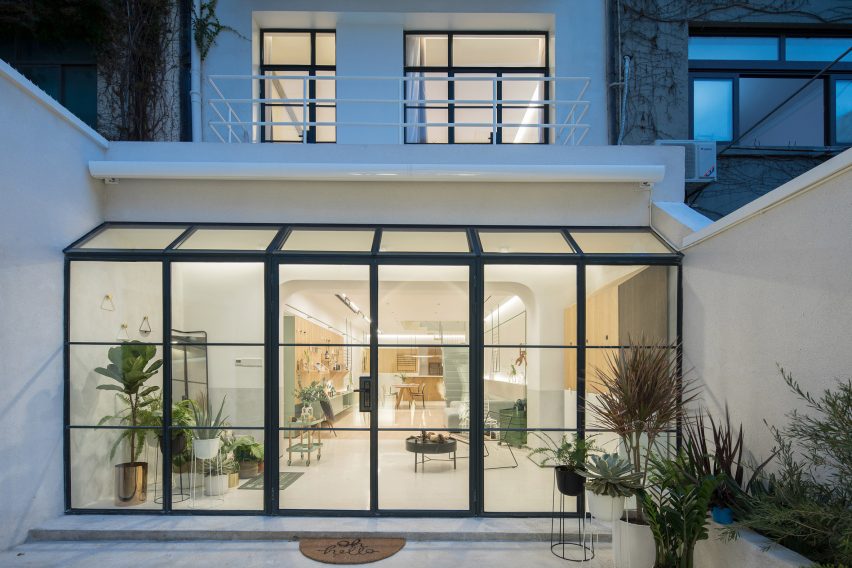
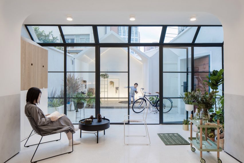
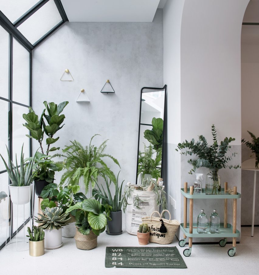
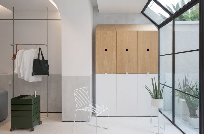
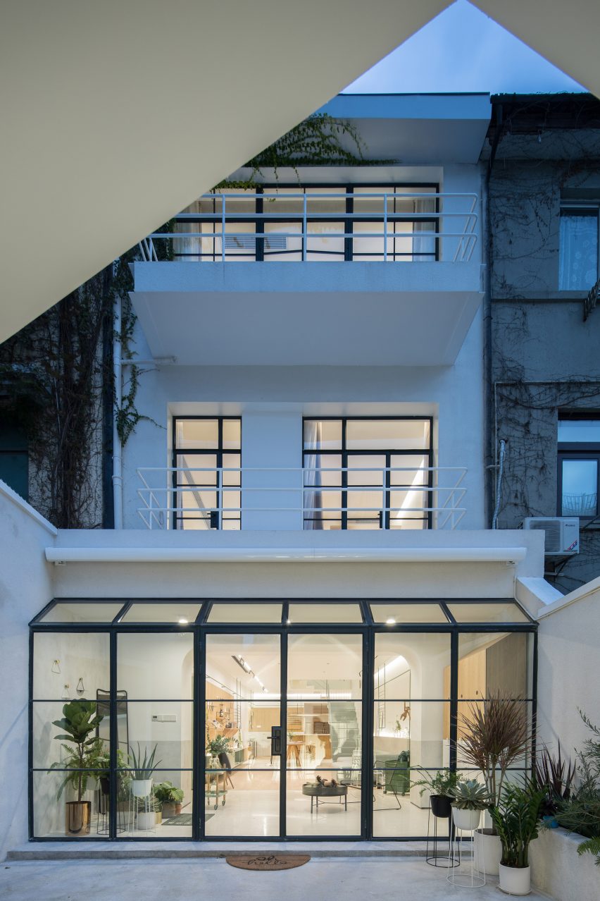
A new, plant-filled conservatory with glazed panels and a door in a modern black frame connects the ground floor with the external courtyard, which is the main entrance to the house.
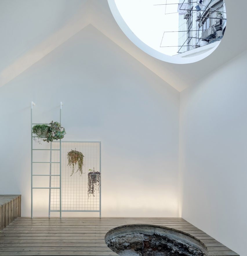
A children's playhouse with a circular hole cut into one side of the gabled roof has been built in the courtyard garden.
A hole has been left in the poured concrete to accommodate a tree being planted. Liu suggested a new tree would grow along with the child of the owners. "Time is also a part of our design," said Liu.
The client's child was central to the design process.
"It was our design original purpose – to bring a bigger world to the kid, allowing him to learn about the changing world from another dimension," he said. "The kid likes the house very much, climbing stairs, playing in the courtyard."
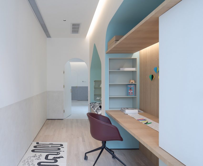
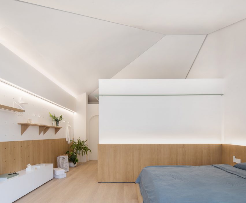
The child's bedroom has been designed in keeping with the aesthetic of the rest of the home, with additional playful elements. The same light wood and two tone white and grey colour scheme has been used, with accent walls painted a soft blue.
The bed sits inside a niche cut out in the shape of a gabled house, with inset shelves and backlighting around the edges. A desk has also been set into the wall with shelves and additional storage space above.
Two other bedrooms occupy the first floor, one next to the child's room and another across the landing decorated with houseplants, next to a bathroom.

The landings are painted white, with grey felt panels covering the lower half. Doorways into rooms are rounded at the top, as are the edges of the hidden storage areas in the hallways.
The master bedroom runs the width of the property, with large windows looking out over the courtyard below. An ensuite bathroom and a walk-in wardrobe have been built into an interior box in the bedroom.
Along the opposite side of the room another life board and handing console unit provides a customisable shelving, display and storage area. Railings run along the exterior of the wardrobe, and inside the bathroom where the racks double as a towel rail.
The third floor has been completely reconfigured to allow for the new skylights and a new outdoor area, through which a study can be accessed.
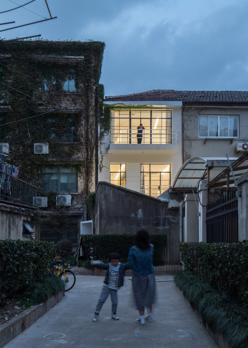
House-shaped windows have been cut into the walled side of the second floor courtyard, completing the motif on all three stories.
The simple, five-line shape reminiscent of a child's naive rendering of a house has become popular in contemporary architecture, particularly in that for for children.
In Japan, Tokyo-based architect Masahiko Fujimori designed a kindergarten in Sendai with colourful house-shaped boxes around the windows.
Another Japanese kindergarten by Hibinosekkei and Youji no Shiro used house-shaped openings in indoor areas to create fun seating and play areas for the children.
London architecture firm Studio Ben Allen also incorporated house-shaped cut outs into the remodel of a flat on the Barbican Estate to create bedrooms and play areas for the client's two children.
The trend has not been limited to architecture involving children, either. For a new architecture facility for a Belgian university Aires Mateus cut a huge house-shaped void into the facade to create a striking entryway.
Photography by Fangfang Tian.

