Abraham Cota Paredes creates stark white interior for hair salon in Mexico
Mexican architect Abraham Cota Paredes has given this hair salon in Guadalajara a minimal makeover, hiding beauty products and accessories in the all-white space.
Paredes and his local firm Cotaparedes Arquitectos were asked to overhaul the identity of L'Occoco – one of the largest beauty salon franchises in the country – to "reflect an image of elegance".
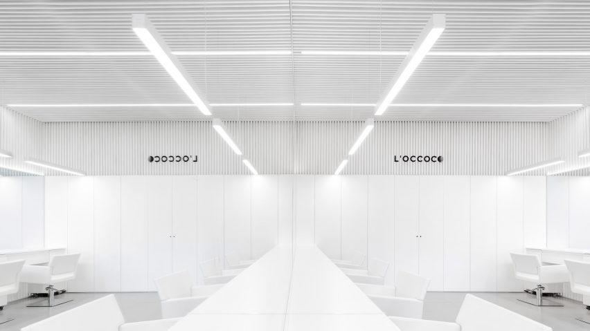
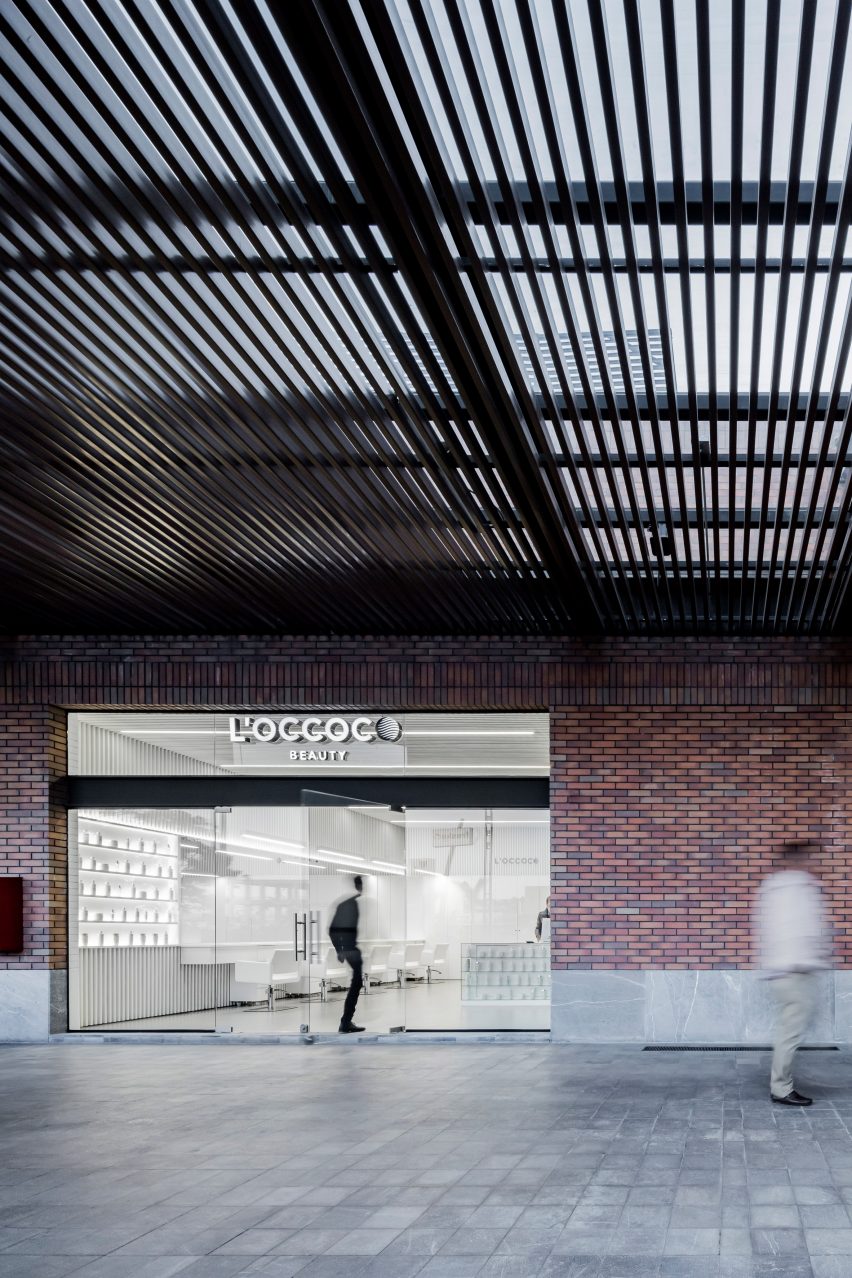
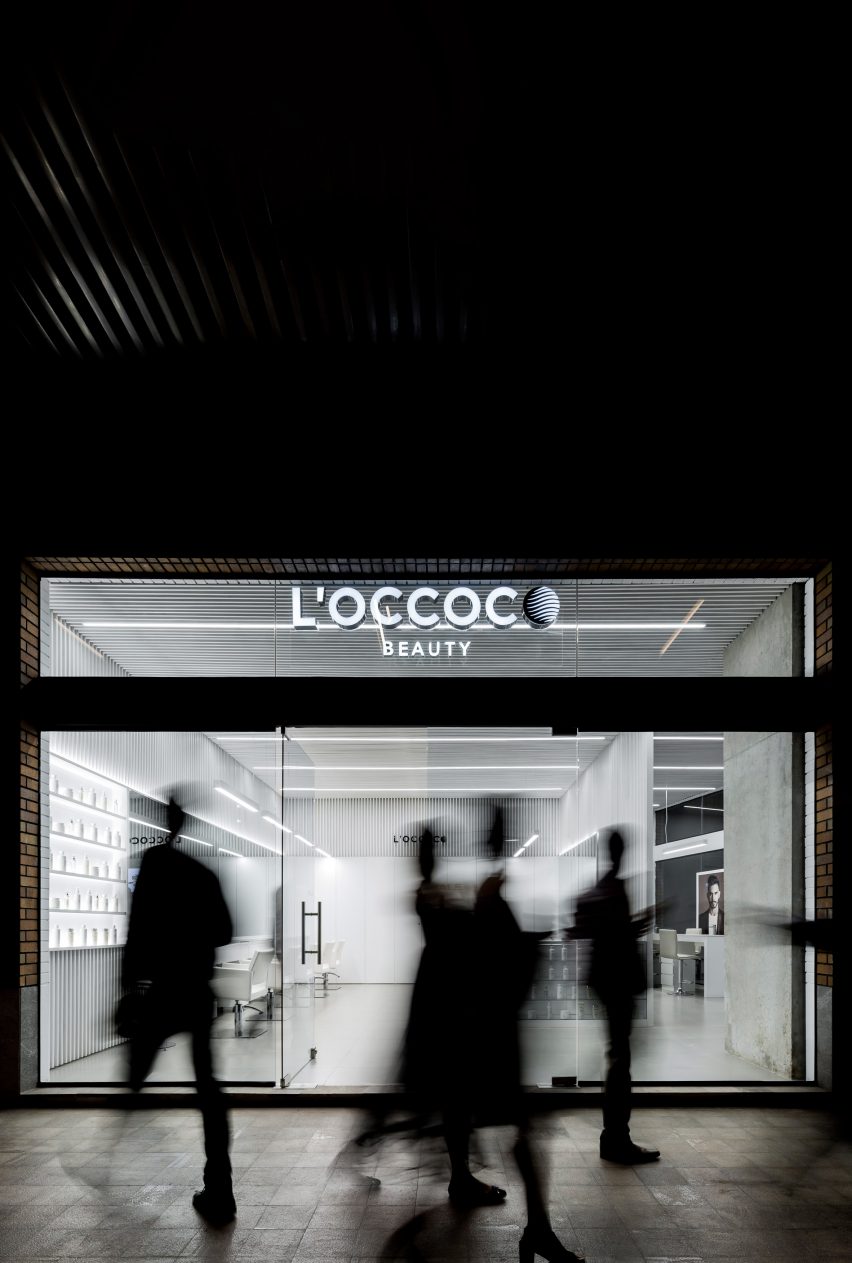
The Salon L'Occocó in Guadalajara was the first to receive an overhaul, with a monochrome interior designed to match the company's black-and-white logo.
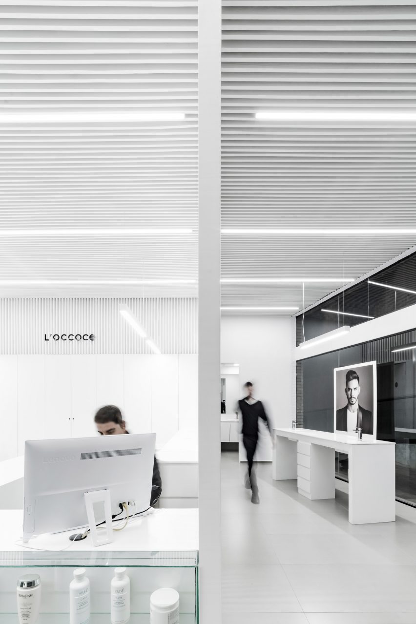
The front of the 990-square-foot (92-square-metre) store comprises floor-to-ceiling windows, with black grates forming a semi-protected canopy outside the entrance. Inside, thousands of thin slatted boards cover the ceiling and walls to create an optical illusion.
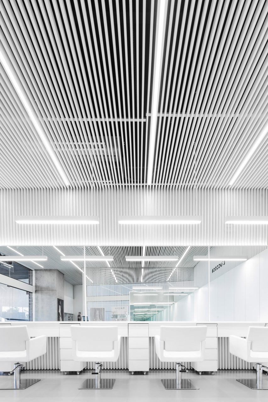
"To bring the quality of character and elegance to the space, and as reminiscent of the Pamplona bus station, we decided to apply slender wooden slats in full and empty sequences solving the problem of the ceiling and walls," said Paredes.
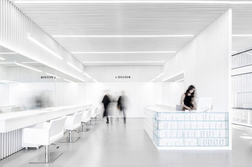
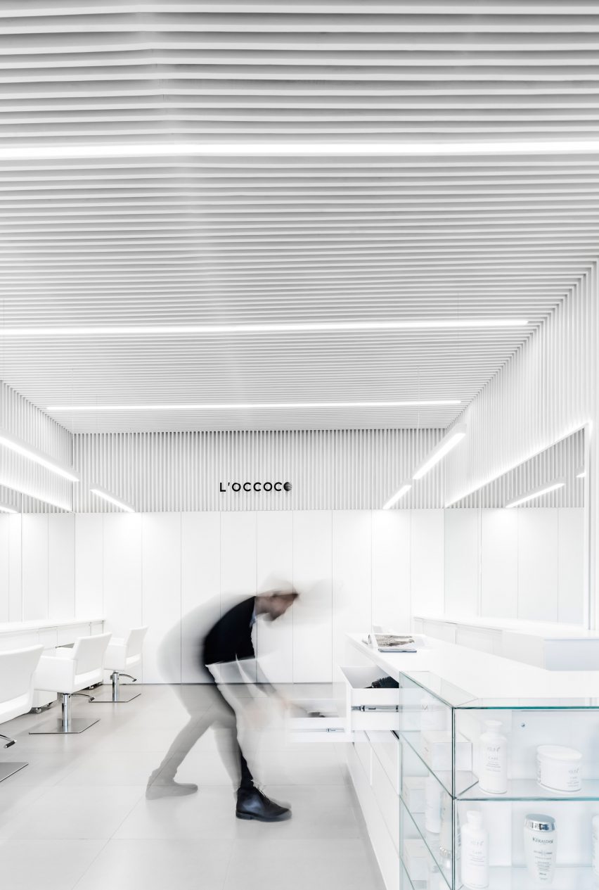
The layout revolves around an L-shaped reception desk centred in the middle of the salon, with work stations on either side. Along the front of the desk, all-white beauty products are showcased inside a glass cabinet.
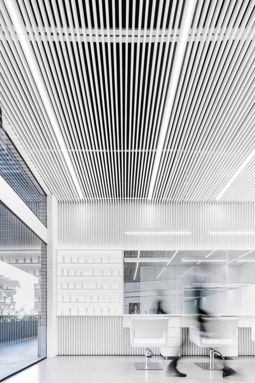
To the left is a set of six hair-cutting stations. The top halves of the walls are lined with mirrors, reflecting the crips white interiors. Upholstered chairs and cabinetry are also white, creating a seamless visual effect.
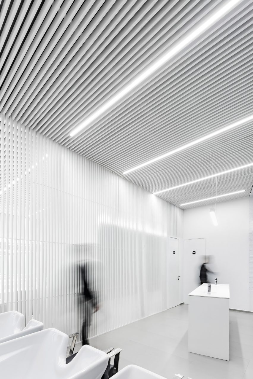
"We use the colour white as a resource to look for abstraction and luminosity," said Paredes. "The artificial lighting is integrated into the envelope, following the continuity pattern of the straps in the longitudinal and transverse direction."
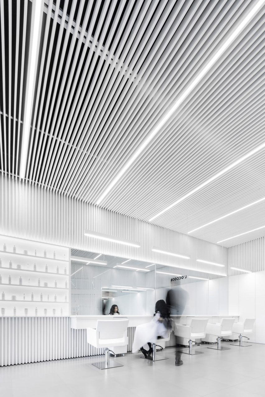
The only non-white elements in the salon are the black Salón L'Occocó logo on the back wall, metallic bases on the salon chairs, and blue-tinted glass on the front desk.
The right side of the salon accommodates three hair-washing stations, which are offset from the glazed front wall. A long countertop is placed in front of the window, overlooking passerbys.
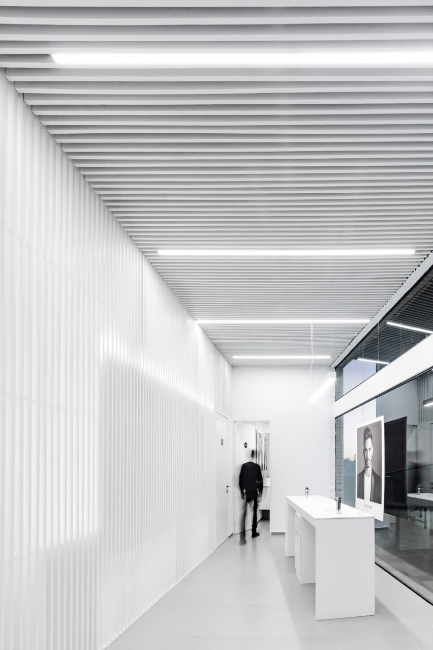
"The cutting area and washing area are divided into two spaces, through a screen with vertical panels that allow views and air circulation," said Paredes. "This causes a promenade or travel from one stage to another, providing privacy to each space."
Paredes and his team researched hair salons to determine the best layout for the corner property.
"The exercise began by analysing existing salons, understanding the dynamics of use, the furniture necessary for the performance of salon activities, the flows of customers and staff, and the optimal spaces to work freely," he said.
"Our language had to simplify the current. We had to identify the indispensable, and readjust what could be adapted in another way."
Beyond the washing area is a four-person table and a small bathroom behind. A rear corridor acts as an employee service area for prepping materials. This hallway is designed with additional cabinetry and a sink.
Many of Paredes' projects feature stark white interiors, with other examples including a two-storey house with an interior courtyard and tree and a residence with a cantilevered second floor and pebbled entryway.
The Mexican architect is one of several making waves in Guadalajara, which is becoming the country's hub for contemporary architecture.
Salon L'Occocó follows a trend for minimal hairdressers and beauticians, joining a nail salon in Los Angeles featuring pops of cobalt and pink, a hair salon in Osaka with plywood and concrete details, and a white-timber salon in Houston furnished using a row of blue chairs.
Photography is by Cesar Béjar.