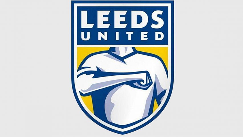
Leeds United Football Club is to reconsider its new crest, after complaints from fans led to more than 50,000 people signing a petition urging for it not to be used.
Revealed yesterday, 24 January 2018, the updated logo swaps the club's initials for its full name. It features a torso with a fist placed against the heart – depicting a gesture known as the "Leeds Salute" that is widely associated with the club.
But in under 24 hours, the logo received ample criticism from fans – despite the club claiming it had undergone a rigorous design process that lasted six months and saw over 10,000 people affiliated with the club consulted.
On the same day, a petition set up by Leeds fan Steven Barrett urging for the logo not to be used gained over 50,000 signatures by 7 pm.
"The volume and depth of opinions expressed reinforced the level of passion our fan base has for our club," said a statement released by the football club. "While the current board of directors are custodians of Leeds United the fans will always be at the heart of everything we do, and you will be listened to."
"We conducted thorough research into the desire for a change to the crest to symbolise a new era for the club. However, we also appreciate the need to extend the consultation with supporters and we are committed to working with you to create an identity we can all be proud of," it continued.
East Leeds MP, Richard Burton was among those to voice his concerns: "to be frank, the idea of it being used in connection with next year's celebrations of the centenary of the founding of our club from the ashes of Leeds City fills them – and me – with horror."
Others were quick to disparage the rebrand on social media, with some fans comparing it to the label on a packet of the heartburn medicine Gaviscon.
Some felt the logo resembled communist and fascist art, while others went as far as to interpose the heads of mocking figures like Jimmy Saville and Barry Chuckle onto the crest.
In response to the backlash, Leeds' chief executive, Angus Kinnear, later announced that the club will consult supporters again over the crest, which was planned to be featured on the 2018/19 season kit.
"We always knew that the introduction of a crest, particularly one that is so bold and such a break away from the traditional conventions of football club crests, was going to create debate and may be controversial," Kinnear said.
This is the 11th time that Leeds United has changed their crest in the 99-year history of the club. Other football clubs that have revamped their crests include Italian team Juventus, which unveiled a minimal crest that became the subject of widespread criticism. Similarly, England's premier league updated its own lion logo last year with a significantly simplified version.
The new visual identity was presented as representative of a "new era" for Leeds United. "Once we heard that there was a desire for change to help herald a new era for the club, it became of primary importance that the new crest clearly reflected who we are," said the statement.

