Sasaki creates two landmark buildings for Monterrey Tec campus in Mexico
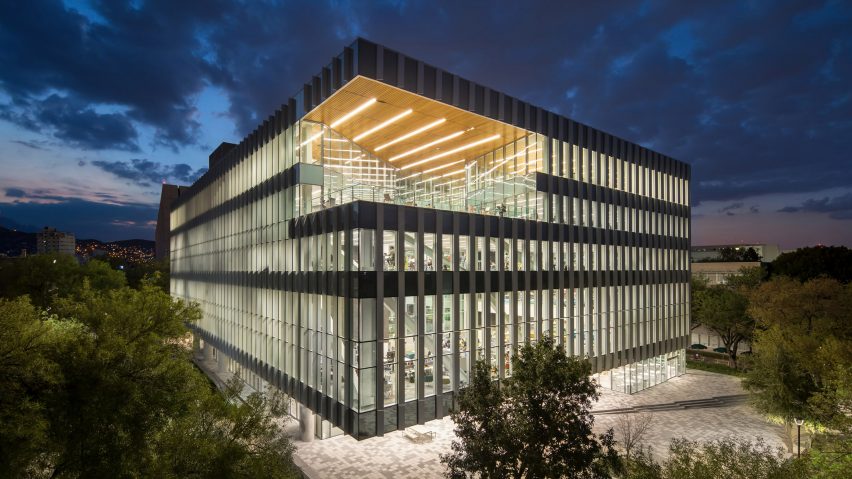
Design studio Sasaki has completed a minimalist white pavilion and a glazed library for a growing university in Monterrey, with terraces that offer generous views of the city.
The Instituto Tecnológico de Monterrey, often referred to as Monterrey Tec, is situated on an urban site in the capital of Mexico's northeastern state of Nuevo León. The institute has 29 campuses around the country, with the Monterrey location serving as its flagship.
The library and pavilion are part of a larger masterplan conceived by Sasaki, a multidisciplinary firm with offices in Boston and Shanghai. The firm was founded in 1953 by the late landscape architect Hideo Sasaki, who was born in California and taught at Harvard.
In 2015, the firm was commissioned to rethink the university's educational model and to develop its spatial expression. The team devised a programme called the Tec 21 Educational Model, which addresses new ways of teaching and learning, the use of digital tools, a commitment to society rooted in humanitarianism, and the importance of interdisciplinary and collaborative learning.
"The work included thinking at both the level of the overall campus environment to more detailed work at the scale of the learning environment," the team said.
"The latter included developing a toolkit of spaces that could be deployed on existing campuses, or in the planning of new academic buildings, to assist the university in implementing the new pedagogical model across existing infrastructure at the university's 29 campuses across Mexico."
The New Main Library sits on the site of a former library that was demolished. The team had hoped to renovate the original 1969 structure, but that plan proved too costly due to the need for major seismic upgrades.
The new building serves as "a place where students, faculty, staff and the region's industry leaders come together to access information, study, collaborate and be inspired".
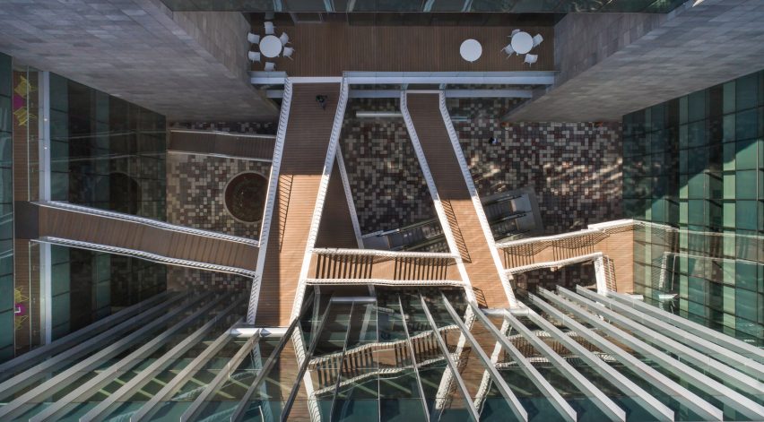
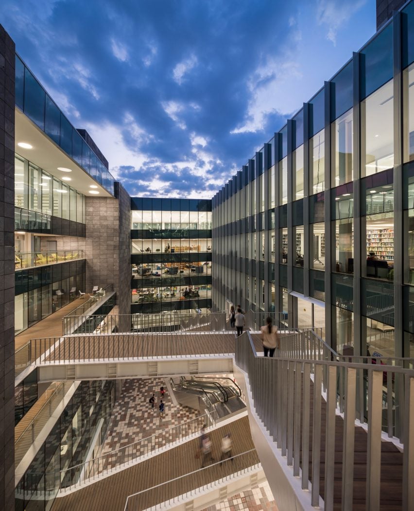
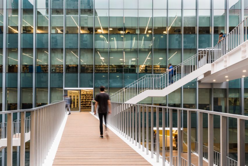
The rectangular 17,000-square-metre building has a central light well that is crossed by sky bridges, and is externally clad in glass and metal fins.
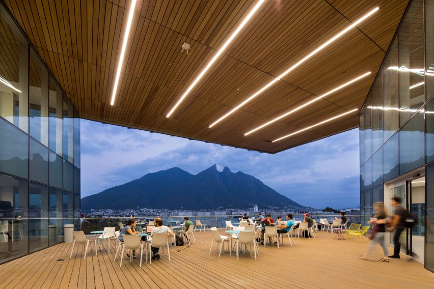
The upper southeastern corner features a large terrace, where students can study and socialise while taking in their surroundings. The terrace is illuminated at night by long, large strips of light that traverse a wooden soffit.
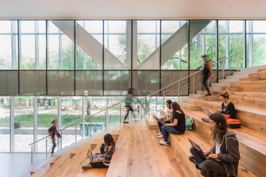
The ground floor contains a cafe, an auditorium and a makers lab. A portion of the ground level was carved away, forming a sheltered student plaza.
The upper levels of the library encompass a range of functions, and offer views of the leafy campus and surrounding city.
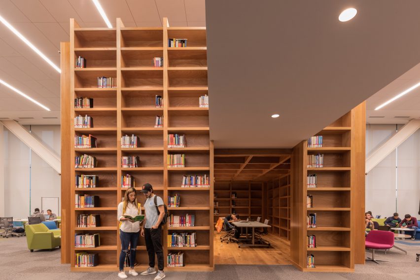
"Comprising four floors of program elements, the library transitions from technology-rich collaborative study spaces at its base to quiet, contemplative study at the top," the team said.
A central staircase extends from the plaza to a roof terrace, where students are afforded dramatic views of Cerro de la Silla, a prominent mountain that overlooks the campus.
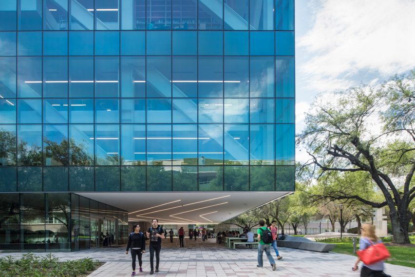
Also completed by Sasaki, the Carreta Pavilion sits in a shaded garden within the symbolic and historic core of the campus. The 1,376-square-metre building offers a place for members of the university community to engage and collaborate, while also serving as a gateway structure.
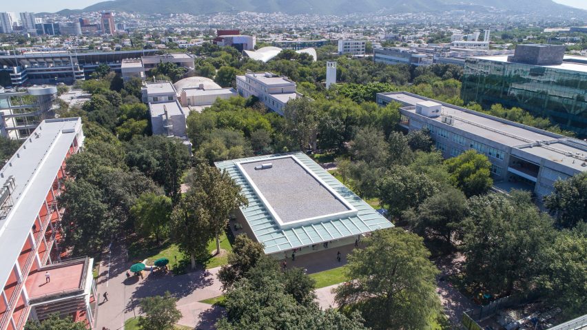
"It serves as a point of arrival to campus and the first impression for visitors, conveying both the rich traditions and history of the university while also expressing its dynamic and innovative future," the team said.
Topped with a vast flat roof, the minimalist, single-storey pavilion is approachable from all sides and is designed to be highly flexible. Its steel and glass envelope has a series of tall pivot doors, which can open and retract depending upon the number of occupants in the pavilion. The space can accommodate up to 450 visitors.
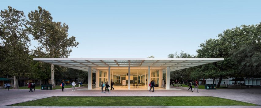
"With the ability to open entirely to its surroundings, the structure transforms into an open-air shelter in the heart of the campus," the team said.
The pavilion's structural grid lines take cues from surrounding buildings on campus. The glazed enclosure benefits from a large pergola, which "tames Monterrey's direct sun impact and filters daylighting all around it".
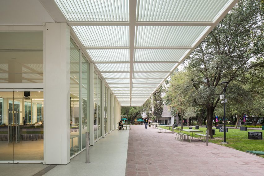
The building was mostly fabricated offsite as a kit of parts. It sits atop a conventional foundation with a basement that houses mechanical systems and storage space.
"This intentional approach to its design and construction allows the pavilion to function as a prototype that can be replicated on other campuses," the team said.
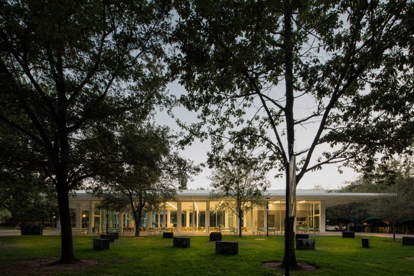
The pavilion is designed to embody the shift in teaching taking place at Monterrey Tec, which is focused on a "challenge-oriented" curriculum.
"The pavilion is a critical display and presentation space to encourage research, invention, competition and collaboration across campus," the team said. "For this reason, campus leadership considers la Carreta a symbol of the Tec 21 campus of the future."
Other projects in Monterrey include an art and design school by Tadao Ando at the University of Monterrey, which has a blocky concrete form and a triangular void at its core. The city also has a steel museum designed by Grimshaw Architects, which features an old blast furnace that was converted into useable spaces.