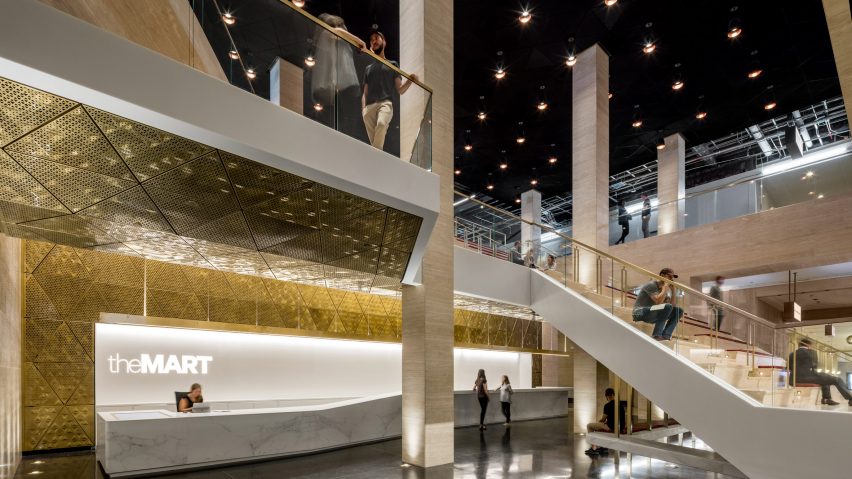
Manhattan studio A+I has overhauled the entrance and lobby of the vast Chicago Merchandise Mart, using mirrored surfaces and metallic details to link its spaces together.
Now named The Mart, the historic building is being repurposed by real-estate group Vornado and undergoing a $40 million renovation.
The company commissioned Architecture + Information (A+I) to redesign the main entrance to the building, which was largest structure in the world when it opened in 1930.
"Functionally, lobbies often serve as a point of entrance and exit – spaces without comfort or reason to linger," said A+I cofounder Dag Folger.
"They are the delineation that marks the work-life dichotomy: inside is work and outside is other," he added. "A+I designed an entrance experience for The Mart that dilutes this hard line. It is a softened space owned and used by the building's tenants."
The studio sought to make more of a social space out of the lobby, in addition to satisfying the massive building's reception and wayfinding requirements.
Upon entering The Mart, visitors are now faced with a monumental staircase that integrates tiered seating. This area, dubbed the Grand Stair, encompasses 5,600 square feet (520 square metres) and is open to the public.
Underneath it, the architects laid out the reception and information desk, keeping it out of the way of the central lobby area.
Materials chosen for this portion of the renovation reference the palette of the original building.
"A+I's use of stone and bronze stems from the building's original material palette," said the firm. "The design reinvigorates and connects historic parts of the building and will dramatically change the way the community will experience the building."
At the top of the Grand Staircase is a new cafe, lounge, and restaurant named Marshall's Landing.
This space is filled with mid-century-influenced furniture, set up in a lounge configuration. Along the back wall of the space, cozy booths overlook the Chicago Riverwalk and Wolf Point, the area where the city's main rivers converge.
To complement the architectural design of Marshall's Landing, A+I also took charge of the venue's brand identity and graphics.
A+I has also recently renovated the Lower Manhattan offices of Horizon Media, using a minimal palette of wood and concrete. The firm's other projects include the offices of Squarespace in New York City and a colourful workplace for ad agency Canvas.
Photography is by Magda Biernat unless stated otherwise.

