Lufthansa attacked for "bland and pointless" redesign of its classic logo
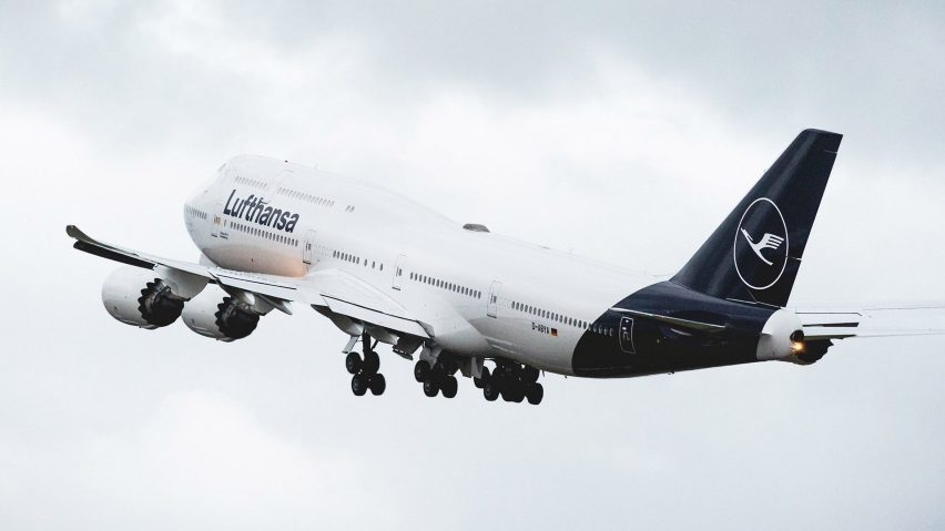
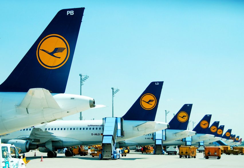
German airline Lufthansa has overhauled its livery, changing the background of its iconic 100-year-old logo from yellow to blue.
Images of the new look – the first major change to the world's oldest airline logo in over 50 years – were leaked ahead of the official unveiling, due to take place on 7 February 2018.
The images have stoked controversy over the way the classic Lufthansa livery has been updated. Aviation writer Enrique Perrella described it as "bland and pointless", while industrial designer Clemens Weisshaar told Dezeen it was a "design belly flop."
The leaked shots show a redesigned tailfin featuring a white logo on a rippling blue background, in place of the former blue-and-yellow design. The plane's grey underbody has been replaced with white.
Lufthansa quickly confirmed the changes and released images of the livery, which will be rolled out across the fleet of 330 aircraft over the next eight years.
Flying crane logo dates back to 1918
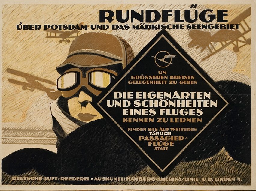
The redesign, spearheaded by Lufthansa in-house designer Ronald Wild, comes 100 years after the logo, which depicts a stylised flying crane inside a circle, was first created by German architect and designer Otto Firle for Deutsche Luft-Reederei (DLR), Lufthansa's predecessor.
The yellow was added in the sixties by graphic designer Otto "Otl" Aicher and students from his Gruppe E5 at the influential Hochschule für Gestaltung Ulm (Ulm design school), which he co-founded.

Aicher's design system, which also redrew the crane logo and introduced the use of lowercase Helvetica Bold as the airline's font, is widely regarded as one of the great airline graphic identities.
Disegno magazine described it as "one of the 20th century's most successful and long-lasting corporate rebranding exercises."
Since then designers including Jörg Zintzmeyer and Hartmut Esslinger have tweaked but never radically changed Aicher's blueprint.
Update slammed as "a design belly flop"
The latest redesign received a scathing response from airline livery enthusiasts. "Lufthansa now joins LATAM, Iberia, Avianca (and more) in this ubiquitous Eurowhite, bland, pointless design pattern" tweeted Enrique Perrella, publisher and editor in chief of Airways magazine.
Speaking to Dezeen, industrial designer and regular Lufthansa passenger Weisshaar described the new livery as "a design belly flop of epic dimensions".
"The new Lufthansa identity seems to ignore [Aicher's] legacy," said Weisshaar, who is one half of design duo Kram/Weisshaar. "It opts for a corporate blue that comes straight out of a late capitalist nightmare."
Weisshaar compared the new livery to that of a "dodgy insurance company" or "a failed bank".
"What we'll miss most is one of the most beautiful liveries in the skies, with this unbelievably elegant grey underbody," he added.

Design journalist Daniel Golling told Dezeen that the move meant Lufthansa was about to strip its fleet "one of its most distinguishing features," adding that Lufthansa yellow "stood out among all the white, blue and red in the airline industry," and appeared at every point a customer came into contact with the brand, from the check-in counters to the luggage tags.
"With the new livery that is being rolled out Lufthansa is moving into what is becoming generic design territory inhabited by Iberia, Avianca and others," Golling added: "A Eurowhite fuselage ending with a colourful tail fin that is allowed to extend in an embrace of the entire tail of the plane."
Leading designers contributed to the Lufthansa logo evolution
Otto Firle, who first drew the crane logo, was an eminent German graphic designer and architect who also created logos for German postal service Deutsche Reichspost and railway network Deutsche Reichsbahn.
Otl Aicher, who updated the livery and introduced the warm yellow colour in the sixties, was a leading graphic designer who additionally developed the corporate identity of Braun and, most famously, created the identity and stick-like pictograms of athletes for the Munich 1972 Olympic Games.
The warm yellow Aicher introduced is called "melon yellow" in the RAL colour system and is technically called RAL 1028 but is more commonly known as "Lufthansa yellow".
The evolution of Lufthansa's corporate identity is charted in a book called Lufthansa and Graphic Design, published by Lars Müller.
The latest changes follow the controversial rebranding of American Airlines in 2013, which saw Massimo Vignelli's angular logo ditched in favour of a stripy tail fin and stylised eagle symbol by FutureBrand.
Golling described the Lufthansa changes as "a sad fate for an industry that used to invest so much prestige in logos and liveries and most likely not what legendary German graphic designer Otl Aicher envisioned when, in 1962, he and his team made the yellow of Lufthansa warmer as a hint to the democratisation the airline industry underwent at the time due to an increasing number of vacation travellers."
"With its new austere look Lufthansa makes it clear that the airline is determined to uphold the hierarchies and class system that has always been one of the pillars of commercial air travel," Golling said.
"At a quick glance it is only the choice of colour and animal that from now will separate a Lufthansa Airbus A380 from a Qantas one."