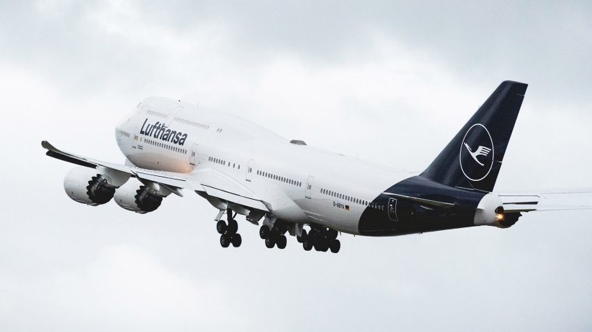
Readers are divided over Lufthansa's decision to switch its 100-year-old logo from yellow to blue, in this week's comments update.
All aboard: the German airline's updated livery has been branded "bland and pointless" by aviation writer Enrique Perrella, and plenty of readers agreed.
"Re-design for the sake of re-design, in this case throwing away a highly successful and very distinguished identity that stood head and shoulders above the others," lamented Will.
But Wo was positive about the change: "If anything, this shows there is hope for quality graphic design still. This is a great update that has been thoroughly thought through, which is shown in the execution."
"It joins a growing number of airline liveries that probably have pages of design rationale behind them, but could ultimately be knocked up in minutes by a complete amateur. It's like the emperor's new clothes," responded Paul Osborne.
"It's brilliant! The 'Lufthansa yellow' was more like my grandma's couch yellow and sorely needed an update," wrote an excited Jose Fricther.
But Danilo Schöneberg wasn't convinced: "If it was about identity, the last thing they would have changed would have been the yellow logo. It's like Nike deciding to drop the swoosh."
This reader felt like a big deal had been made out of nothing:
Should Lufthansa have overhauled its logo? Have your say in our comments section ›
Waste of space: readers had plenty to say in the run-up to the launch of Space X's Falcon Heavy rocket, which founder Elon Musk decided to load with his own Tesla sports car.
"How bad is the net loss of fossil fuels burned and emissions released from launching rockets vs the gain from electric cars? Seems like Space X kills any gains from Tesla pretty quick," pondered HeywoodFloyd.
Archi had a question: "What is exactly is the point of sending a rocket that far into space with no return point? Just to see how far he can go?"
"There's literally no point sending random things into space. We’ve already polluted Earth as a species, we don’t need to pollute space with junk," answered M.
But came to the sharp defence of Musk: "The point is that whilst moronic heads of state are tweeting at one another and conflict rages throughout the world, there are geniuses and explorers in labs and workshops broadening the boundaries of our species."
This reader had a simpler theory:
Read the comments on this story ›
Pitch black: Asif Khan's winter olympic pavilion in South Korea, described as the "darkest building on earth", had some readers worried about health and safety.
"Looks like an amazing work to experience. I thought that Vantablack was considered dangerous for people to interact with and only appropriate for space and lab applications?" wondered .
"I wonder how many people will injure themselves not being able to distinguish shapes on and in the building," added Droy.
Matthew Ryan felt the project had missed an opportunity: "I was really looking forward to this, but it's disappointing that they weren’t able to use actual Vantablack. That would have been iconic. The interior is beautiful though."
One reader felt the project needed to be seen in person to be truly appreciated:
Read the comments on this story ›
Underdog: readers had their say on the choice of this year's Serpentine Pavilion designer, Mexican architect Frida Escobedo, who revealed plans for a latticed enclosure surrounding a pool of water.
Concerned Architect thought the pick represented a change in strategy: "Admittedly, she is the first Serpentine pavilion designer which I personally have not heard of previously. Serpentine finally is using itself as a platform for promoting emerging designers."
"This is a fantastic choice, so much talent coming out of Mexico right now," praised photographer Edmund Sumner.
This reader was a big fan of the design too:
Read the comments on this story ›

