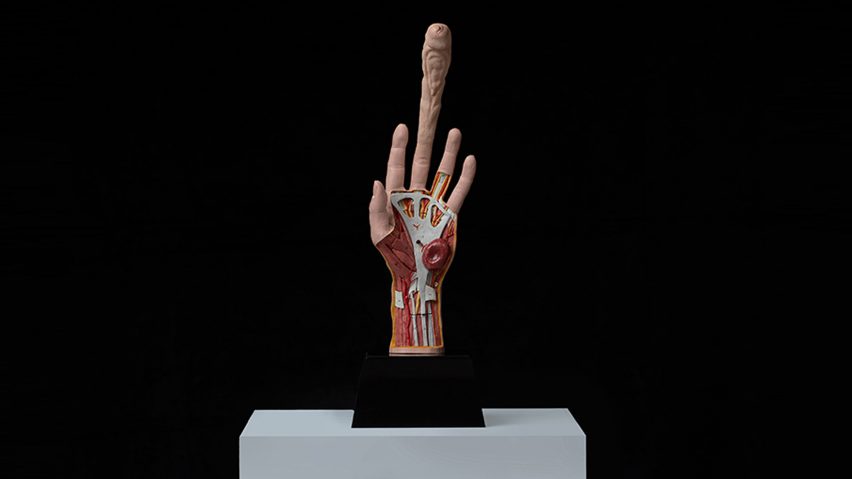
Readers were left shocked and annoyed by the Seeding Finger, a conceptual artificial insemination tool modelled on a hand with an extra-long digit, in this week's comments update.
Plant the seed: readers were aghast by a concept for a hand-shaped tool invented for women to impregnate themselves, and questioned whether it should be taken seriously by the design industry.
"Well thank you Dezeen. It's going to be nightmares tonight," commented a disturbed Greenish.
Clunking Fist gave the idea a firm thumbs down: "It looks gross. Had I only seen the photo without the headline, I'd have assumed that some artist was making a statement about Trump."
"I hate seeing bad design get attention because it's shocking. If it's shocking, it still has to be good, and this is not," continued Jaykjay.
Priscilla Gama suggested the tool was a threat to some commenters: "I only see boys saying that this, and sex toys, shouldn't be on here. Seems like girls just wanna have fun."
While the concept unquestionably had David Gape's attention: "Well that could certainly fill a gap in my market."
"ET phone home!" exclaimed, Arc* apparently reminded of the Steven Spielberg classic.
The tool had already benefited this commenter.
Should the Seeding Finger be taken seriously? Have your say ›
Throwing stones: news that staff had been walking into the glass walls at the Foster + Partners-designed Apple Park campus in Cupertino seemed to tickle some commenters this week.
"This is hilarious! Seems like Apple has ran out of ideas now, and it is just pushing its over-the-top minimalism," laughed M.
"If it's like my experiences with iPhones, the glass will be smashed after a few months and the problem will be solved," wrote Christopher Gon De Leeuw, cheekily.
Dikki Smabers, however, defended the design believing that a lack of attention from Apple employees may be the problem: "Please, come on. I have walked into glass many times in my life. The reason; not paying attention to where I was going."
This reader agreed, stating that employees could be victims of their own products, rather than the architecture.
Read the comments on this story ›
Lap of luxury: renderings by British visualisation studio The Boundary, showing a "super luxury" hotel planned for Arizona, left the majority of readers amazed.
"Beautiful set of images for a very interesting architectural project," gushed Nuno Silva.
"Incredible 3D skills, and bloody good designers," added Hendrix.
However, Stefon proved that you can't please everybody: "I think I'd rather go to Amangiri [in Utah], this looks OK, but more like the home of a James Bond villain."
One commenter was already beginning to budget for a trip.
Read the comments on this story ›
Scale back: new images of one of the final buildings designed by the late Zaha Hadid, the One Thousand Museum tower in Miami, were seen as problematic by readers.
Will felt the images betrayed Hadid's legacy: "She does deserve, and of course certainly will be, remembered for much greater things."
"Why the rendering of a generic sauna? Also, so many white women in their 20s. Must be a strong market for that?" questioned Archi-Nerd.
"They probably spent days to build up stunning super-real renders, and then someone comes around the corner and says 'could you also place some sexist female figures, that's what everybody expects?'" scoffed Fabian K.-Z
One reader believed the renderings could be bad for business.
Read the comments on this story ›

