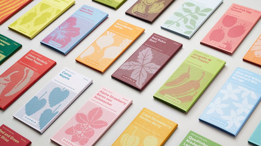
Piccolo seed packaging rebranded to look like miniature book collections
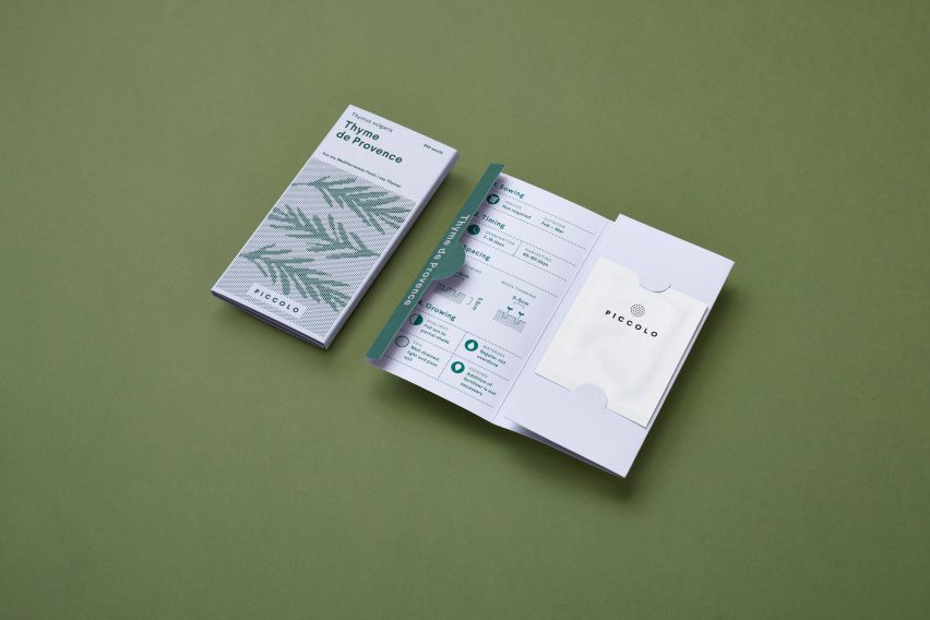
London-based studio Here Design has created a new brand identity for Italian seed company Piccolo, including updated packaging designed to look like a miniature book series.
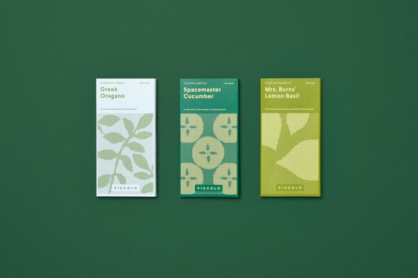
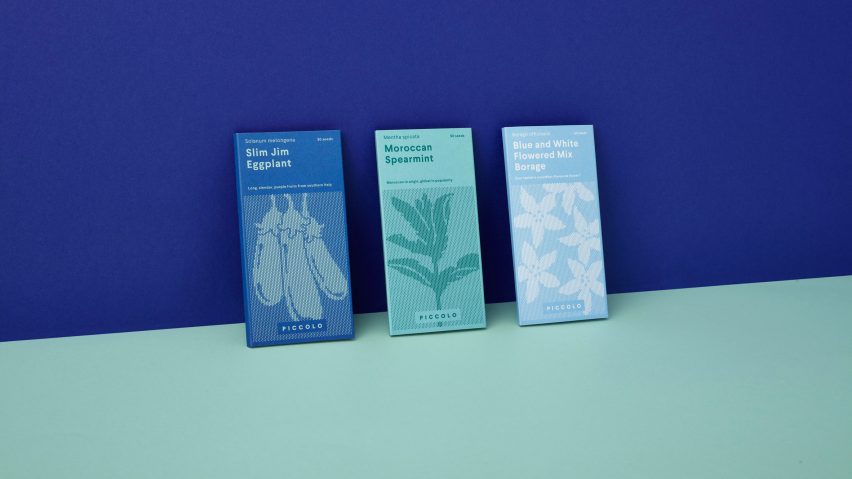
Slim Jim Aubergine and Spacemaster Cucumber are among the seed types offered by the Italian brand, which supplies a variety of plants and vegetables specially selected for space-limited urban gardens.
In a bid to make itself more relevant to its "contemporary, urban and green-fingered audience," Piccolo invited Here Design to rebrand its logo and packaging.
The studio took inspiration for the redesign from collections of miniature books, such as publisher Penguin's Mini Modern Classics series.
"From the moment we saw these products we loved the idea of treating the design as a collection of miniature books that lure youintoo detailed information about how to grow each variety," said Here Design partner and designer, Mark Paton.
The slim, rectangular packages are covered in colourful seed-like dots, arranged in a compact formation designed to "emphasise the perfectly contained nature of the business."
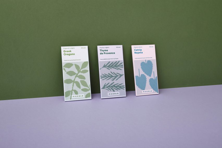
On the front of each packet is an illustration of the plant, vegetable, herb, or edible flower that is contained in seed-form inside.
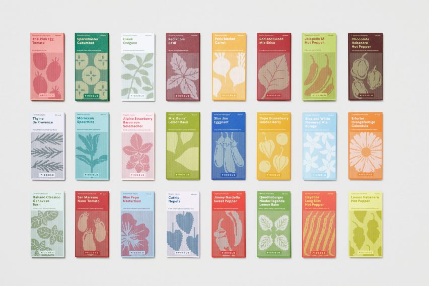
Each image is comprised of multiple rows of dots in a contrasting shade to its backdrop. Larger dots within the rows collect together to form the shape of each specific plant.
Seed varieties are represented different colours – for instance, red for Jimmy Nardello Sweet Pepper, mint green for Moroccan Spearmint and orange for Paris Market Carrot.
The brand used sans-serif typography and infographics to make the packaging more inviting and engaging, as well as to get across the "urban modernity" and "friendly" language of the seed company.
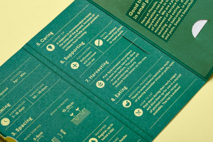
Piccolo's seed packaging is also made from sustainable, 100 per cent recyclable materials.
Based in East London, Here Design have worked with the likes of Adidas, the Victoria and Albert museum and Thames & Hudson, creating new brand identities, book designs, packagings and signage.
With its new identity, Piccolo joins the list of companies reducing their logos and branding down to the bare essentials. File-sharing site WeTransfer rebranded for the first time in 2016, stripping back its logo by dropping the word "Transfer", and The Guardian newspaper also unveiled a simplified and smaller tabloid format at the beginning of this year.