
Natasha Thorpe uses timber to soften mood at Quebec dental office
Slatted wood panels and ambient lighting are intended to make visitors feel more at ease at this orthodontist practice in Canada, by designer Natasha Thorpe.
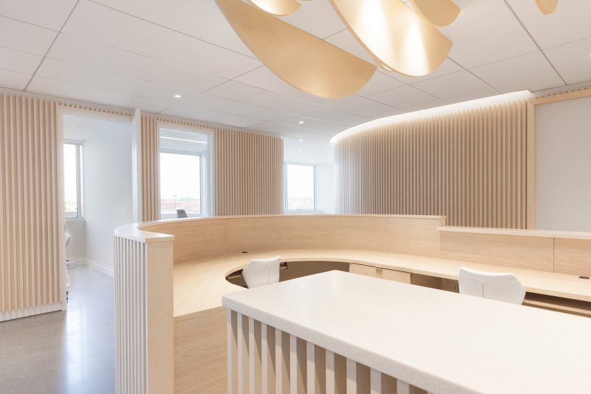
Natasha Thorpe Design used timber to add a sense of lightness and comfort to the otherwise mechanical and hygienic environment at Go Orthodontistes in Quebec.
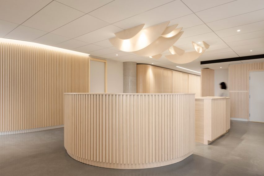
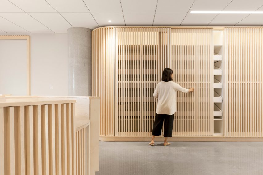
The 1,943-square-foot (180-square-metre) space features hundreds of wood boards that conceal storage units and service areas. The office is kept as open as possible to enhance visibility between patients and doctors.
"In the context of a clinic, sensitivity to visitor experience is essential, as feelings of anxiety are often present," said Thorpe. "The use of natural materials and open-plan layout were essential to creating a feeling of ease and comfort."
A central reception area forms the focal point of the main space, where a circular desk is lined with slatted wooden boards in a vertical arrangement. The area is treated as an independent space and designed to be welcoming.
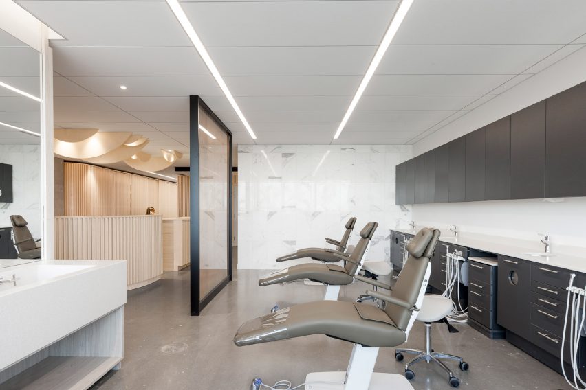
Douglas fir is used as the primary material throughout the space to create a cohesive feeling. The mono-thematic design was also chosen to enlarge "the relatively small office, for the environment that might have otherwise felt claustrophobic", said the designer.
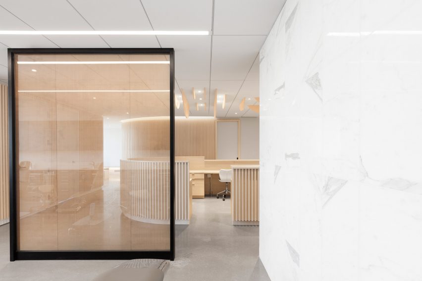
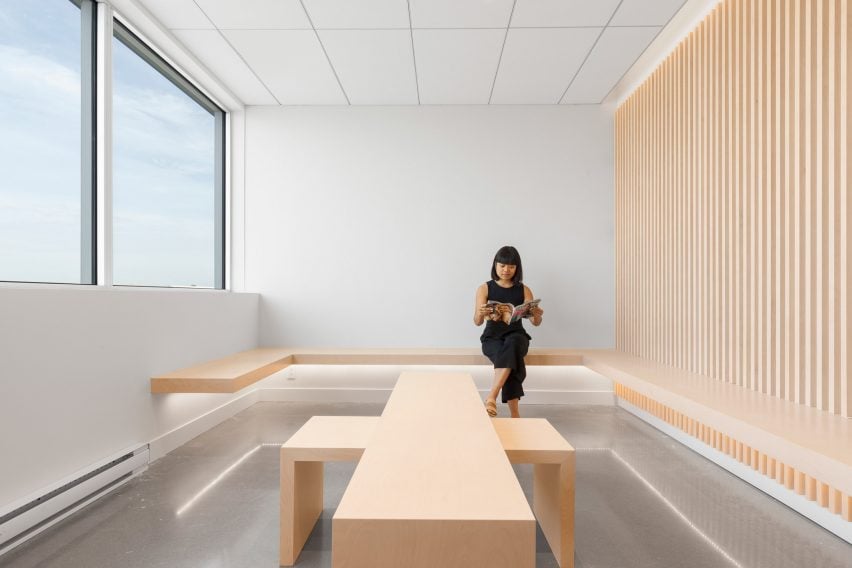
The treatment rooms visible just beyond the reception desk, while the waiting room features large windows and wall-mounted benches with low backrests.
"The palette favours light natural tones that showcase materials at their best and put visitors at ease," said Thorpe. "No seat is turned with its back to the entrance which reduces apprehension."
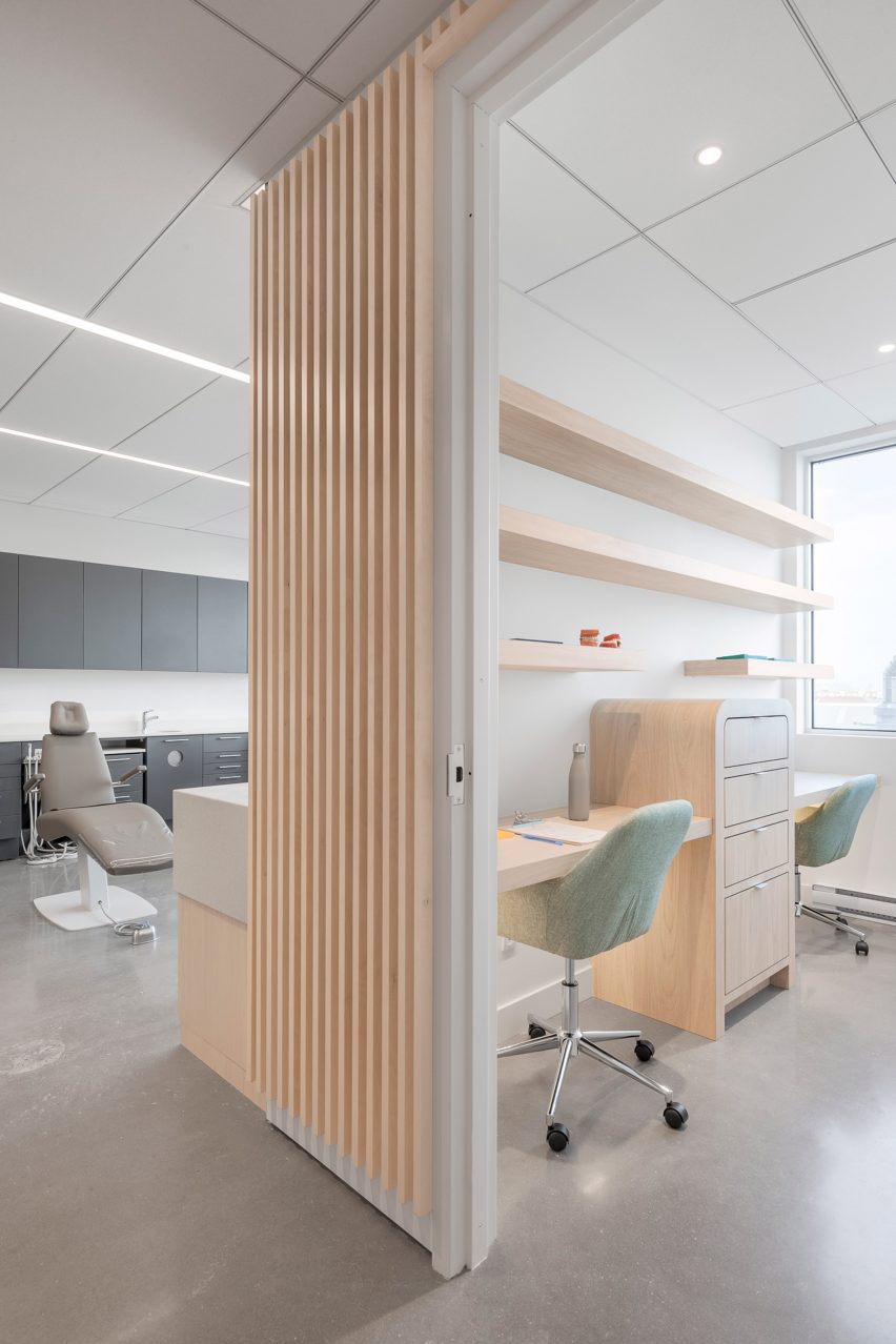
Benches and tables are made from lightly stained Russian plywood to match surrounding timber designs. Low tables can be reconfigured, overlapped, and tucked away to create more space.
Treatment areas carry a similar soft aesthetic to help soothe nervous patients.
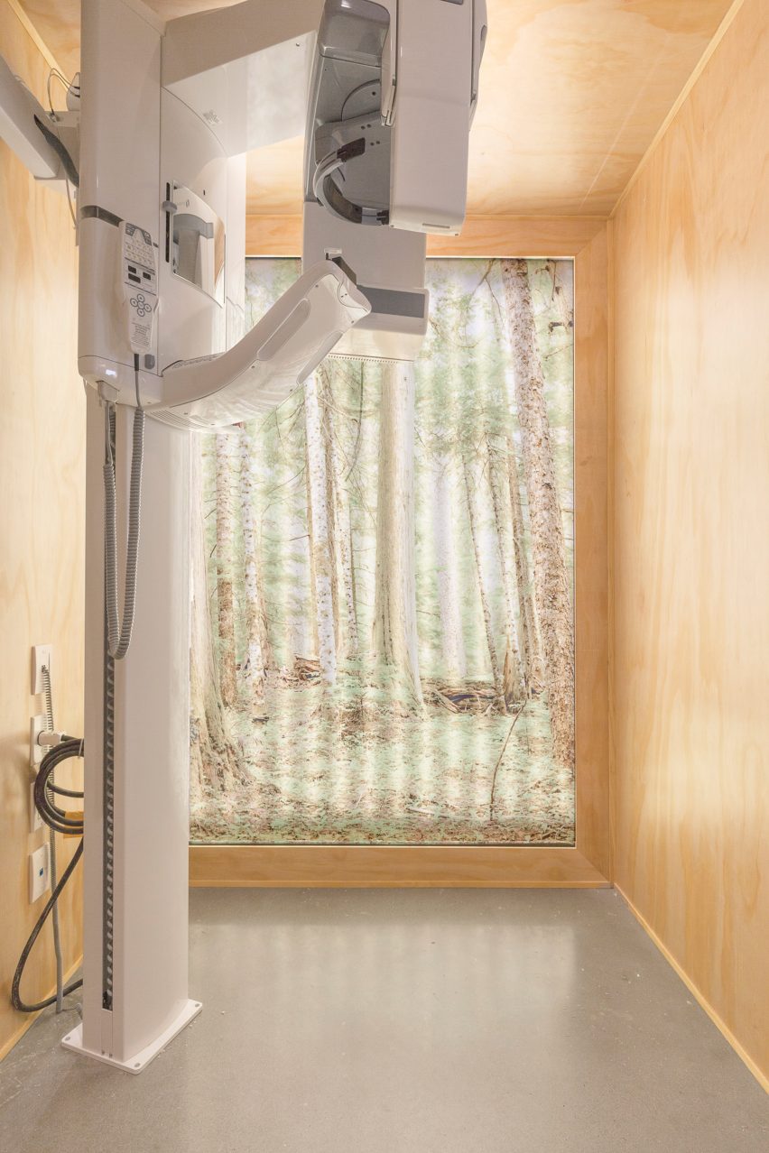
"The area most associated with fearful experiences in dental offices is often the X-ray chamber," Thorpe said. "When placed inside the all-fir environment, the X-ray machine becomes altered by its context. It seems less scary and machine-like."
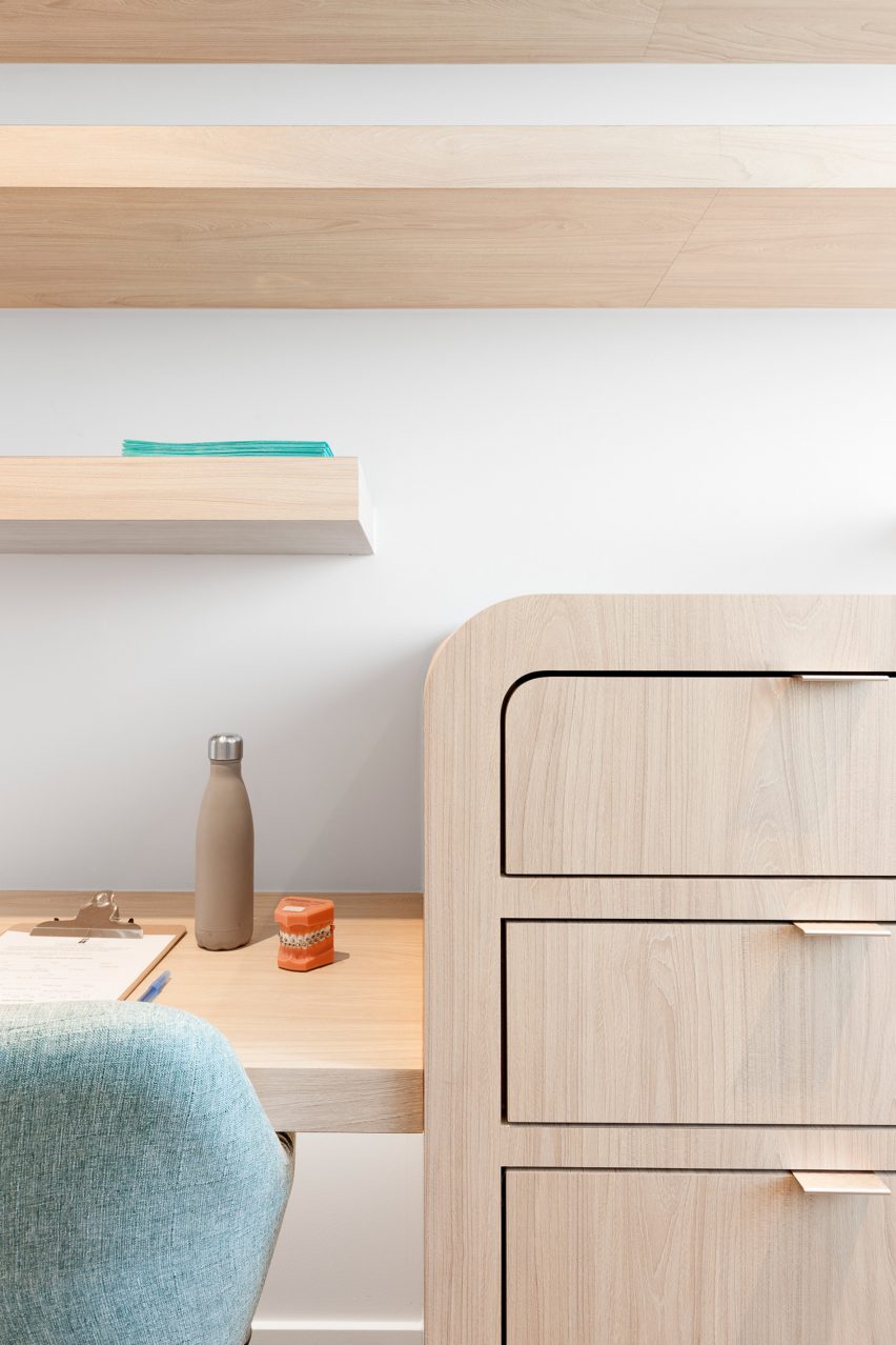
A laboratory and an instrument sterilisation room are lined in more translucent glass, so technicians can work with privacy. Other more private areas, like a consultation room, are fully enclosed.
"The spatial configuration addresses notions of public or private spaces by the degree of material opacity and visibility depending on the vantage point," said Thorpe.
Dental chairs are hidden behind a glass wall with a golden bronze mesh lining. Thorpe custom-designed furniture for the dental office, including built-in benches, cabinetry in an office, and storage units in a laboratory.
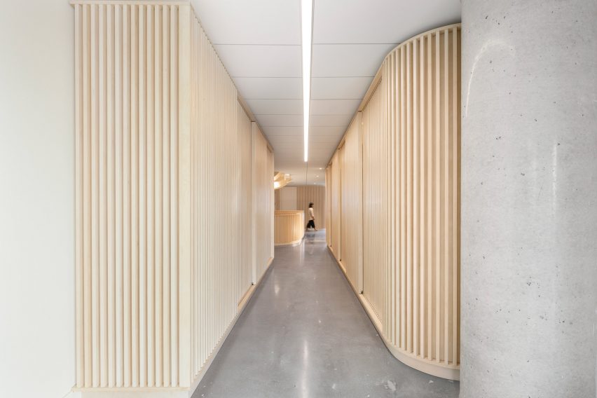
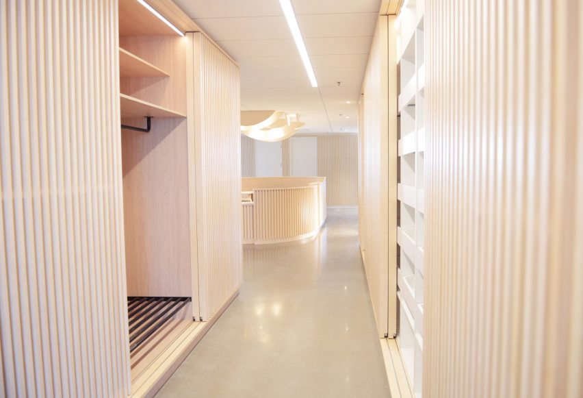
A long corridor off the reception is designed as a storage cabinet, with slatted timber walls concealing shelves and drawers. On one side of the hallway is room for storing appliances, while the other side is used as a closet.
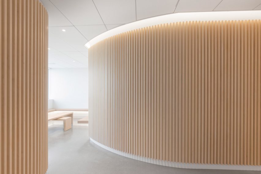
Original concrete flooring and rounded pillars are polished to reflect light. A satin finish is applied on all of the wood to further add lightness.
LED under-lighting emphasises the geometry of the interiors and adds depth. White glossy marble covers a wall, with surrounding walls and ceiling painted white to complement the pale and natural palette.
Timber has become a popular material for dentists' offices. Other examples are a clinic with lightwood panelled walls by Urban Agency in Dublin, a dental office with rounded wooden cabinetry as wall units by RIGI in China, and a clinic designed with a wall of small wooden shelves for storing toothbrushes by Germain Canon and Li Mengshu in Taiwan.
In contrast, some dental practices have a more clinical feel created using stark contemporary design, as found at an office with fully grey and white interiors by Ayeneh Office in Iran and a clinic with white geometric dividers for patient areas by Ren Pepe Arquitetos in Portugal.
Photography is by Maxime Brouillet.