"Doshi certainly has the career that deserves a Pritzker"
Readers debate the selection of Indian architect Balkrishna Doshi for the Pritzker Architecture Prize 2018 in this weeks comments update.
Seal of approval: commenters were split by Doshi's Pritzker win, with some seeing it as a victory for region-specific architecture, and others suggesting that there were more deserving winners.
"Another solid selection to further push the idea that regional, contextual architecture is better than globalist, stylistic works," stated Archi.
But Brazilian was quite against the decision: "The prize is becoming a joke, seriously. RCR and Doshi are just choices to fulfil an agenda. At least this time they chose someone with a lifetime career."
HeywoodFloyd argued that there might have been an oversight: "I'm all for the regional/contextual thing, I just think there are one or two globalists who deserved their moment of glory before the rules changed, Steven Holl being at the top of that list."
"I really like that the Pritzker has focused more recently on architects who don't fit the Frank Gehry starchitect mould, but I also can't help feeling that many of the more recently chosen architects have not actually had careers or impacts worthy of architecture's top prize," agreed Adam Cohen
"Doshi certainly has the career that deserves a Pritzker. The Pritzker prize should award excellence in architecture. Full stop," fired back a defensive Tina.
One reader thought the choice might have gone over the heads of a certain demographic.
Was Balkrishna Doshi the right choice for this year's Pritzker Prize? Join the discussion ›

Twist the knife: there was a lot of criticism of a New York project by BIG, which is shown in renderings as a pair of rotated towers.
"The relentless banality of BIG's output is staggering," sighed HeywoodFloyd
Newarch felt the project was indicative of a larger problem: "Modern architects are a joke to the people who are forced to interact with their buildings daily. The situation is so sad and is in desperate need of change."
"Looks like a 90s Nickelodeon cartoon, and not in a good way," sneered Slime.
Ralf Bähren tried to get into the minds of the studio: "Someone discovered the twist filter and thought it might be a cool idea?"
Arc* believed out the firm could do better: "BIG's Telus tower in Calgary accomplishes the twist far more gracefully – these are just awkward."
This reader had a cheeky response to the project and its location.
Read the comments on this story ›

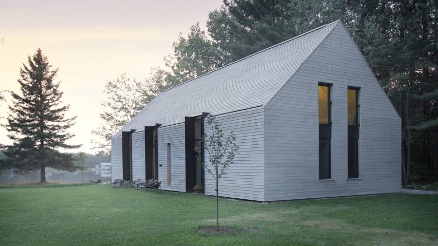
True love: A contemporary cabin in Quebec by Canadian firm YH2, featuring pale cedar cladding, seemed to capture the hearts of readers this week.
"Wow, this is calming," mused Jack.
"It looks and functions like a real house, despite the recent trend. This is how you do it. I think I'm falling in love," gushed Miles Teg.
"Very nice if you conduct your life on 45, 90 and 180 degrees," joked RobWeeve, in reference to the project's angular elements.
This reader kept his praise short and sweet.
Read the comments on this story ›

Face swap: a project that involved switching male characters on iconic logos such as Pringles and Monopoly for International Women's Day thrilled some readers, but others felt it missed the mark.
"I like the Monopoly logo reboot – seems the most successful of this crop," praised Arc*.
"Well done," agreed Pink Tiger.
But Moho felt the idea hindered more than helped: "What I find unconsciously biased, if not outright sexist, is the blatant implication of the notion that women cannot possibly have short hair or a moustache, or to not wear earrings"
This reader learned something new.
Read the comments on this story ›