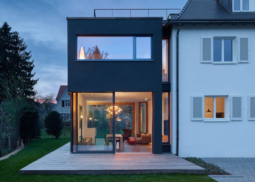
A sliver of glazing separates a white house in Stuttgart from this black extension Holzer Architekten designed to create additional living spaces with plentiful garden views for its owners.
The local practice was asked to renovate the the 1920s house to suit the needs of a family of five, adding the two storey annex to the southwestern side of the building with glass windows that provide views straight through to the surrounding garden.
Rather than blend the new building with the almost 100-year-old house, the architects painted the addition to House L125 black, in striking contrast with the white-painted house.
"A glass gap separates the new and the old building without taking away the special character of the old house," said Thilo Holzer, founder of Holzer Architekten
"On the inside the communication between the new and the old space is harmonic and creates a new space for the family to live a modern lifestyle inside those old walls."
The floor of the main building is elevated 8o centimetres from the ground, but the annex has been placed at ground level to create higher ceilings for the new living area.
Floor-to-ceiling sliding glass doors run the length of the ground floor, allowing it to seamlessly connect with a decked terrace.
The cast concrete frame has been left bare across the ceiling to create an industrial look that is distinct from the more traditional white-painted walls and wooden floorboards, and exposed beams of the rest of the house.
Wide wooden steps lead from the kitchen down to the new open-plan dining and living area, the light wood contrasting with the dark grey of the concrete floor.
A large rectangular cut-out in the wall of the kitchen frames an internal view of the fireplace from the kitchen, and the staircase from the living area, connecting the two communal spaces.
Two internal walls were removed from the original house to create a more open layout, but the original staircase was retained to "feature some of the former character" of the home.
The main entrance was moved to the front of the house, and the new entryway has been lined with bespoke cupboards.
Upstairs, the original layout remains but a new family bathroom has been added. The master bedroom and en suite bathroom now occupies the first floor of the extension.
A new doorway was set into the the roof of the second, attic level of the main house, which now opens on to a rooftop terrace set into the top of the extension.
Nick Deaver Architects also chose to make a clear distinction between old and new when adding a room wrapped in corrugated metal and fully glazed dining room to a white-gabled 1930s era bungalow in Texas.
Fougeron Architecture remodelled a Victorian home in San Francisco that had been untouched since the 1920s by adding a canted glass facade and a bright orange stairwell.
Photography by Zooey Braun.

