Don Angie restaurant interior takes influences from Italy and New Jersey
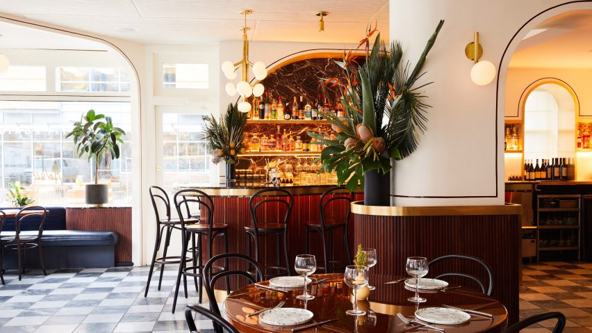
Brooklyn studio GRT Architects has used a "rhythm" of arches, chequered tiles and brass details throughout this Italian-American restaurant in New York City's West Village.
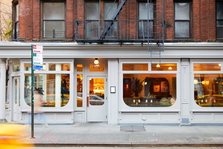
Don Angie recently opened in the ground floor of a pointed corner building, shaped by the angled intersection of West 12th Street and Greenwich Avenue.
The restaurant – one of many in the neighbourhood – is the brainchild of young chefs Angie Rito and Scott Tacinelli, who aim to put a fresh spin on typical Italian-American dishes.
"We were struck by the husband-and-wife team's ability to breathe new life into familiar territory, to experiment and please at the same time," said a statement from the studio.
"In response we designed Don Angie aiming to blend the effortless glamour of northern Italian design with the familiarity of a north New Jersey red-sauce joint."
GRT Architects chose a simple flattened arch as a repeatable design element across the interior, for its links to traditional architecture in Italy.
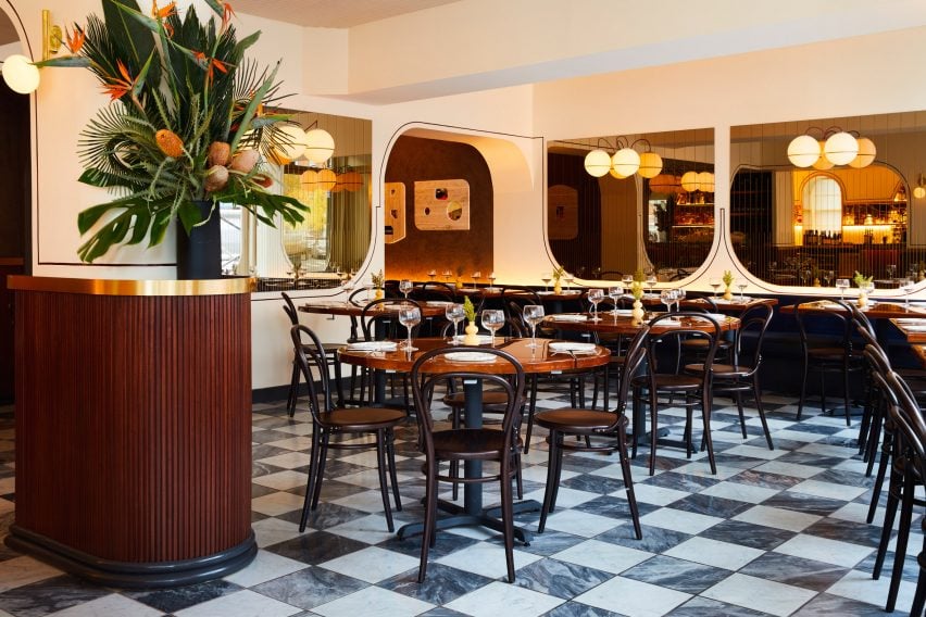
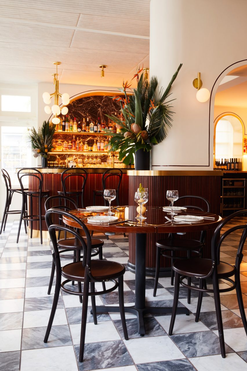
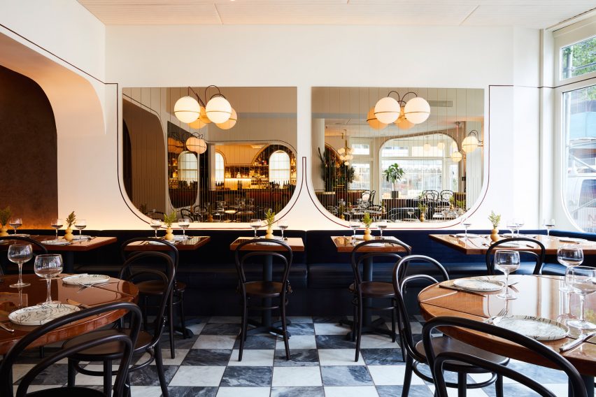
Used both right-side up and inverted, the shape is found over doorways and the bar shelving, and as bronzed mirrors and mahogany panelling on the walls.
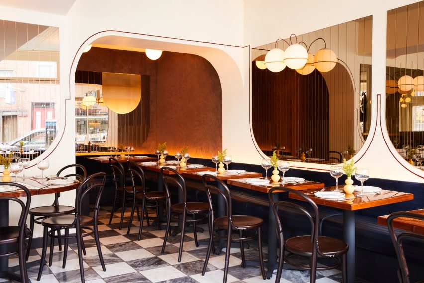
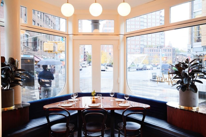
It was also added to the corners of panes that form the street-facing windows, below golden line work that gently suggests the impression of bistro curtains.
"From the facade to the interior, a rhythm of flattened arches – both upside down and right side up – serves as a framing device, creating subtle differences between the bar, dining room and corner booths without making the already cozy space feel small," said GRT.
A chequerboard of 12-inch grey and white marble tiles covers the floor of the 1,000-square-foot (93-square-metre) space, reminiscent of the vinyl flooring commonly associated with Italian-American eateries. In the bathrooms, these are swapped for half sizes in a grid of red and white.
Along the windows, a banquette upholstered in navy leather and velvet provides seating, and addresses the room's awkward corner. Tables coated in a deep varnish are also accompanied by wooden bistro-style chairs.
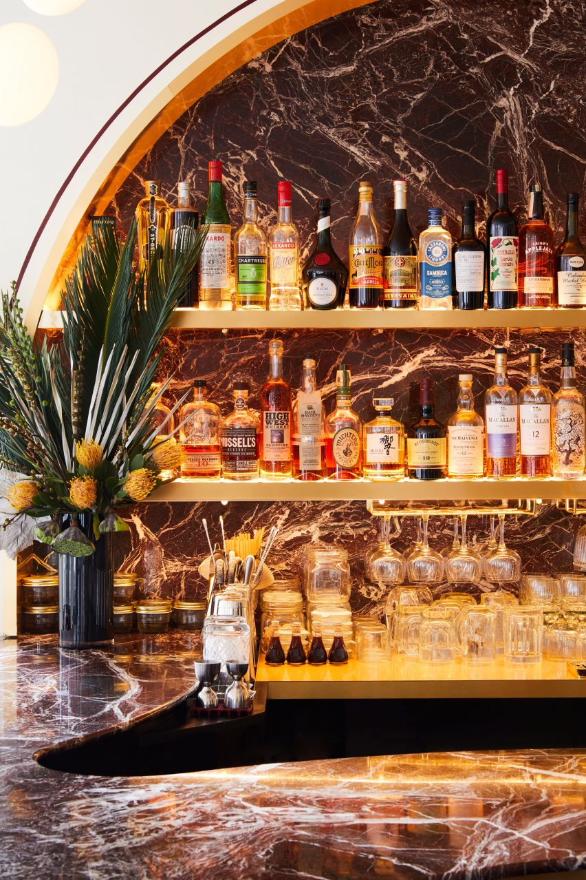
Rosso Levanto marble tops the bar counter, which forms an S into the space, and lines the bottle display above.
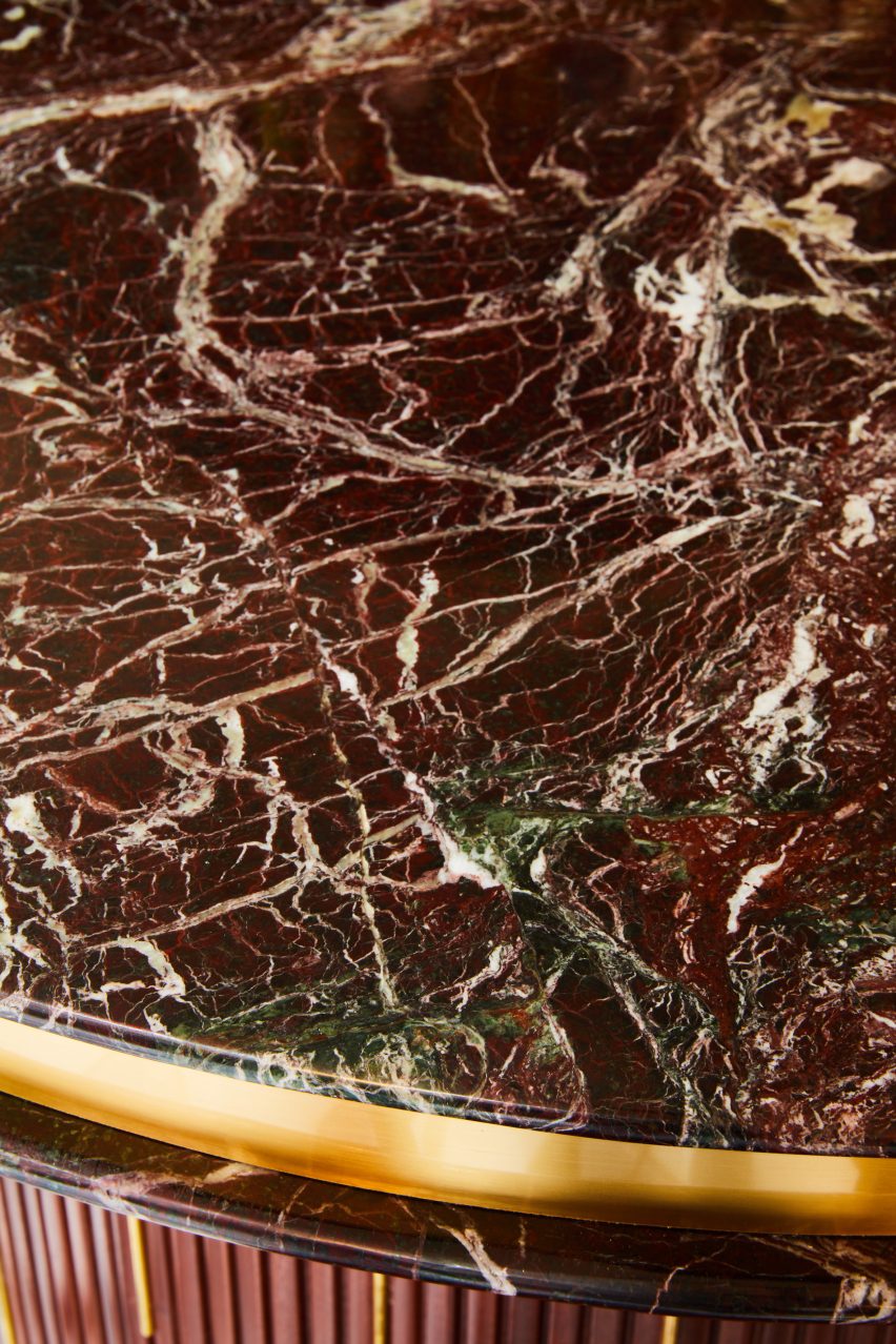
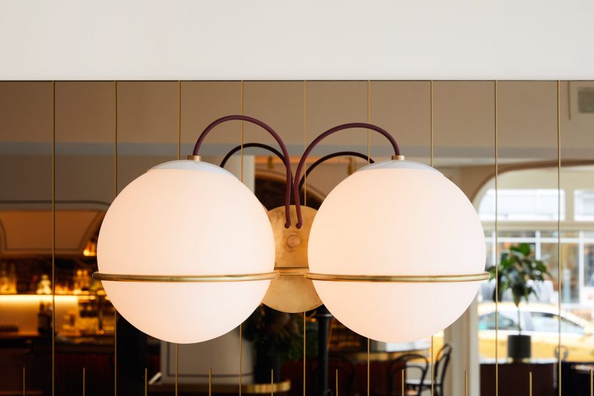
Brass accents wrap the edges of the countertop and shelves, and around the base of the bar. The metal is also used for the custom light fixtures, which GRT designed themselves and fabricated locally.
The blown-glass diffusers create sconces and pendant lamps influenced by the work of Italian lighting designer Gino Sarfatti.

Ceilings are covered in upholstered panels, reeded to "visually and acoustically soften the space to aid the acoustics of the space". Design and installation of the whole interior took just four months from start to finish.
New York's ever-evolving dining scene has several new venues with noteworthy interiors, including a ramen restaurant near Herald Square and a cafe in NoMad that becomes as a speakeasy after dark.
GRT Architects, founded by childhood friends Tal Schori and Rustam-Marc Mehta, has also completed a handful projects in the city recently. They range from an office designed to look more like a home than a workplace, to the renovation of a Brooklyn townhouse.
Photography is by Nicole Franzen.
Project credits:
Design: GRT Architects: Rustam Mehta, Tal Schori, Sharif Anous, Tiantian Liu
Lighting consultant: Focus Lighting
Linework and art features: Handwerk
Graphic design: Reunion Goods and Services