"How nice, buildings that don't cast shadows!"
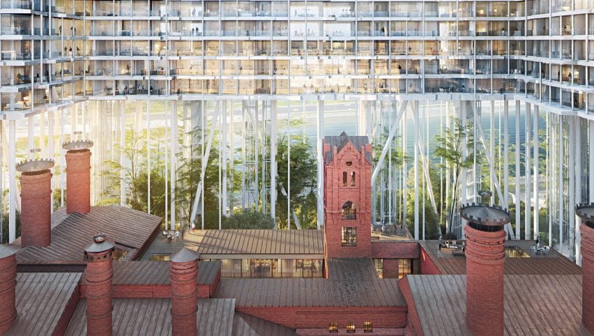
In this week's comments update, readers ridicule Herzog & de Meuron's renderings of two "horizontal skyscrapers" on stilts by the Moscow River.
Lack of support: the Swiss firm recently revealed visualisations of two apartment blocks on stilts, set to form part of its redevelopment of an abandoned brewery in Moscow, and suffered the wrath of sarcastic commenters as a result.
"I like how they're referring to regular buildings as 'horizontal skyscrapers'," said Luis Spinola.
"How nice, buildings that don't cast shadows!" added Pierre.
Miles Teg wasn't impressed by the plants shown in the visuals: "I'm sure a forest can thrive under the shadow of a 'horizontal skyscraper' just like in the renderings."
Igloo also wasn't a fan. "The building cores are rendered almost invisible, naturally because their presence completely destroys the effect they are going for. Once built it will look a mess."
However HeywoodFloyd was more optimistic: "Crazy enough that it just might work."
The plans reminded this reader of a popular childhood game.
Are the renderings of this Herzog & de Meuron project too unrealistic? Join the discussion ›

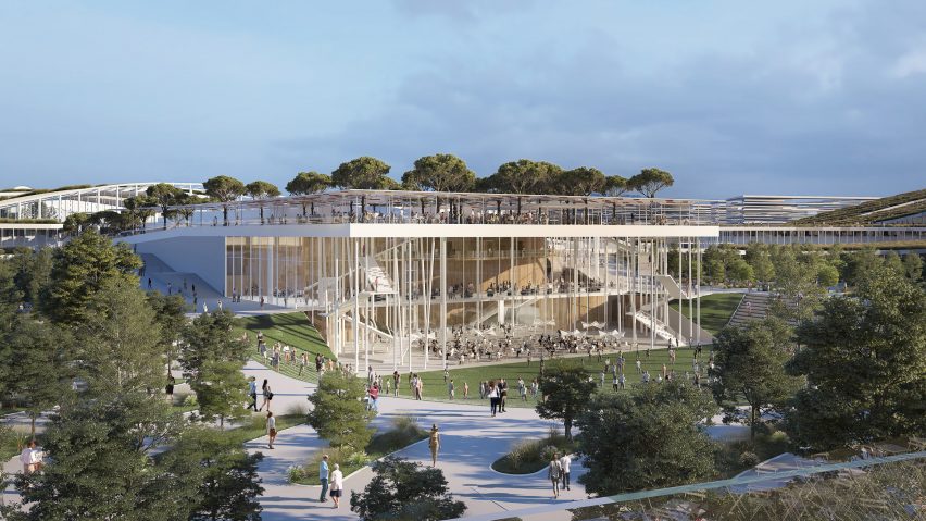
Big mistake: plans for buildings that will make up the BIG-masterplanned EuropaCity district in Paris, by studios including Atelier COS and UNStudio were revealed this week, causing readers to scrutinise the masterplan.
"What a mish-mash," lamented David.
"When will these designers understand that people don't like crafted and created environments unless it's a theme park?" asked BillH11103.
"Themeparchitecture, not architecture," quipped Onboard.
Miles Teg got deep with his comment: "We have all this money. Instead of solving problems with this money, we will bury it on land, will have more money and more problems. Isn't capitalism beautiful?"
"It makes me sad for the profession, this headlong rush to simply build at such a rapid pace with almost no critical self–reflection on any of it," continued Arc*.
One reader is confident that the project won't impress:
Read the comments on this story ›

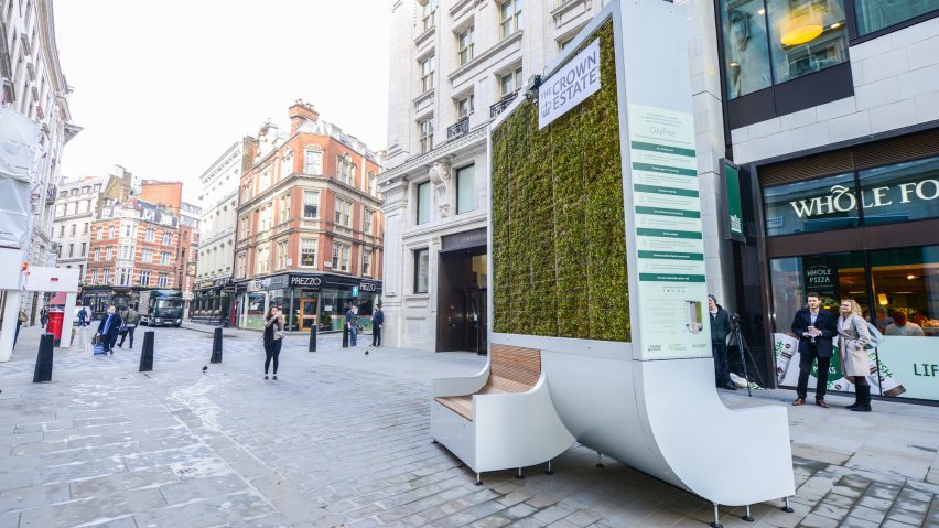
Overcomplicated: some readers felt that German startup Green City Solutions had missed a simple trick when it came to the mossy living wall installed in London's Piccadilly Circus to combat urban air pollution.
"Another thing that can be done is to plant a tree and put a bench next to it," pointed out Jan Vlach ironically.
"This is just another piece of street furniture that is visually polluting," cringed Lee Washington.
"Yes, but the moss is supposed to be equivalent to 275 trees. I agree though that trees are more attractive," responded Lynne Snyder.
"We need to be integrating green infrastructure not cluttering our public spaces with greenwashing products," sighed Sarah.
But Ruckus Amsel was into the idea: "I need this mossy living wall in my home."
This reader spotted something else:
Read the comments on this story ›

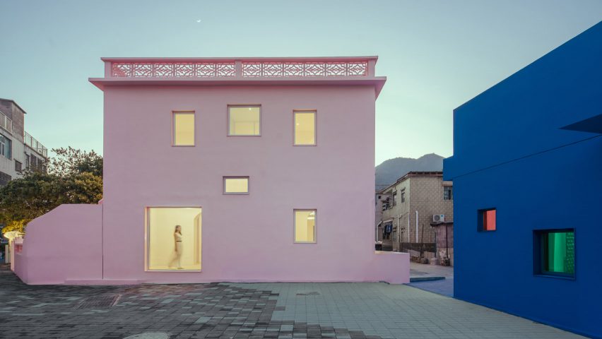
Colourblind: a pair of houses painted pink and blue, to explore gender constructs, was blasted by readers this week for a lack of social awareness.
"Painting two buildings in patriarchal gender stereotype reinforcing colours is not an exploration of ideas," groaned HeywoodFloyd.
"This is really an uncomfortable article to read, masculinity being expressed by dark colours, hanging meat and 'manly-man BBQs,'" agreed Jack Oliver.
Pierre didn't see what the fuss was about: "These stereotypes have existed for a few million years, even animals have sex differences between lion versus lioness. So why deny them that?"
"Blue and pink have only been assigned male and female in the west, and then for less than a hundred years. Also, pretty sure stereotypes haven't existed pre-humanity. Also, pretty sure stereotypes don’t actually prove anything," put across Jamie.
This reader suggested a movie director who would enjoy the colour palette:
Read the comments on this story ›