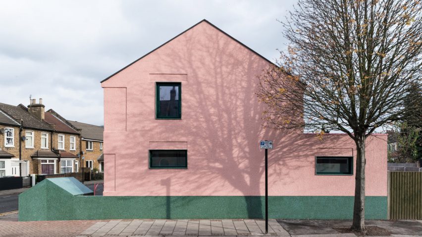
Architecture studio Office S&M combined on-trend millennial pink with green terrazzo details to give this house in east London a character that sets it apart from the city's other rental properties.
The new-build house on Salmen Road in Plaistow was designed by Catrina Stewart and Hugh McEwen of Office S&M as a rental home for young property developer, Isla Kennedy of My Property and Home.
The architects managed to create an 87-square-metre house with three bedrooms and three bathrooms on a compact plot at the end of an unassuming midcentury terrace.
Salmen House's pale-pink and green exterior lends it a distinctive presence amongst its more conventional brick-clad neighbours.
The architects claim the choice of colours is intended to make the building "stand out from the everyday", and "challenge preconceptions of London's typically dire rental market".
Office S&M favours bold colours in its architectural projects, and previously designed a quirky shingle-clad extension to a London house featuring bright-yellow window frames and a multicoloured interior.
"We don't produce quiet architecture, and this house revels in colour and materiality," said project architect Hugh McEwen.
The facades are covered in a stippled render to give them a subtle texture, while the terrazzo adds a rich surface detail and helps to reflect light into the building.
Kennedy, who began her career in property development after a skiing accident that left her in a coma for five weeks, wanted to produce a low-cost house that was quick to build and of a higher standard than many properties available to rent.
The architects specified low-cost but high-quality materials and construction methods to ensure the house could be completed in just six months for only £205,000.
Interior spaces are optimised by paring back the structure to its minimum expression. Exposed ceiling beams, four-metre-tall bedrooms and a triple-height spiral staircase illuminated by a skylight all promote a sense of space within the building.
"Salmen House is a study in generosity for its inhabitants and context, and with our background in social and private housing, we brought the best of both worlds to the project," McEwen added.
"We were able to make the most of the space through careful planning of how the house could be used in the future, and want this to be a benchmark for quality rented property in London."
The house's elevations follow the lines of the awkward angled corner plot. The arrangement of the interior creates a series of rooms with natural light and views from two directions.
A cranked entrance leads into a circulation space that extends between a shower room and bedroom towards the open-plan living area and rear garden beyond.
The spiral stairs lead up to a first floor containing two further bedrooms, one with an en-suite bathroom, and a family bathroom. The arrangement of bedrooms and bathrooms ensures optimum flexibility for a range of potential occupants.
The popular shade known as "millennial pink" has been popping up regularly in architecture, fashion and interior design for the past year or so. Duggan Morris Architects used it for the cladding of an office building in London, and furniture brand Ercol applied it to updated versions of two of its midcentury seating designs.
Photography is by French + Tye.

