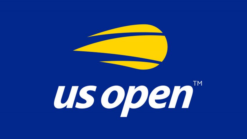
New York branding and graphics firm Chermayeff & Geismar & Haviv has pared back the "complicated" flaming ball logo of the US Open Tennis Championships to just three yellow stripes and lower-case text.
Chermayeff & Geismar & Haviv created the more minimal version of the logo to bring the 50-year-old United States Open Tennis Championships into the digital age and give it a more "youthful appeal".
The new design simplifies the golden tennis ball with flames billowing behind, which has represented the event since 1997, into three yellow marks that are pointed at one end and rounded at the other to resemble the shape of a tennis ball in flight.
A red streak was stripped away in favour of a plain blue backdrop, while the thin capital serif type spelling "US Open" has been swapped for italic sans-serif typography in lower case. The "n" at the end of the text now resembles a flipped version of the "u" at the beginning.
"The mark that had been used for 20 years — an illustration of a flaming ball paired with thin serif type and a red swoosh — was a complicated image that had challenges in digital media and did not represent the tournament well as a premium sporting and entertainment brand," said Chermayeff & Geismar & Haviv.
"While the rendition of the mark posed challenges, the core concept of a flaming tennis ball still captures many of the attributes of the US Open – energy, excitement, movement."
The firm – which is behind recognisable logos like the rainbow-coloured peacock for television network NBC, and the blue and line-drawn globe for airline Pan Am – was enlisted by the United States Tennis Association (USTA) to create the US Open logo to mark the event's half-century anniversary this year.
The design is already fronting the event's Instagram account, and will feature on a host of products and applications, as well as billboards and print advertisements.
"The US Open has a great tradition, so the evolved symbol respects the legacy while moving us confidently into the future," said Nicole Kankam, USTA managing director of marketing. "This innovative rendition of a tennis ball perfectly captures the dynamism of our event."
US Open is the latest company to swap complicated old logos in favour of more minimal designs. England's primary professional football competition kicked off its 2016/2017 season with a significantly more simple lion's head logo, while design agency Pentagram gave credit card company Mastercard its first branding redesign in 20 years in 2016 with visual identity comprising two overlapping circles.
German airline Lufthansa also updated its century-old logo and livery earlier this year – a move that was met with a backlash for being "bland and pointless".
The annual US Open event began life in 1881 as the US National Championship, when it was limited to amateur players.
But in 1968, the event opened up to professional male and female athletes, marking the "open era" and the first US Open. It now takes place each year as the fourth and final Grand Slam, following the Australian Open, the French Open and Wimbledon championships.
Held in New York, the 2018 US Open commences on 27 August 2018 and runs until 9 September 2018. This year will also see the opening of a new tennis court, the Louis Armstrong Stadium in Flushing, Queens, with design features including a retractable roof and terracotta louvres.
Chermayeff & Geismar & Haviv was established in 1957 by Tom Geismar and Ivan Chermayeff, who died last year. Sagi Haviv became the third partner in 2006.
The studio's famous clientele includes oil and gas corporation Mobil, Chase Manhattan Bank, the Public Broadcasting Service (PBS) and National Geographic, as well as New York's MoMA and LA's MoCA museums. It has also developed materials for Barack Obama's presidential campaign, and posters for cultural institutions including New York's Guggenheim Museum and the American Museum of Natural History.

