Junya Ishigami's architectural models feature in Fondation Cartier exhibition
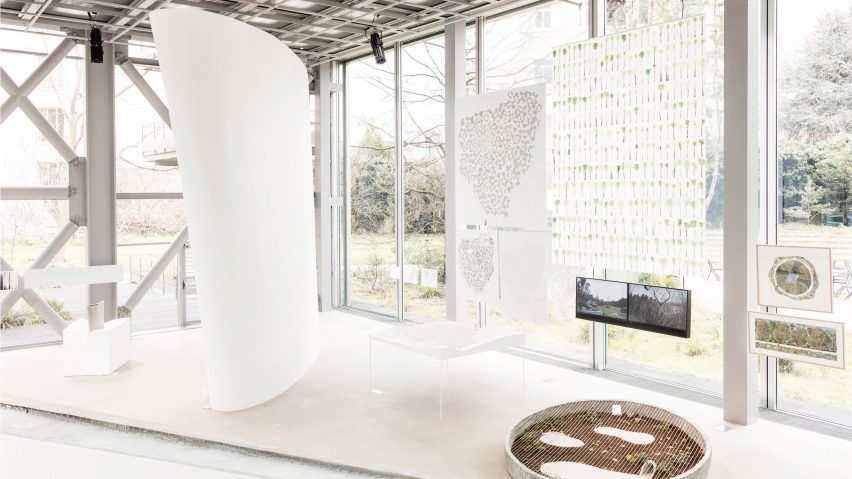
Twenty architectural models by Japanese architect Junya Ishigami have gone on show at Fondation Cartier in Paris. In a Dezeen exclusive, exhibition curator Isabelle Gaudefroy reveals her five highlights from the show.
Freeing Architecture is the first large-scale solo show that Fondation Cartier has dedicated to a single architect.
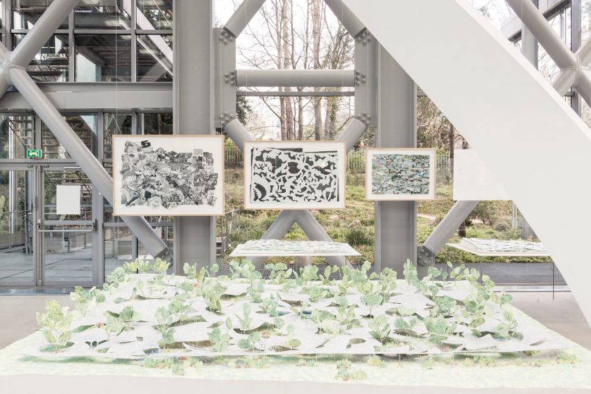
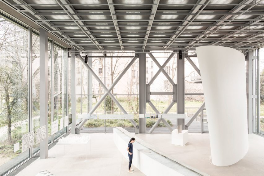
Presented through large-scale models, films and drawings, the exhibition brings together 20 key projects by Ishigami, an architect who has built a reputation on designs with dream-like qualities.
Gaudefroy, the foundation's director of exhibitions, told Deezen that Ishigami's portfolio of work cannot be pinned down to a particular architectural style, because the architect tries to conceive architecture as freely as possible.
"In this exhibition, we show how Ishigami approaches architecture freely, in the sense that every project is very different from the other and takes into context how every building is done and the landscape that is drawn into the project itself," she explained.
But the curator said that the relationship between architecture and the natural world is a reoccurring theme in Ishigami's designs.
"For me, there are different relationships with different projects, but one idea that comes up regularly is architecture being a natural phenomenon – architecture that resembles a cloud, a rock, a forest and so on," she said.
"These poetic analogies that come from nature are not only a source of inspiration but the basis for everything."
Freeing Architecture continues until 10 June 2018. Here, Gaudefroy describes five key projects on show:
Forest Kindergarten, Shan-dong, China (2010)
"This is a beautiful project because it is a concrete roof that has been cut with all these shapes and you don't know what they are referring to.
"Ishigami tried to figure out how to conceive a building with a child's imagination, so the shapes of the roof evoke images linked to the children's world, including animals and flowers. He progressively stylised and abstracted them until he got these shapes, making it an open space for imagination and for play.
"Merging inside and outside spaces, he tried not to plan the building's functions but rather work with the scale of the different rooms and different inside spaces. Some are quite high and can serve as adult spaces, while others are really low so only children can use them, and they can become private spaces."
Chapel of Valley, Rizhao, China (2017)
"The Chapel of Valley is a worship space that Ishigami was commissioned to build in China. He decided to locate the church in a very small valley at the top of a hill, which almost appears like a small cut in the rocks.
"He wanted to create a very narrow and very tall building. The chapel, which is 40 meters high, is made of white concrete and has a lot of visual impact.
"To enhance the impression of the building rising from the earth, he sunk the building 20 meters into the ground to give the impression that it really rose from this small valley."
House and Restaurant, Yamaguchi, Japan (2014)
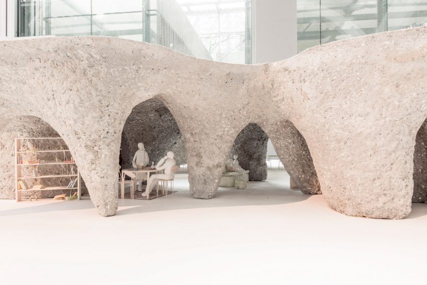
"I love this building because it is very different from Ishigami's other buildings, which are usually thin, light, very white and very transparent. Ishigami has always said it should not be the style that leads the architecture.
"This project was commissioned by a client who is a chef and wanted his restaurant to have the cosiness of a wine cellar. He also wanted something that was natural and organic.
"To do this, Ishigami used holes in the ground where he was building as a mould into which he poured concrete. When they dug out the earth underneath, the concrete that was poured became the ceiling of the structure."
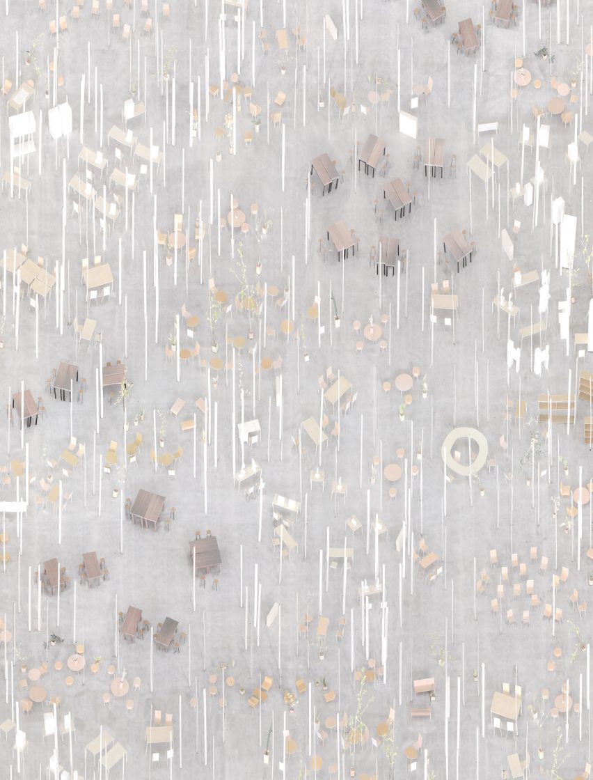
Kait Workshop, Kanagawa Institute of Technology, Japan (2008)
"Kait Workshop is a workshop for a technical university in Kanagawa. They needed a space for their students to work with metal and wood, to make their prototypes.
"Ishigami decided to create an open space that would have no walls. He wanted to create a space that would feel like wandering through a forest. The idea came quickly to make a space that was held by 308 thin columns – it's like having a plate of Mikado sticks.
"The columns are all oriented differently and appear seemingly random. But in fact, they all are positioned intentionally. Like a forest, it has different densities of trees depending on where you are. Out of necessity, the forest is very dense, but every column has a role to play in the stability of the building."
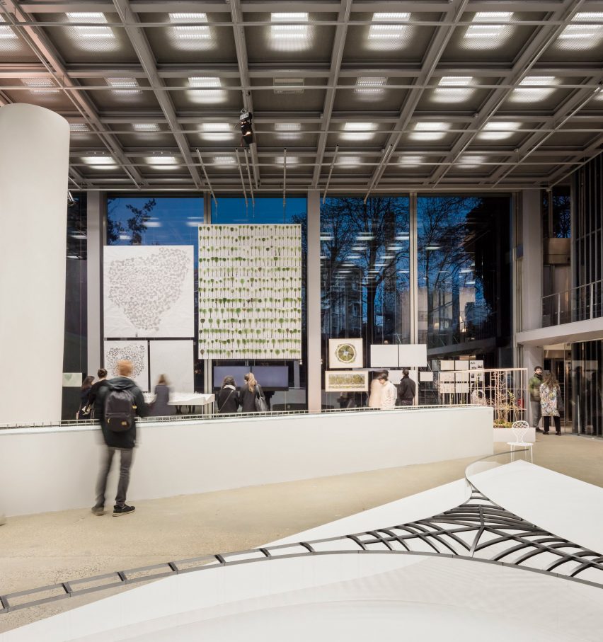
Visitor Centre, Park Vijversburg, Netherlands (2017)
"This is a very important project for me because I think it shows how Ishigami makes a gesture that's intelligently taking into account all the often complicated parameters when working at a heritage site.
"In this case, you couldn't cut down any trees in the park so he had to create a building that had the least possible visual impact, and the least possible impact on the environment.
"It is completely transparent when you see it from the side because it has absolutely no columns. It is actually the glass that is structural. The curve of the glass is what holds up the building."
Photography is by Giovanni Emilio Galanello and Luc Boegly.