Alonso & Crippa renovates compact urban dwelling in Buenos Aires
New apertures and an all-white stairwell are among the modifications made by Argentine studio Alonso & Crippa to a two-storey, century-old brick building in a gentrifying district in Buenos Aires.
The project, called PH Thames, is located in Palermo Viejo – a historic neighbourhood that is dominated by small, brick buildings dating to the early 20th century. Long a residential district, the area is now in the midst of a major transformation.
In many buildings, ground-level spaces facing major streets have been taken over by shops, restaurants and offices. Residences now occupy upper floors or the inner areas of large urban blocks.
"In the last decades, this part of the city has faced a process of gentrification and intense transformation of its uses, turning a purely residential neighbourhood into a cultural and commercial one, while maintaining its low density," said Alonso & Crippa, a local studio founded in 2010 by architects Mariano Alonso and Ludmila Crippa.
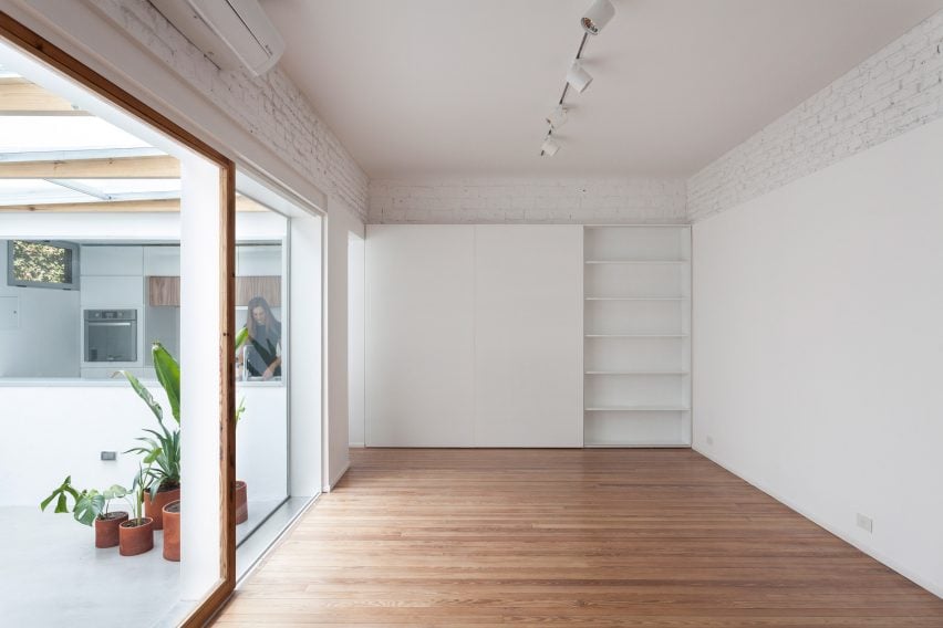
For the PH Thames project – PH stands for "horizontal property" – the architects were tasked with renovating a 1920s home that is situated off a small, internal road. The 110-square-metre residence consists of two levels organised around a central void.
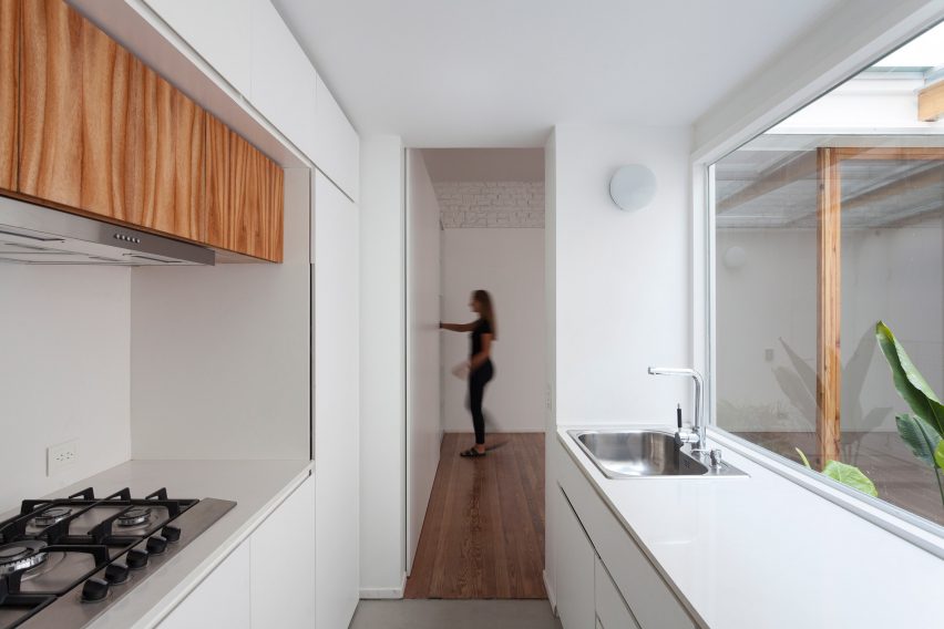
The commission presented an opportunity to explore a new type of living experience, one that would "withdraw from street interactions and be in contact with another kind of landscape, one in which very deep constructions, non-passable roofs, service terraces and domestic gardens get along with the constant presence of the sky", the team said.
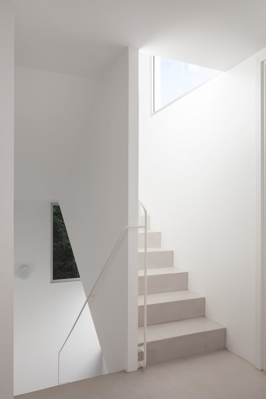
The property had already undergone multiple transformations over the years, including the addition of a new floor above the ground level. The interventions resulted in "a dislocated vertical circulation, a complex spatial organisation, and a covered patio that reduced natural light and ventilation".
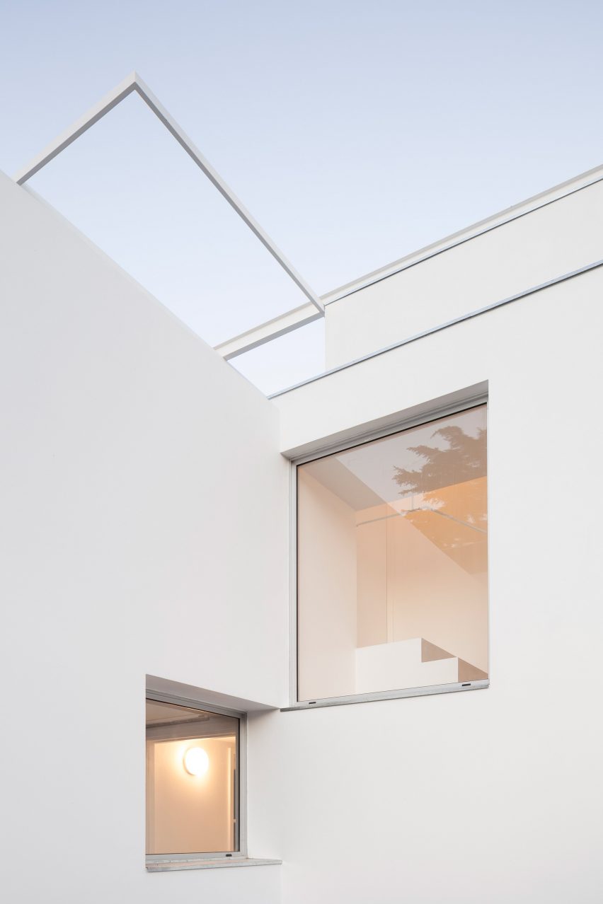
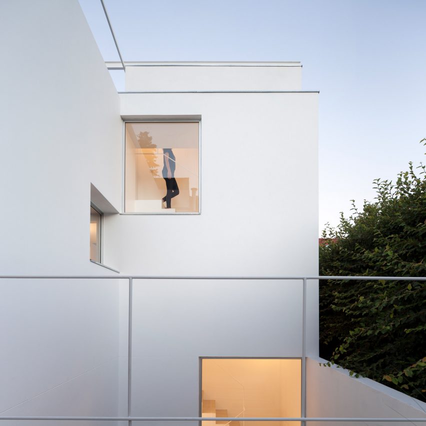
Rather than enlarge the one-bedroom dwelling, the architects sought to redefine connections and maximise outdoor space. A restrained palette of colours and materials was used in order to maintain the continuity of the white walls and to reflect natural light. Existing windows were modified, and new ones were created – all using proportions based on the square root of two.
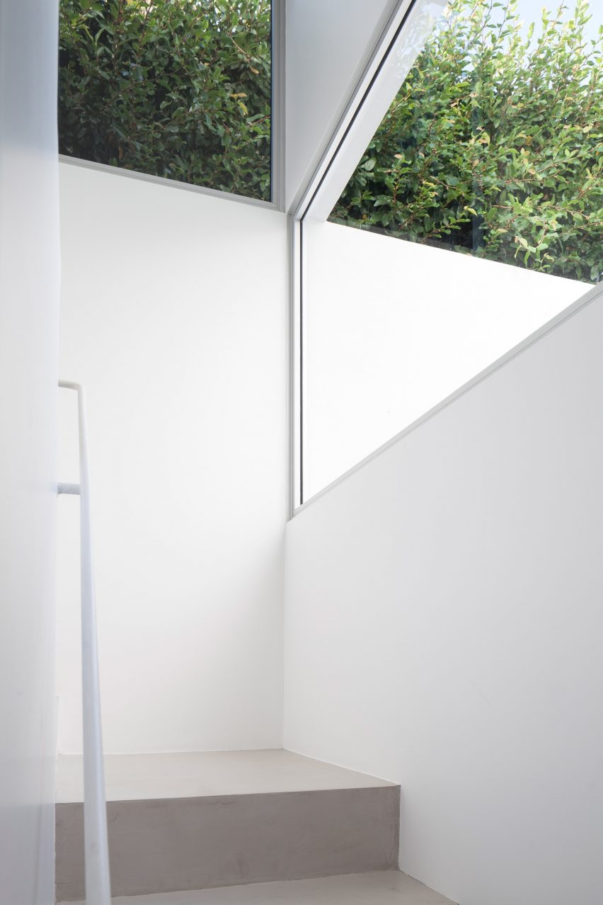
"Each window has a specific condition – either to frame a view of the exterior, to incorporate light, to provide ventilation or to create an interior-exterior connection," the architects said.
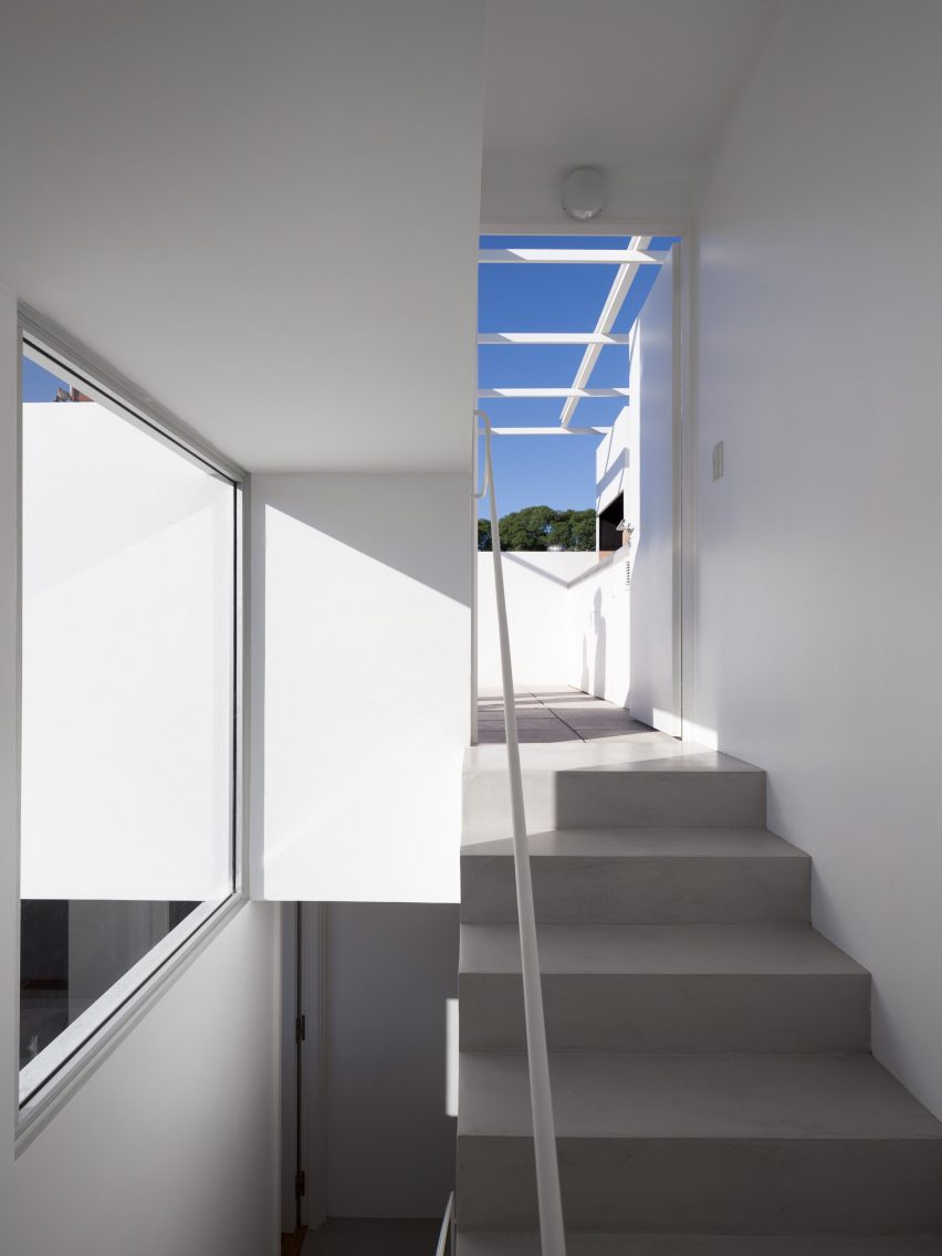
One of the biggest modifications was the creation of an all-white stairwell that flanks one side of the home. The staircase is meant to define the "new envelope of the house".
"The envelope allows to rethink the dialectic between view and facade, by organising a series of spans of different but proportional sizes, which solve in each case the problems of lighting, ventilation and a physical or visual connection between inside and outside," the architects said.
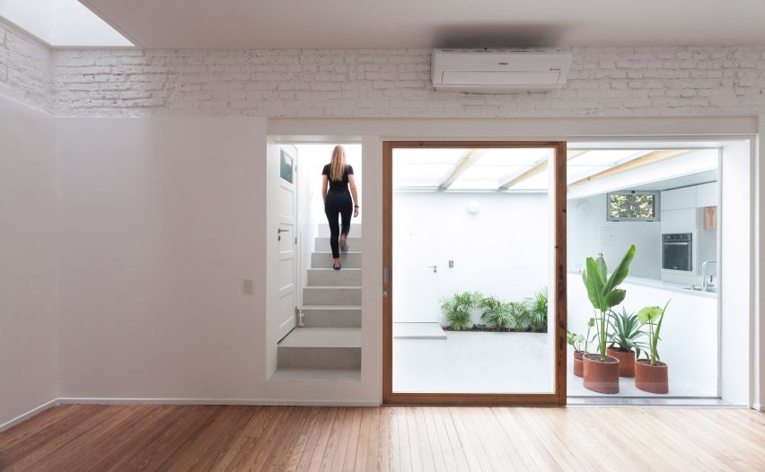
On the ground level, the team overhauled the courtyard, which over the decades had become part of the kitchen. The team "returned the patio to its original use", adding potted ferns and a ceiling made of wooden beams, aluminium and glass. A large sliding glass door is framed with wood that was repurposed from the home's original flooring.
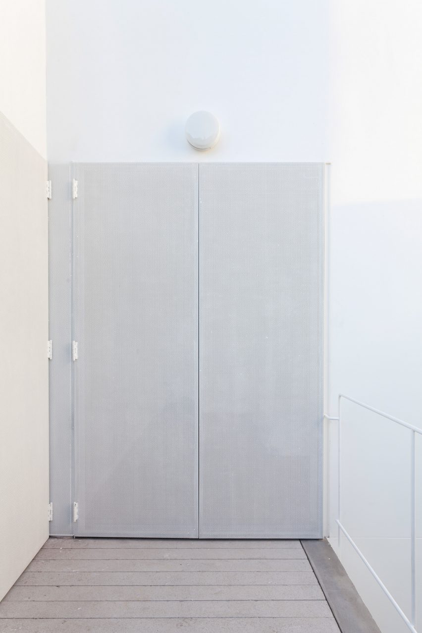
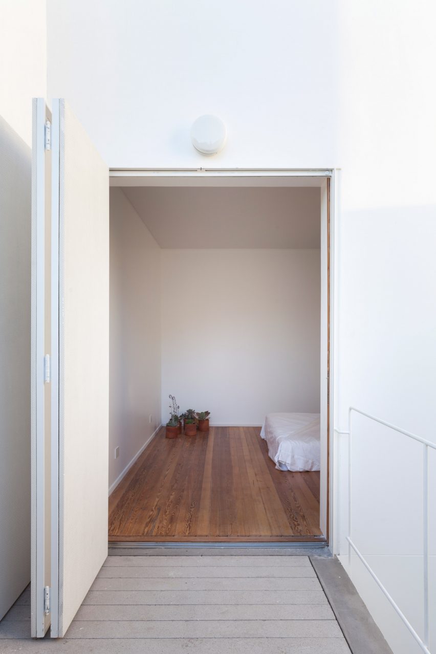
On the first level, the team connected a small terrace to the bedroom and inserted a folding door. The terrace formerly wasn't linked to the bedroom. Moreover, it was slightly lower than the first floor, meaning the team had to lift it up.
"It wasn't possible to go from the bedroom to the patio," the architects explained. "What we did was take the patio level up, and create a new door that connects the bedroom with this intimate patio."
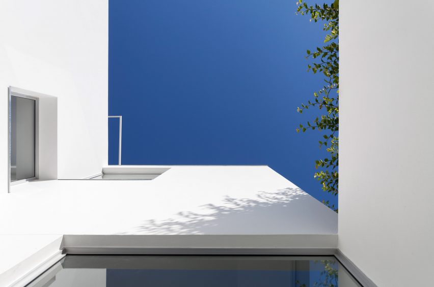
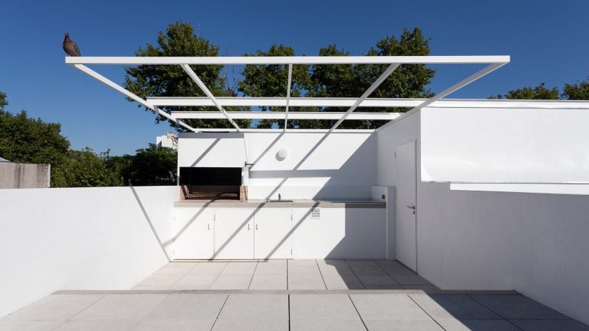
The roof was converted into an outdoor living room, complete with lounge furniture and a kitchen. The team also added a "sky window" that brings natural light down through the home. The elevated deck offers sweeping views of the neighbourhood, including its verdant tree canopies.
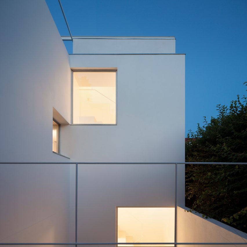
All of the outdoor areas, combined with the new apertures and abundance of natural light, make the refurbished home feel larger than it is.
"Despite the small surface, the arrangement of the openings allows deep perspectives and a framed perception of the outside from all its insides," the studio said.
Photography is by Javier Agustín Rojas.
Project credits:
Designers: Mariano Alonso, Ludmila Crippa
Team: Pablo Galicer, Agustín Azar, Joaquín Berdes, Naomi Garay, Génesis Pestana, Alice Volpi, Giulia Brena