Students from Singapore and Kyoto design objects inspired by each other's cities
Students from Singapore and Kyoto have created a series of design objects based on photographs of each other's home city.
The Exchanged Forms project was set up by two professors, from the National University of Singapore (NUS) and the Kyoto Institute of Technology, (KIT) to bring together young designers from two "distant realities."
The collaboration went forward without the two groups ever meeting in person. Instead, they took photographs of objects and sceneries that are typical in their country and sent them to the students in the other city, paired with a short description.
Each student then chose one of these images and used it to create their own interpretation of the foreign city.
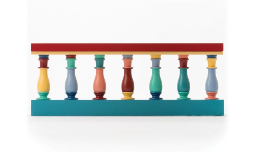
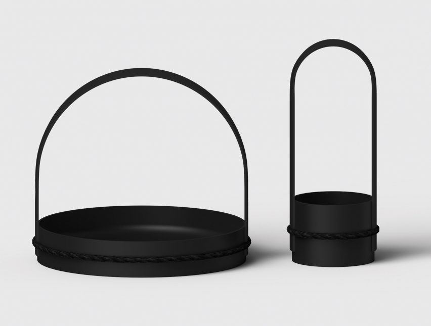
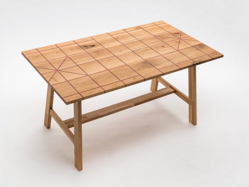
The 17 resulting objects range from a table patterned with a Chinese chess grid to a tobacco tray set inspired by Japanese dragonflies.
"In this project, we both hope to discover and rethink our identity through each other's lenses and interpretations. Not only exchanging forms, but also the exchange and forming of each other's values and identity," said Patrick Chia, a professor at NUS.
According to Chia, Singapore and Kyoto appear on the surface to be opposites in culture, landscape, weather, language, crafts and tradition.
He describes the Japanese city of Kyoto as having a strong sense of tradition and craftsmanship. Whereas Singapore is seen as a city that is in "constant metamorphosis," as its buildings are repeatedly torn down and rebuilt.
In their projects, the 17 students have tried to explore the subtle similarities between the two cities, as well as the differences.
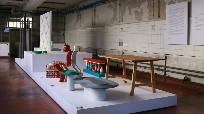
Exchanged Forms is on show inside the Università building at new Milan design week venue Ventura Future – for which Dezeen is media partner.
In the exhibition, the works are mixed together in a bid to challenge visitors to find out the origin of each piece.
"Relating to someone else's culture is a good exercise because it forces you to connect, to create empathy," said curator Paola Bellani.
"In the case of the Japanese designers, they mainly took the multicultural urban patterns, while the Singaporean students were inspired by the natural elements of Japanese landscape," she added.
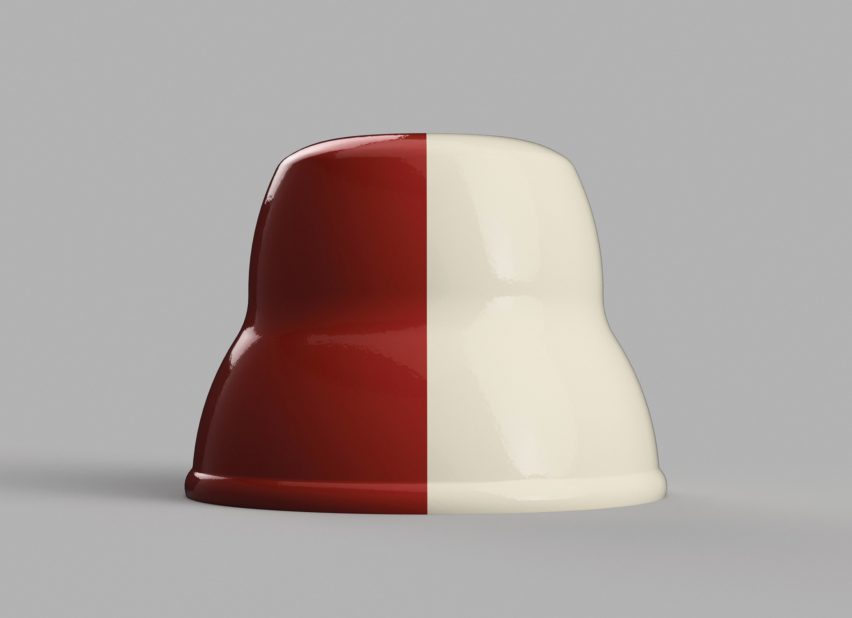
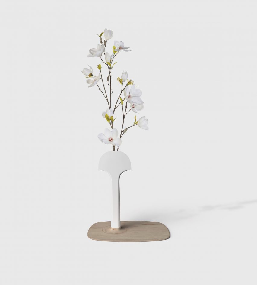
Using an image taken of the red and white plastic seats on the Singapore underground, Aika Nishiyama designed a 3D-printed flower pot.
Half red and half white, Nishiyama's flower pot matches the colours used to represent priority seating on Singaporean trains. It takes its curved form from the shape of the seats when viewed from the front.
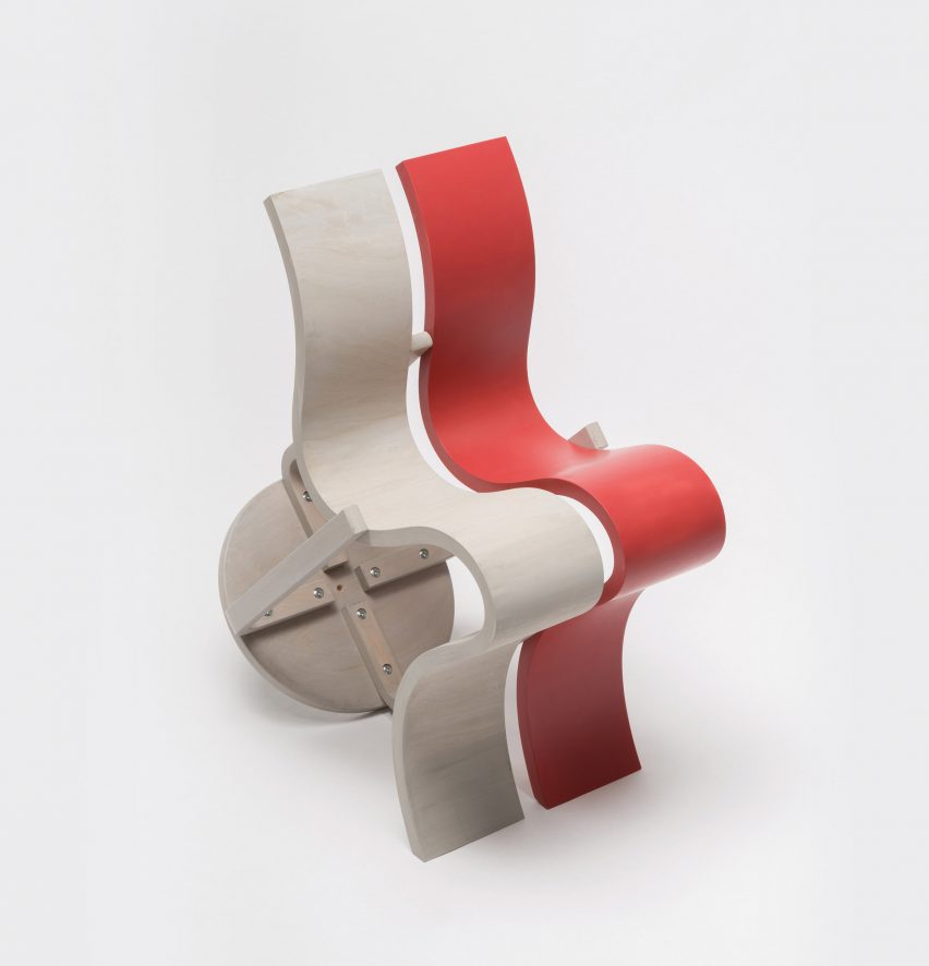
Adopting the same colour palette, Mayu Noda created a red and white plywood chair that she made by adding parts onto a simple stool.
"In a picture of Singapore, I found it interesting to see plastic signs attached on to old buildings, changing these buildings' function from residence to a visitor centre," said Noda.
"So, in my design, I use the same analogy. The old stool is like an old building with added parts, to create a new form," she added.
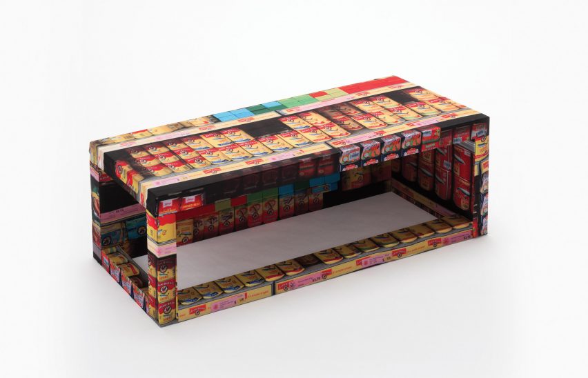
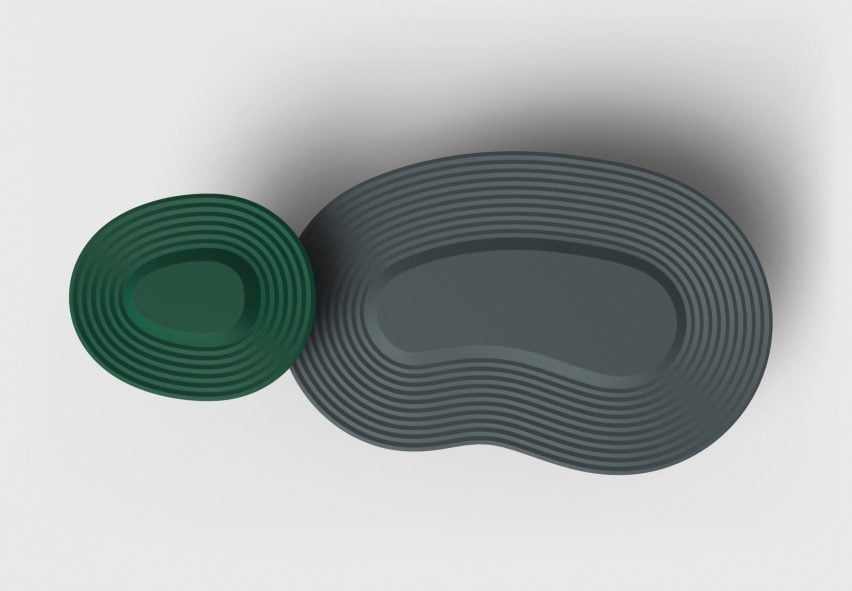
Other designs include a bench printed with vibrant images of Singaporean supermarket shelves, a set of low tables indented with the patterns found in Kyoto's Zen rock gardens, and a silk fabric patterned with "soft scales" inspired by Singapore's half-fish-half-lion Merlion statue.
"This is quite a peculiar collaboration, as normally there is a lot of dialogue and exchange. Whereas here we were working in a very blind way, and I think this resulted in a kind of uncomfortable way of working," Chia told Dezeen.
"This was good, as there was no reference to check against, which allowed for more creativity. The students were able to take a leap of faith," he added.
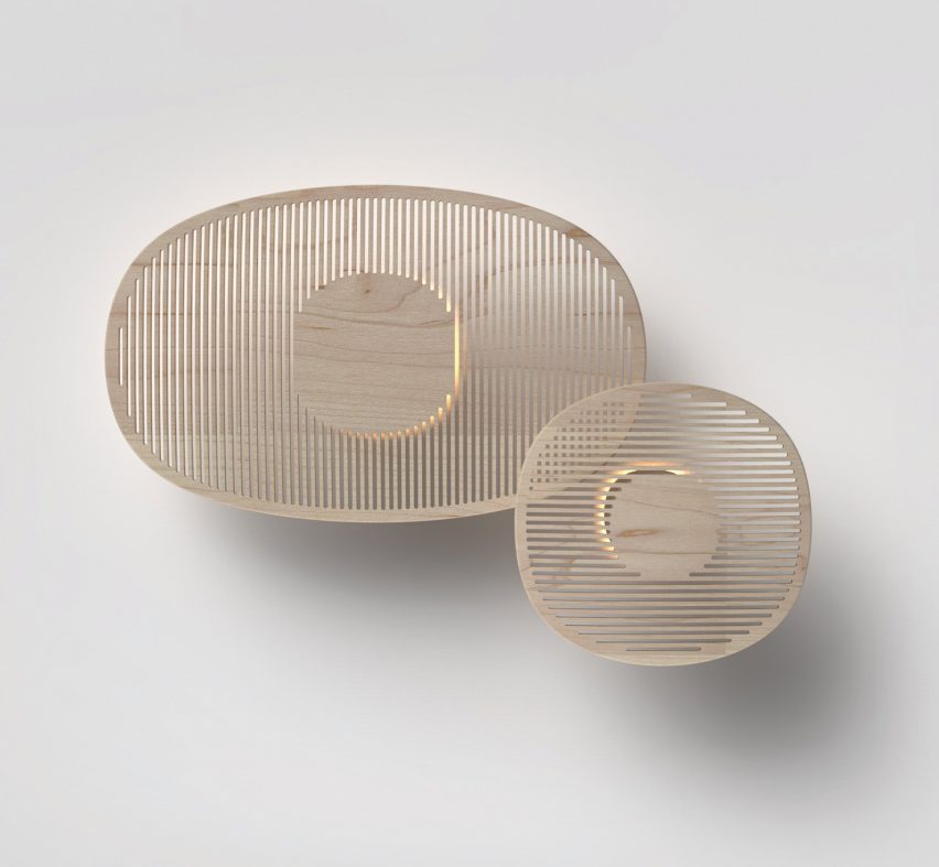
Without meeting in person, the students from each city weren't able to give and receive criticism or input about how well each design represented its respective city.
"Thanks to the inevitable misinterpretation that accompanies this process, we produced objects that reflect qualities of both Singapore and Kyoto," said Eizo Okada, a professor from KIT.
According to Chia, this meant that the students were "free to just do as they wish," resulting in "unfiltered" designs that weren't over-edited.
The exhibition curator said that a "retro" aesthetic has dominated the last few editions of Milan's Salone del Mobile, bringing back "old" materials like marble, brass, velvet and a "dusty colour palette."
"What is relevant in this selection of designs is that tradition is not the end of the journey, but is the beginning," she said.
The exhibition is on display at Ventura Future from 17 to 22 April as part of Milan design week. Other student projects at the festival include an exhibition by ÉCAL students exploring the changing nature of the manufacturing process.