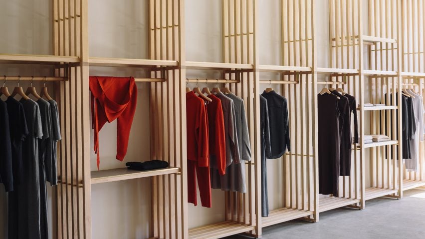
Japanese architecture and joinery inspired Knight Associates design for this clothing shop in Wellington, which is defined by a sequence of slatted timber panels.
The flagship store for ethical clothing brand Kowtow in the New Zealand capital, which opened 11 years after the fashion brand was founded, is set within a former bakery.
Until now the brand has exclusively operated online, so for the design of its first bricks-and-mortar store they tasked Auckland-based interior design studio Knight Associates to create a space that reflected their eco-friendly ethos.
"Like many contemporary fashion labels, Kowtow had developed a compelling online identity, with a global following, and transitioning into a physical space meant a commitment to brand values and 'seeing' themselves for the first time," the studio's founder, Rufus Knight, told Dezeen.
"Rufus was excited to work with us as sustainability and traceability is core to what we do, and he wanted to execute that in the design," Kowtow's founder, Gosia Piatek, added in a statement.
The practice worked alongside local practice Makers of Architecture to carry out the project's structural changes.
They began by inserting a series of floor-to-ceiling slatted panels made from interlocking beams of sustainably grown eucalyptus that are intended to give the store a more defined layout.
"It was important that areas of the store were not closed off to the senses," explained Knight.
"The use of the panels enabled permeability of light, sound, and vision, meaning the space could maintain a sense of singularity and cohesiveness."
Knight was heavily influenced by architect Kengo Kuma's Prostho Museum Research Center. This building in Nagoya, Japan, features a similar timber lattice facade and also uses Chidori, a Japanese joinery technique that omits the use of nails or mechanical fixings.
"These references seemed to coalesce into something that was tactical and poetic, but functional. It was then researching how this could be realised using sustainable materials," added Knight.
The designers traded a pair of windows on the store's facade for large panels of frameless glazing so that passersby can have a more open view of the activities taking place within the store.
The space has been dressed with a modular sofa, which sits on top of a dark grey rug crafted from salvaged materials like fishing nets. Overhead hangs an oversized lamp produced by Japanese company Ozeki & Co, which has specialised in the craft of paper lanterns since the late 19th century.
British designer Jasper Morrison also used timber shelving to divide up the interiors of the Good Design Store in Tokyo, creating a series of homely "rooms" by erecting full-height storage units made from maple wood.
Photography is by Simon Wilson.

