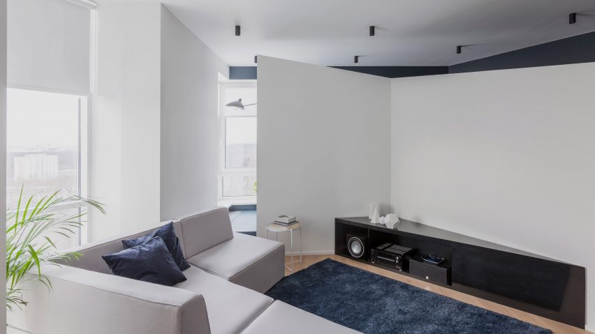
Russian studio Shkaf Architects inserted asymmetrical and diagonal walls to make the most of the space within this one-bedroom apartment in Moscow.
Located in an apartment building in the north-eastern part of the city, the flat benefits from far-reaching views across Moscow.
The clients, a young couple, wanted the apartment to feel spacious but also requested that it fulfil a number of different functions.
"The clients wanted a bedroom, two bathrooms, a study, kitchen, living room, and, of course, big storage spaces," Anna Besprozvannykh, co-founder of Shkaf Architects, told Dezeen.
"That was challenge – to create a spacious apartment with many functional zones."
Using a style that the architects have coined "emotional minimalism", the apartment is divided by angular walls and colour-blocked walls in dark blue and white.
A diagonal hallway splits the apartment's plan across the centre. To the left is a small triangular cloakroom and beyond that, a marble-lined shower room. Further along to the left the hallway opens up into an open plan living, kitchen and dining room.
With two large windows along the exterior wall, the room is wrapped on the opposite side by an asymmetrical white wall fitted with a custom, triangular media unit.
Behind this angular, asymmetrical wall is a narrow L-shaped room, that is divided into two spaces by built-in furniture.
Where the wall is taller, a private space with a wall-to-wall daybed looks out across the city through a corner window. In the other half of the room, where the wall curves around and slightly downwards, there is study fitted with a desk.
This darker portion of the room is lined with mirrors to reflect the light and make the space feel larger.
"The space was quite ordinary, so we wanted to break it and add rhythm," said Besprozvannykh, who co-founded Shkaf Architects together with Victoria Korneeva in 2011.
"We wanted to turn it into a kind of labyrinth, where you can find something unexpected round the corner."
To the right of the diagonal hallway, is a bedroom with an en-suite bathroom. Here, another white asymmetrical wall divides the space. While the bed backs onto one side, a walk-in wardrobe is concealed on the other.
Walls are painted in alternate blocks of dark blue and white throughout the apartment to enhance the angular lines.
"The main colour is white. To emphasise the inner architecture of the asymmetric walls we used deep blue as background colour," the architects explained to Dezeen.
Architect Raúl Sánchez previously used angled walls to create visual breaks in the layout of an apartment in Barcelona, while a house in Onomichi, Japan, by Suppose Design Office is framed by five parallel walls, which have been placed at an angle to frame views of an adjacent waterway.
Photography is by Yury Grishko.

