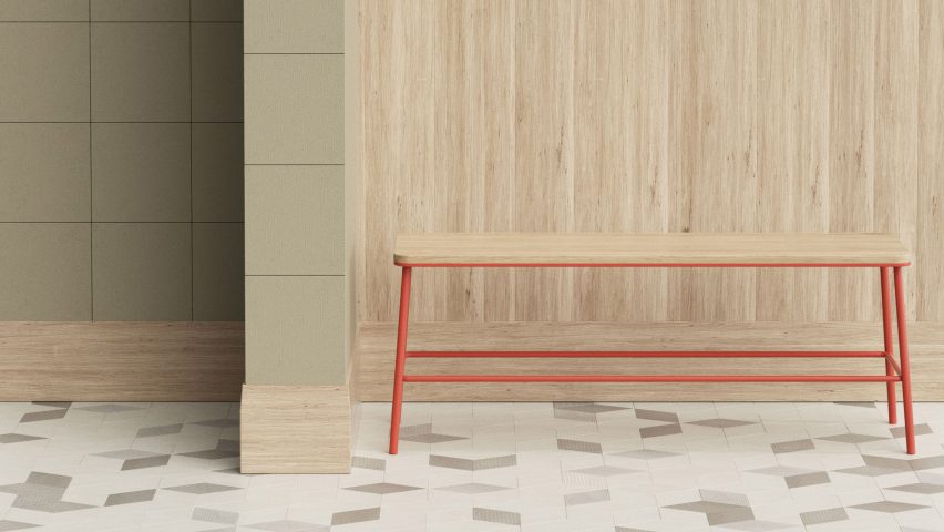
Ceramics brand Mutina has collaborated with design office OEO Studio to create furnishings and accessories to accompany its popular tile collections.
Called Mutina Accents, the collection includes traditional furniture and homeware, such as cabinets and shelves, as well as architecture details and finishes, including skirting boards, screens and even paint.
"The collaboration started as a dialogue," Thomas Lykke, head of design at Copenhagen-based OEO Studio told Dezeen. "We at OEO Studio have used Mutina tiles in many projects, such as with the two-star Michelin restaurant Kadeau in Copenhagen, and we like Mutina for their design and quality."
"The Mutina team was intrigued by the way we work with their products and how we combine their tiles with other materials and textures," he said.
"This led to an idea in CEO and company owner Massimo Orsini's mind: How about creating a complementing universe around the tiles? And that led to the birth of Mutina Accents."
The collection debuted at the Salone del Mobile during Milan design week last month.
It includes eight furnishing accessories, comprising mirrors, cabinets, shelves, clothes hooks and towel rails; four architectural elements, including panelling, skirting boards and space-dividers; and a range of paints available in 20 colours with different finishes.
For Milan, then brand used the range to create a series of styled vignettes, intended to capture the spirit of the brand's tile offering.
The resulting products combine neutral colours, subtly textured surfaces, and materials such as timber and metal.
"It was an open brief, in the way that we could add any kind of product we wanted as long as it made sense in relation to the Mutina brand and followed the objective of creating a coherent experience around Mutina tiles," Anne-Marie Buemann, managing partner at OEO Studio told Dezeen.
"It may be a diverse offering, but from an interiors' point of view it makes a lot of sense," added Lykke.
"Mutina Accents is about giving people guidance to work with their own space as well as offering them the luxury of somebody having taken the time to create beautiful compositions of tiles, skirting boards and paints."
Furnishings include a Shaker-style timber rail lined with clothes hooks. From this, other products such as the mirrors, shelves and towel rail can be hung.
Architectural elements include a zig-zagging panel design that looks like folded paper, and a simple timber grid frame screen that functions as a space divider.
The Mutina Accent paint colours range from dark greys through to muted greens, blues and subdued tones of peach and red.
Mutina was founded in 2006 by Massimo Orsini, in the Italian city of Modena.
It has previously worked with a host of well-known designers, including the Bouroullec brothers, Patricia Urquiola Inga Sempé and Konstantin Grcic. Its latest collection, also launched in Milan last month, was created by Dutch designer Hella Jongerius.
The brand hopes that the Accents collection will give a new dimension to its existing product range.
"Mutina Accents was designed with respect and with passion. We are all individuals and live differently from continent to continent. It's about balance, composition, contrast, tactility as well as light and shadow," added Lykke.
"We are already thinking of refinements and new developments."

