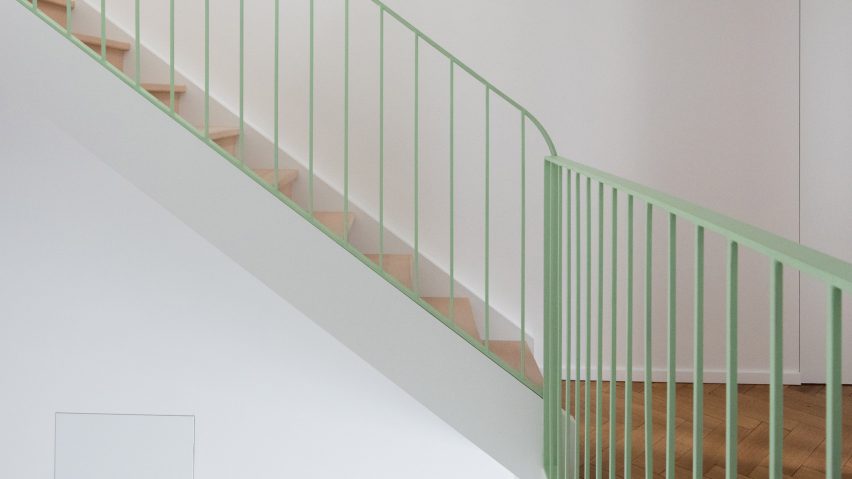
A staircase with living areas on its large landings replaces unnecessary rooms at the centre of this Brussels apartment, which was renovated and extended by Belgian architecture studios Mamout and AUXAU.
The project undertaken by the team made up of architects from Mamout and AUXAU aimed to readdress the typical layout of properties in the Belgian capital.
The building on Rue Renier Chalon in the Ixelles district follows the standard floorplan of the classic Brussels townhouse, with a sequence of three rooms slotted in between the front and rear facades.
In a normal configuration, the main living rooms are situated to the front of the home, with secondary spaces accommodated in the centre and service areas to the rear.
The result of this arrangement is that the central rooms typically lack natural light, as was the case with this four-storey building.
The two studios collaborated on a proposal for the refurbishment of the townhouse's lower two floors, in order to transform these levels into a single dwelling.
Rooms at the front of the building were carefully restored to create living spaces that retain their original proportions. Decorative features such as mouldings and plasterwork were also preserved to evoke the history of the house.
Walls enclosing the original dark rooms at the centre of the building were removed to create a large void into which a staircase connecting the various levels was inserted.
"This intervention is inspired by Belgian architect Victor Horta," said the project team, "who, a century ago, upset the plan of the typical Brussels house by implanting the staircase in the centre of the house as a source of light and visual connection."
The entrance to the apartment from a shared hallway opens into a large space that looks up through the central circulation area.
A staircase that winds around the perimeter of this void leads up to two split levels accommodating the bedrooms and a reception room on the upper floor.
The stairs culminate at a large landing that functions as an additional living area. This mezzanine-like space looks down on the void and is therefore visually connected to the rest of the house.
Walls and floors at the rear of the building that had no heritage value were removed to create space for a new extension containing the bedrooms.
This addition incorporates full-height sliding doors with Juliet balconies that can be opened up to allow fresh air into the rooms.
The floor level at the back of the building was lowered to enable a seamless transition from the kitchen and dining area to the garden outside.
"Lowering the level of the ground floor also allows to integrate an additional floor by a set of split-levels, and therefore, reach the programme of the client," the architects added.
The new lowered floor is connected with the entrance level by a set of concrete steps that extend the full width of the space.
A simple and consistent material palette is used throughout the home, with exposed ceiling beams, parquet flooring and pastel-green-painted metalwork introducing different tones and textures to the otherwise neutral scheme.
Many of the materials used were salvaged from the demolition or purchased from a local business called Rotor that specialises in deconstruction and the reuse of construction elements.
Mamout was previously involved in the adaptive reuse of a former cigarette factory in Brussels, which it helped to transform into a council office with minimal interiors.
Photography is by Guy-Joël Ollivier.
Project credits:
Architects: Mamout Architectes and AUXAU Atelier d'architecture
Construction: G-LINE Construct
Structure: JZH & Partners

