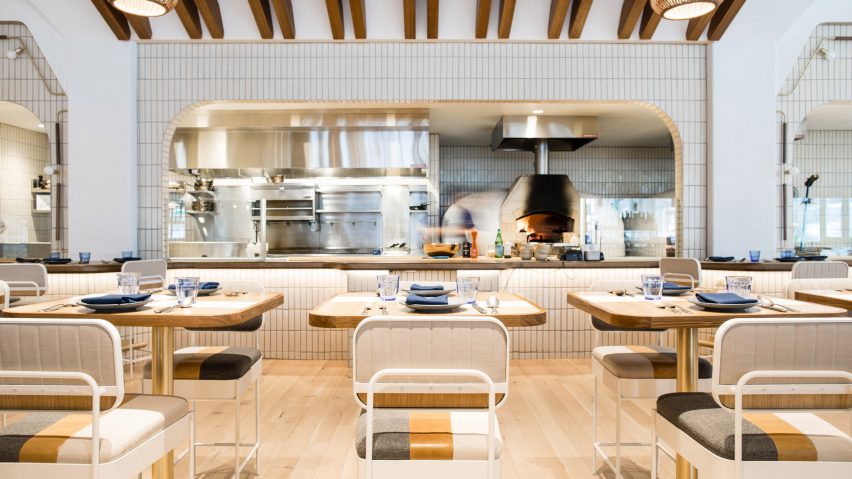
American studio Parts and Labor Design has used lush foliage, creamy white walls and varied tones of wood to create a West Coast feel inside the new Pacific Standard Time eatery and bar in Chicago.
One of the most anticipated restaurants to open in the Windy City this year, Pacific Standard Time is situated in the base of a glass building in the city's trendy River North district, known for its art galleries and nightlife. Created by Parts and Labor Design, a New York studio, the eatery is intended to have a "coastal California atmosphere" that complements the menu, which features items such as whole-grain pizza and roasted vegetables.
Upon approaching the restaurant, guests encounter a textured white facade with curved windows, which take cues from the interior aesthetic.
"Radiused corners of the glazing soften the building's geometry and bring out the curved language of the interior architecture," the team said.
Guests step into a vestibule with a maitre d' stand faced with wooden slats. Beyond the entrance is the main dining room, along with a bar that is marked by wooden ceiling beams.
"A stunning angled wood-beam ceiling is found above the bar, embracing West Coast mid-century modern residential architecture and paying homage to their iconic pitched roofs," the team said.
Throughout the restaurant, the designers used a neutral colour palette and earthy materials. Wood was chosen for dining tables and chairs, with select tables topped with grey-veined and speckled marble. Banquettes are upholstered with light grey leather or royal blue fabric, while chairs are fitted with cushions in varying hues.
A range of lighting fixtures was incorporated into the space, from a large X-shaped wooden chandelier to brass sconces with opaque glass shades. Atop the bar, the team placed fixtures made of concrete, stained walnut and glowing glass orbs, which are intended to offer "intimate mood lighting".
Terrazzo and wood cover the floors, while walls are accented with strips of wood and white tile. In one area, the team created a white and blue wall installation with geometric cutouts. Throughout the dining room, concrete columns are adorned with planter boxes overspilling with foliage.
One of the restaurant's central elements is the open kitchen, where stainless steel equipment and two wood-burning stoves are put on full display. The kitchen is lined with a dining counter and stools, affording guests a close-up view of the cooking process.
"The idea of the domestic chef's table and intimacy of food preparation is at the heart of the design, where a hand-crafted feel and curated edge were implemented to communicate a residential, intimate sentiment throughout the restaurant," the team said.
Chicago has a number of new hospitality projects, including the Proxi restaurant by Meyer Davis, which occupies a former printing plant. The interior features a barrel-vaulted ceiling, patterned flooring and columns wrapped in glossy blue tiles.
Photography is by Brian Willette.

