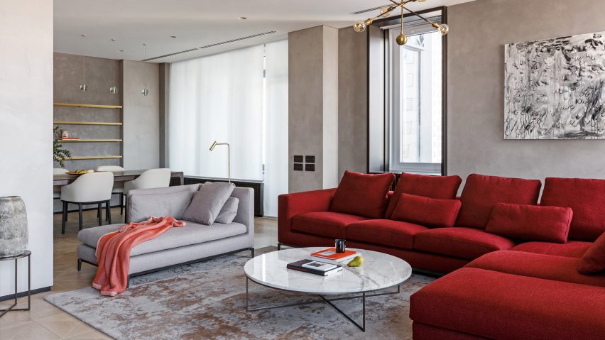
Splashes of burgundy, blue and emerald green appear throughout this apartment in Moscow that Russian practice Archetype has redesigned to feature an "aristocratic" colour palette.
The Pomegranate Apartment is located west of the city centre and belongs to a young, single man who was already familiar with the work of Archetype.
Keeping his brief simple, he asked that the local practice overhaul his home to feature "delicate elements of luxury", and a dark colour palette. He also requested that they provided him with extra storage for his belongings.
"Our aesthetic views on the project coincided, so we could understand quickly enough what the client wanted," the practice told Dezeen.
"We used dark, deep colours that were at the same time calm and aristocratic, which created a feeling of restrained elegance."
The architects began by making some structural changes. The bedroom has been closed-off from the rest of apartment by panelled dark wood wall, with an en-suite bathroom and dressing room added.
A handful of partitions have also been removed to form an open-plan living and eating area. The former dining room has been transformed into a study, which has been painted burgundy red and completed with a large timber shelving unit.
Red also appears in the sitting room that is anchored by a scarlet corner sofa. This starkly contrasts against the stone-coloured walls, which have been upholstered in alcantara.
To create a sense of separation between the home's functional and communal areas, the architect decided to paint the adjacent kitchen navy blue.
The home's entranceway has then been completed in a shade of forest green, and paired with pale marble flooring that is inlaid with gold-hued brass.
"Getting inside the apartment, immediately the dark green color of the walls envelops immediately, creating a calm meditative mood," said the practice.
For the overhaul of another Moscow apartment, Shkaf Architects introduced colour-block walls of dark blue and white to create what they call "emotional minimalism". The practice also inserted asymmetric walls to help divide the space into a series of living zones.
Photography is by Alexander Volodin.

