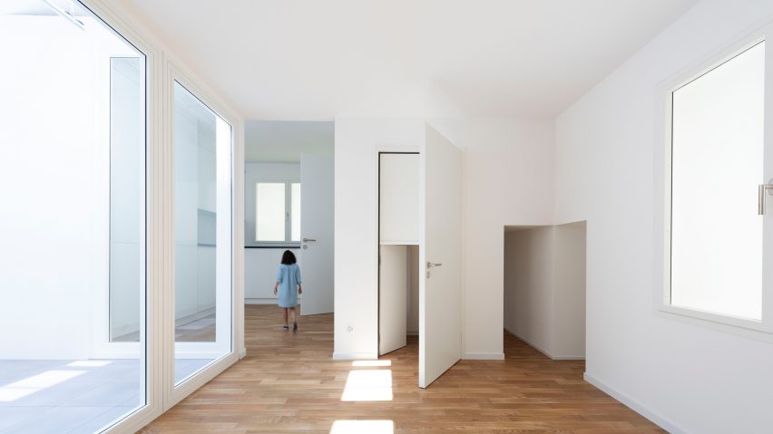
Unremarkable light switches, doors and counters are either shrunk or enlarged inside Switzerland's Venice Biennale pavilion, to draw attention to the ubiquitous interior design of rental properties.
Called House Tour, the exhibition sees the Swiss Pavilion transformed into a warren of unfurnished rooms, using the bland fittings commonly selected for new-build housing or rented apartments.
But the scale of the fittings in each room has been altered, to give visitors an Alice In Wonderland experience. The intention is to draw to attention to the typically overlooked decor of white walls, plastic window frames and wood floors.
"In Switzerland – we always call it a nation of tenants – most of the people live in rental apartments and move quite [often]. So people want a standardised environment," explained Swiss architect and pavilion co-curator Alessandro Bosshard.
Bosshard, who curated the pavilion with Zurich-based architects Li Tavor, Matthew van der Ploeg and Ani Vihervaara, believes there should be more debate about the banal architecture renters are surrounded by in the Western world.
By scaling up or scaling down fittings designed to fade into the background, they hope to bring them into conversation. A new sequence of rooms, alternating between scales, has been inserted within the pavilion building.
One giant door leads into a room with a generous ceiling height, huge windows and a kitchen kitted out with a countertop set at a level only suitable for a giant. Another tiny door draws visitors through a space where everything has been scaled down.
"We want to bring this topic into architectural discourse. It's just taken as given, and no one really questions why the walls are white, or the light switches are always the same," Bosshard told Dezeen at a preview of the pavilion.
The curators collected hundreds of photographs of uniformly decorated apartments as their reference point for the pavilion.
Some of the images are presented side by side in the exhibition booklet to show how the almost identical detailing of the apartments makes it difficult to tell them apart.
"If you see them together they become one body of collective architecture," said Bosshard. "We worked with really a limited amount of elements – it's always the same windows, the same baseboard, same walls, same doors."
"Everything seems familiar to you but if you continue then you realise its not what you expect – too small, too big, too perspectival, distorted," he continued.
"The surface [decoration] becomes the exhibition by itself and it's asking what kind of architecture are we surrounded by all the time."
Bosshard sees the aesthetic as a kind of diluted modernism, reduced to plain white walls, nondescript fittings and wood laminate flooring.
"The shell over the last 100 years hasn't changed too much. The plans changed, the typologies changed, but the real surface – these white surfaces with a wood floor – is really stubborn," he said.
He added. "It's always related to modernism of course, Switzerland never really left the modern. It didn’t have a sharp break with modernism, it's more a continuation of it."
The Venice Architecture Biennale 2018 opens to the public on 26 May and continues until 25 November 2018.
This year's biennale is directed by the co-founders of Irish practice Grafton Architects, Yvonne Farrell and Shelley McNamara. The pair selected the title Freespace as the overarching theme for the event.
Speaking to Dezeen during a tour of their exhibition, Farrell and McNamara likened architecture to the slow-food movement, claiming that the small projects or gestures that architects make within their work can make a positive impact on society.
They created a manifesto for the biennale, which calls for a "generosity in spirit" in architects' approach to designing, whether that might be through the creation of a public space within a project or paying particular to attention to details such as the effect of lighting.
Bosshard hopes House Tour also captures this spirit if generosity: "We try to find the generosity in the most stubborn condition of the interior or housing and to find qualities by playing with the small elements."
Photography is by Wilson Wooton.

