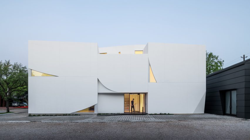
Schaum/Shieh covers Houston art gallery in sculptural white panels
Sculptural white stucco panels and small triangular windows define the facades of this gallery by US studio Schaum/Shieh, which is meant to appear like it could "blow away in the wind".
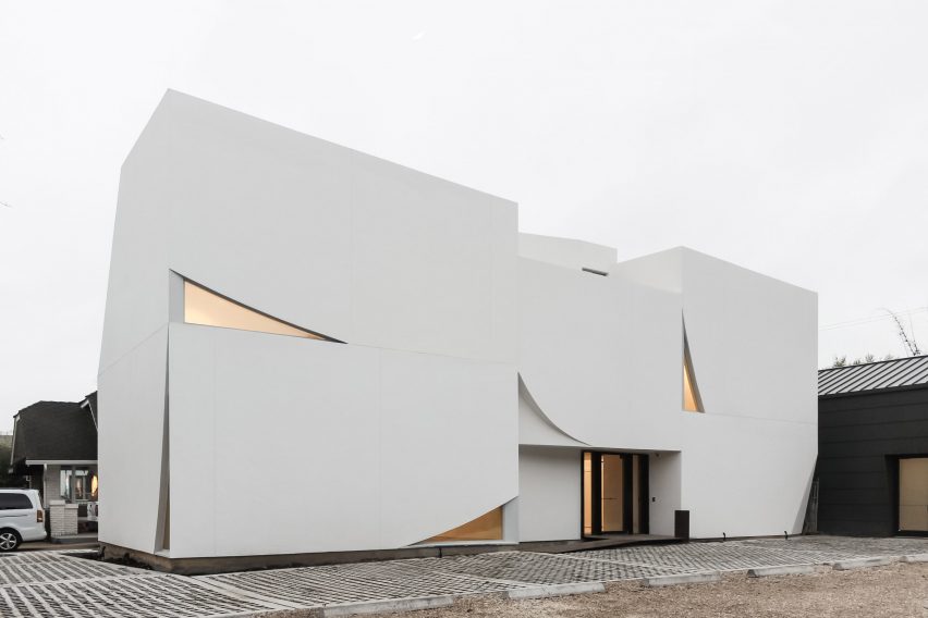
Run by an independent curator, the Transart Foundation for Art and Anthropology is located in Houston's museum district, near buildings such as the Renzo Piano-designed Menil Collection.
The goal of the foundation is to provide "a space for the critical intersection between art and anthropology" and to foster community dialogue about art's role in everyday life.
The project entailed the re-cladding of an existing studio building, and construction of a new multipurpose facility that accommodates exhibitions, performances and events. The buildings are relatively modest in size, in keeping with the character of the district.
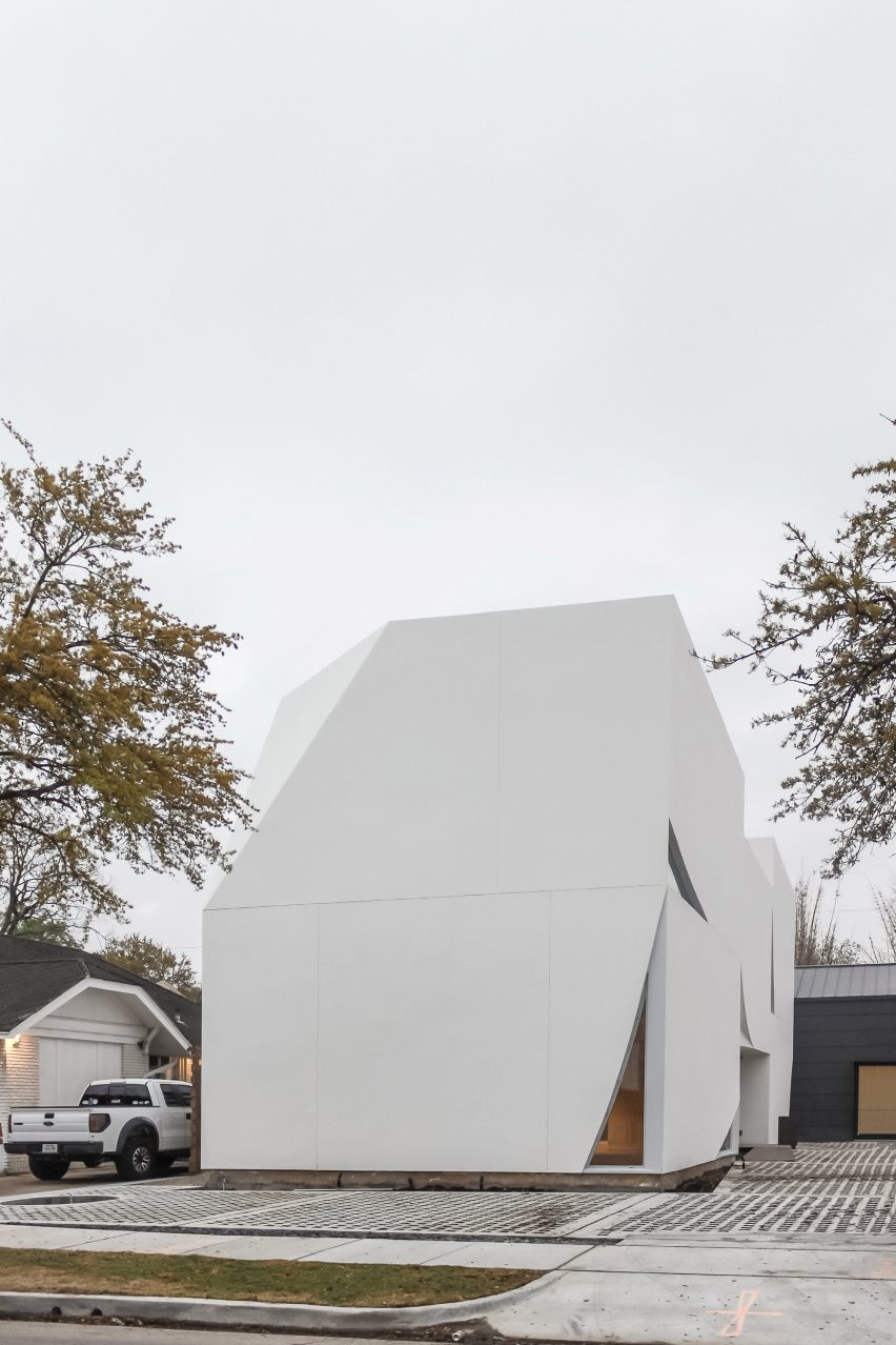
"The modest scale of the Transart Foundation preserves an open relationship to the street and reinforces the walkability of the neighbourhood, extending the tradition of the nearby Menil Collection, Rothko Chapel and St Thomas Campus," said Schaum/Shieh, which has offices in Houston and New York.
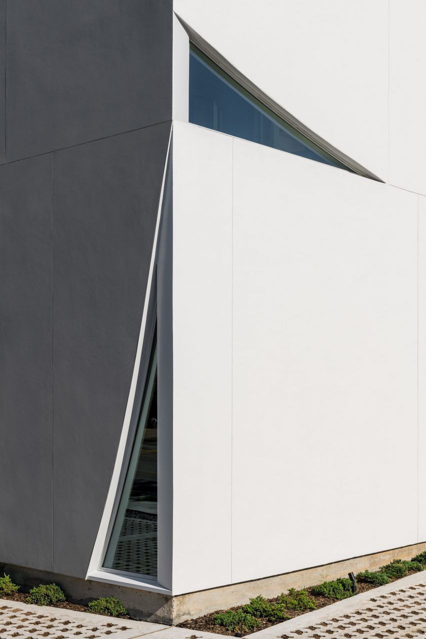
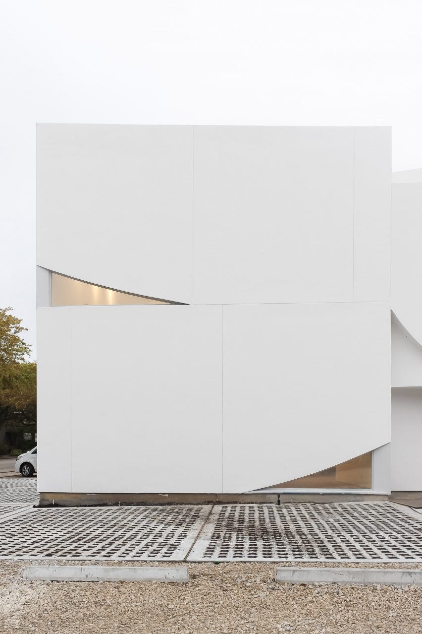
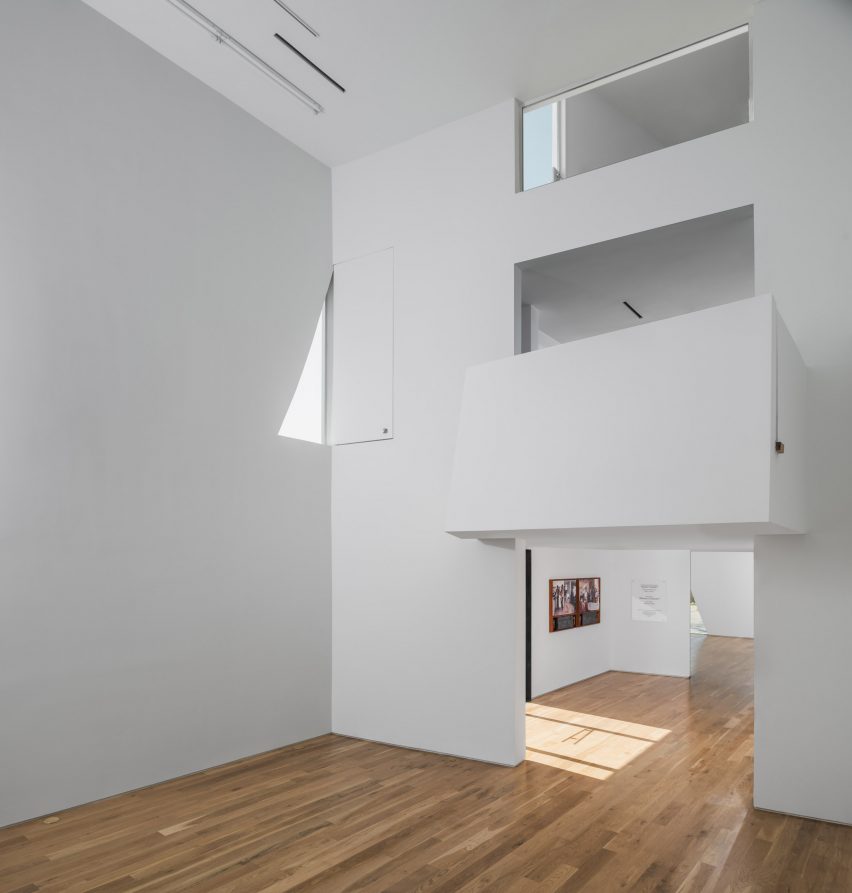
Rectangular in plan, the new building has a sculptural envelope made of white stucco panels in varying shapes. Largely opaque, the facades have angular cutouts that bring slivers of daylight into the building.
With the exterior design, the team sought to not only protect the art galleries from the harsh Texas sun, but also to create a building that looks somewhat delicate.
"We were pursuing a sense of overall lightness," said the architects. "Specifically, we were interested in how the geometry and material finish might make the building feel like it could blow away in the wind, ruffle like fabric, or disperse and scatter like cards."
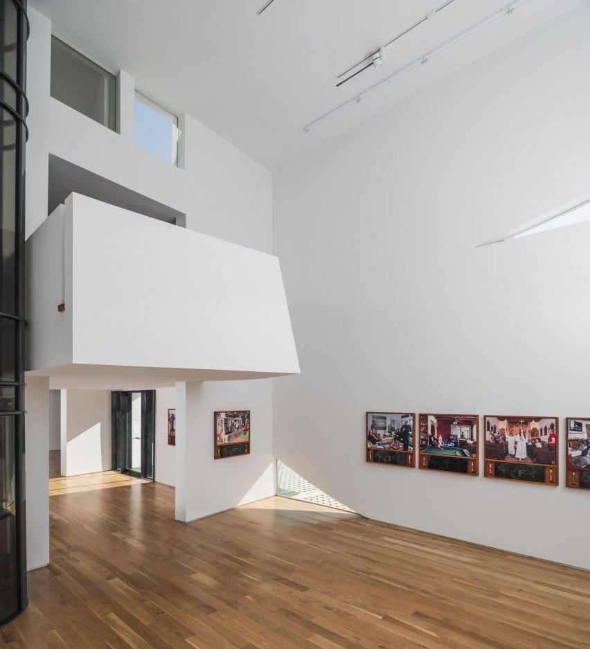
The structural frame is made of thick timber in a manner similar to a Dutch barn. Walls with closed-cell insulation help block heat – a passive cooling strategy that works in tandem with a high-efficiency air conditioning system.
At ground level, visitors step into a central "living room" flanked by galleries. White walls and wooden flooring serve as a quiet backdrop for photographs, paintings, sculptures and other types of artwork.
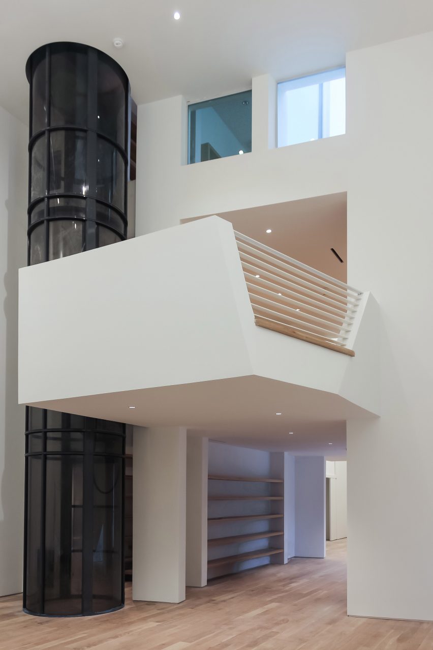
"The front exhibition space, naturally lit and facing the street, is reserved for more traditional exhibitions," the architects explained.
"The back has less natural light and is reserved for new media or performance works that require lighting control."
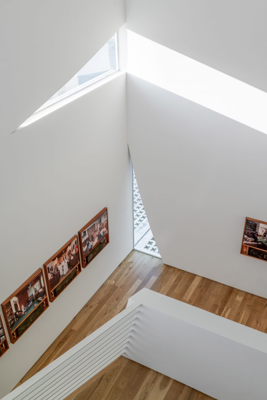
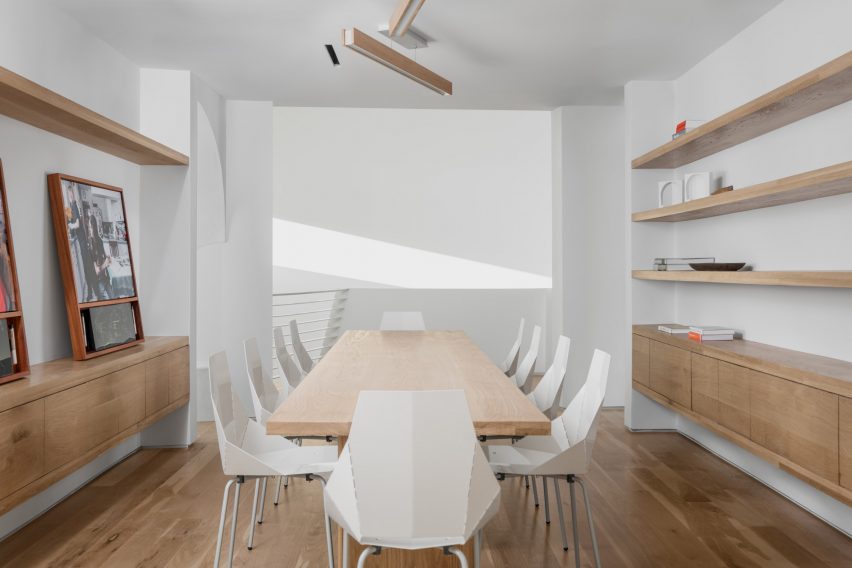
A staircase and a black cylindrical elevator lead to the second floor, where the architects have placed a salon that is open to the space below. The second storey also contains a nook for private meetings or meditation, and an office and terrace are situated on the third level.
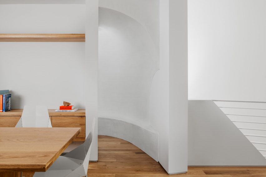
Throughout the facility, the team incorporated several "playful moments", including a triangular glass office desk and a bean-shaped sink that sits atop a white oak log. The bathroom countertop is made from a galvanised-steel beam.
Adjacent to the main building is the existing photography studio, which the team re-skinned in grey cement siding. The studio building extends opportunities for art programming and also provides a work area for visiting artists and scholars.
Rosalyne Shieh and Troy Schaum established their eponymous studio in 2010. Other projects by the firm include a live music venue in Houston with facades wrapped in cedar slats and lap siding made of fibre cement boards.
Top photograph by Peter Molick. Images are courtesy of Schaum/Shieh unless stated otherwise.