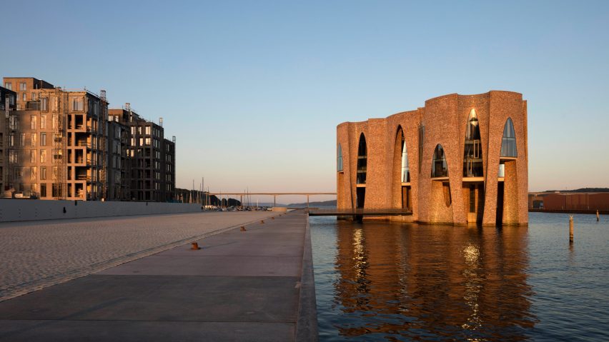
In this week's comments update, readers debated whether artists should delve into architecture, following the completion of Olafur Eliasson's first building.
King of the castle: readers were divided by Eliasson's first completed building – a fortress-like office in Denmark – that some saw as a success, while others thought he should stick to making art.
"An award winner, a beautiful building, complete with a moat. Needs a drawbridge, though. Very stunning and if the first one, this architect has real promise," praised Dik Coates.
"Well done. Looks promising. Reminds me of Gaudí," addeed Christian Tabakoff.
However, Duckusucker strongly disagreed: "Just when you think a guy who designed the similarly appalling Serpentine Gallery had gratefully gone away, this coloured-brick fortress with a white-rod petal elevator thrusts itself into an unsuspecting harbour."
Art or Architecture argued that architecture should be protected: "Rubbish! Artists should just stick to art, let the architects do their thing. Enough of this cross invasion! Architecture is not easy."
Meanwhile, Ana Paola was shocked by the building's "style throwback".
Do you think that artists can also be architects? Join the discussion ›
Just a playground: readers questioned whether form had won over function in a high school that has recently been built by firm Brooks + Scarpa.
"Wonderful: bright colour, open and central space for socialising, and secure," praised duckusucker.
Others questioned whether the building had been designed appropriately for its purpose: "Did anyone find out what would promote an engaging environment for the kids?" quizzed Michael.
Archi sighed: "Considering the entire formal move of the building was to create classrooms around a courtyard, I think the courtyard was a missed design opportunity. So sterile, hardly no plants, no activity, limited seating."
Duckusucker added a little humour to the conversation.
Read the comments on this story ›
All of the lights: Kanye West's first expected foray into architecture, a prefabricated concrete affordable-housing project, caused readers to question the singer's interpretation of affordable housing.
Some sang West's praises: "Really, really beautiful. Well done Yeezus," said a commenter named Richard Rogers.
Likewise, Steve Hassler commented: "I don't follow Mr West but this is a nobel effort. I hope this is successful."
Rob Rohena asked: "Am I crazy person because I am actually excited to see what Kanye can do in the architectural arena? Architecture is much more complicated than fashion and I think will actually test his "genius".
Keith Dougal, believed this stylistic response was not what was needed: "This represents 'style' over purpose and is an aesthetically and emotionally cold response to an issue that needs to deliver so much warmth."
CharlesCU agreed: "The publicity shots show a space which majors on style, minimalism, open space and an environment that will be somewhat alien to the target user group."
The Original Starchy also had a very important question to ask.
What do you think of West's design? Join the discussion ›
Too high to handle: Kengo Kuma and OODA are pairing up to transform a disused slaughterhouse in Porto into a cultural centre, which will feature art galleries and a library with high bookshelves that left many readers disappointed.
"Give it a few years and it will be refurbished as an office park with the CMP banking it. Interiors are out of scale and pointless with those huge bookshelves," commented JMFM.
I don't understand this new trend of incredibly high bookshelves, such as in the MVRDV library in China. Who is supposed to reach those books?!" asked a confused Matteo Sierra Do Miño.
"Why not integrate some sort of access into the design?" agreed HeywoodFloyd.
Chris Becket offered a disclaimer.
Read the comments on this story ›

