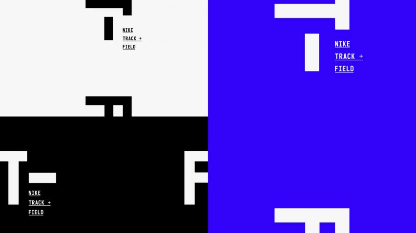
Nike's updated Track + Field branding is based on acceleration arrows
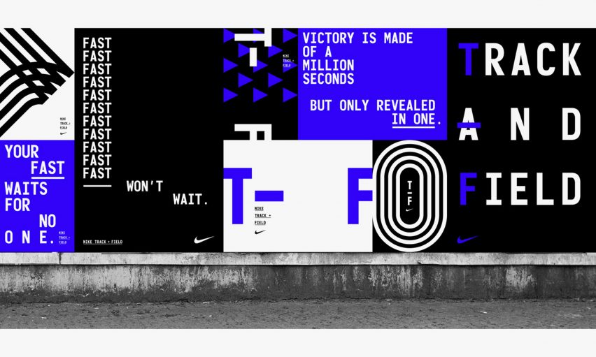
The arrow markings found on athletic tracks form the basis of Studio Build's updated visual identity for Nike's Track + Field clothing line.
The rebrand's "fresh and punchy" visuals feature a succession of arrows, which resemble the acceleration graphics used on athletic fields.
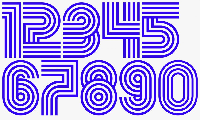
Leeds-based creative agency Studio Build wanted to create an updated version of the original branding that it created for the Track + Field line in 2016, which took design cues from track-line markings.
Featuring a black, white and red colour scheme, the previous campaign included bold typographic elements and numerals inspired by the curved shape of the familiar white spray-painted markings.
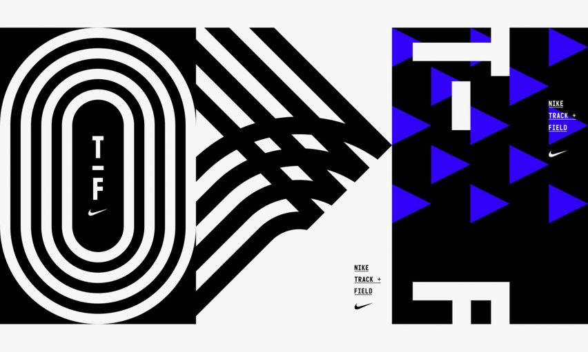
The new identity retains many of the visuals found in the 2016 campaign, but centres instead on the arrow graphic, which is presented in a blue and white colour palette.
"All of the compositions are created in a grid format," said Michael C Place, creative director of Studio Build.
"By creating these in a strict grid, the spirit and precision of the Track and Field is accurately represented."
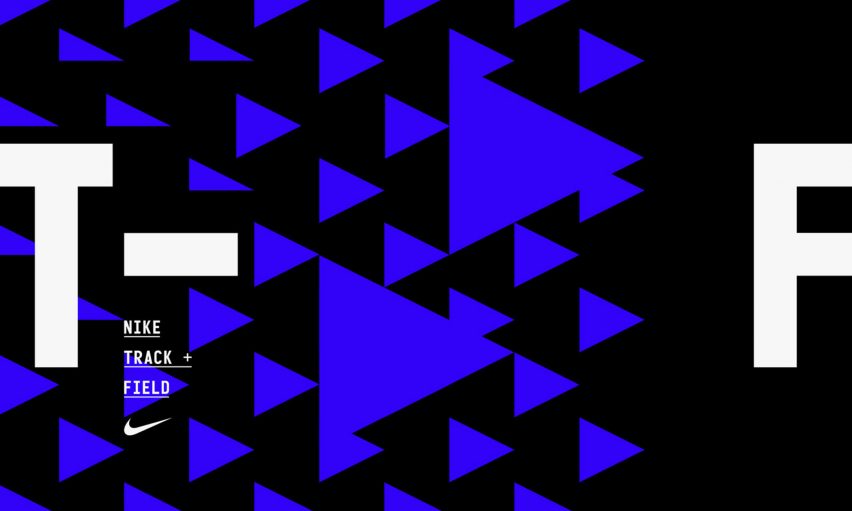
"This new element can be used to create compositions in its more complex form, a simplified form or just used as a single graphic," he explained.
"It was really interesting and challenging to make something as simple as the acceleration graphic (which is essentially just a triangle) to not only convey speed and dynamism but also building a graphics system that can be used for all manner of applications without looking tired."
Set to be released imminently, the new visual identity will be applied to advertisements, banners, apparel and event branding.
Nike ranked at number 37 on Dezeen Hot List 2017. The sportswear brand has released a number of innovative products in the past year, including running shoes with 3D-printed uppers and a trainers for disabled athletes.
The brand was in the new recently for releasing a pair of sandals that have mini bum bags across the toe straps.