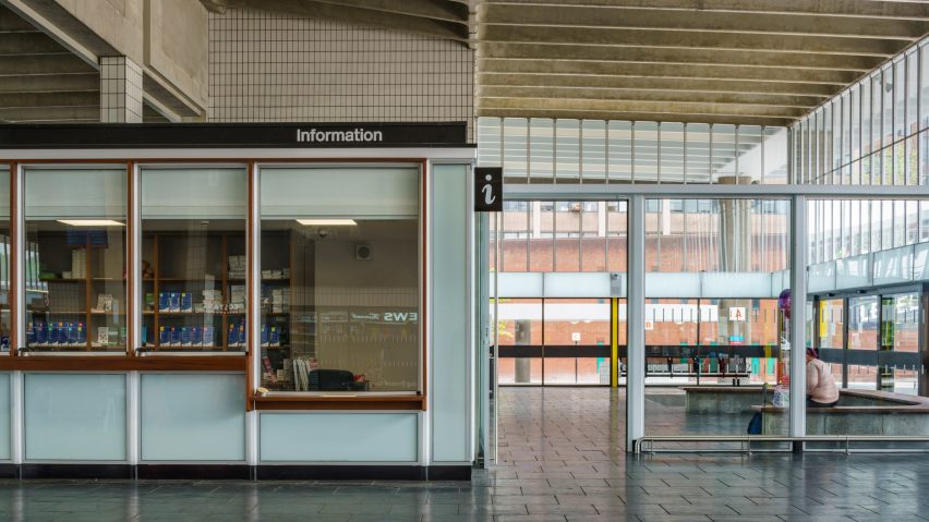
Brutalist Preston Bus Station refurbished by John Puttick Associates
John Puttick Associates has completed the renovation of the Grade II-listed brutalist bus station in Preston, in the north of England.
The architects have restored the interiors and updated the layout of the bus station, which was at one time scheduled for demolition.
John Puttick Associates was only founded the year before it won the RIBA-organised open competition to overhaul the station, and add a youth centre to the site in 2015.
"It was an amazing thing for us really, to win such an important public project so early on in the life of the practice," architect and founder John Puttick told Dezeen. "It's been a privilege to work on."
Original elements, including rubber floors by Italian tire brand Pirelli and Iroko hardwood benches, have been lovingly restored, and the layout reworked by the architects into a space that has been modernised to prioritise pedestrian access.
"We wanted to celebrate the existing building and the design of the building," said Puttick, founder of John Puttick Associates.
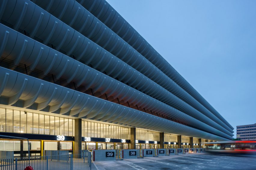
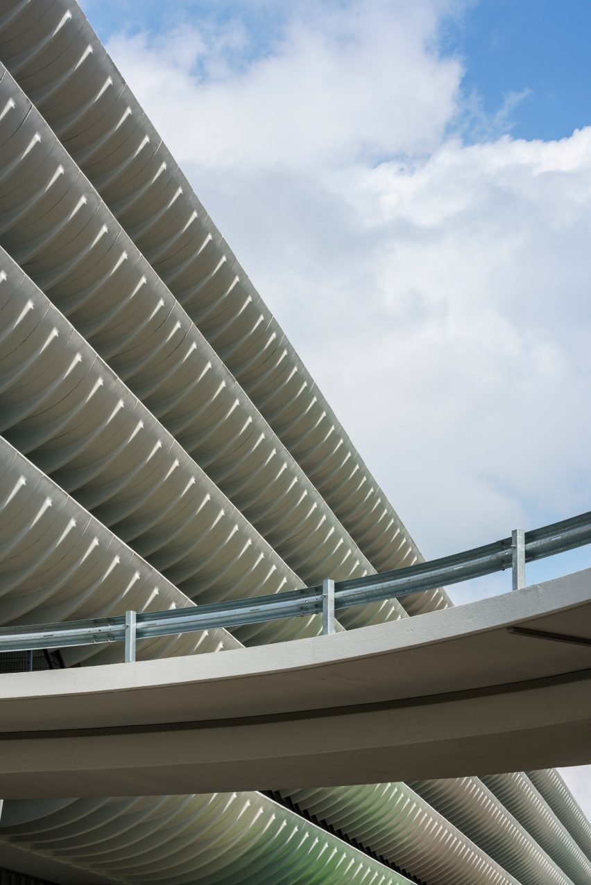
Built in 1969 by British firm Building Design Partnership (now BDP) architects Keith Ingham and Charles Wilson, its vast 170-metre-long length made it the largest bus station on Europe.
Its distinctive curved fins have turned it into a beacon for the brutalist movement, with its scale and grandeur representative of an era when British architects were given the creative scope to produce grand works of public architecture.
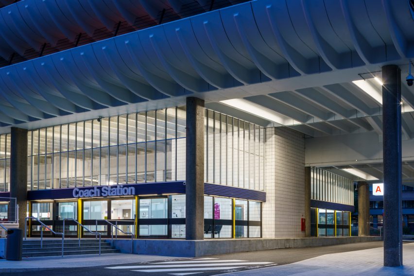
Ingham has said of his design that the bus station was intended to invoke the glamour of 1960s air travel.
"Everybody talks about it being an example of that period of brutalist architecture," said Puttick. "But it transcends that because, regardless of what label you put on it, in the end what's important about it is it's just such a well designed building."
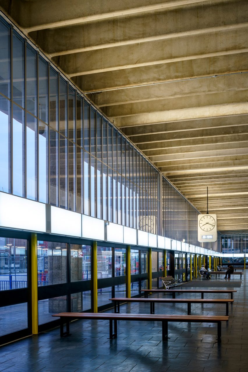
At the time it was though that Preston was poised to become an economic centre, and the station would accommodate the accompanying influx of people. Instead, the overlarge bus station languished and fell into disrepair.
By 2013 it was destined for demolition, but a successful campaign to save the iconic building earned it a reprieve. Having successfully lobbied for the protection of Grade-II listed status for the station, The Twentieth Century Society was one of the main consultants on the project, along with Historic England.
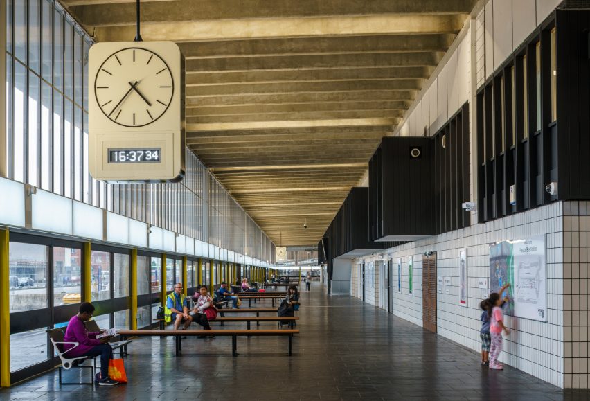
"A lot of the original colours had been changed and there was signage everywhere. It was a bit of a mess," said Puttick. "But the good thing is the original building was built from such robust and good quality materials that under the surface all of that was still there."
"Once we'd removed all the clutter it was possible to bring them back to life," he added.
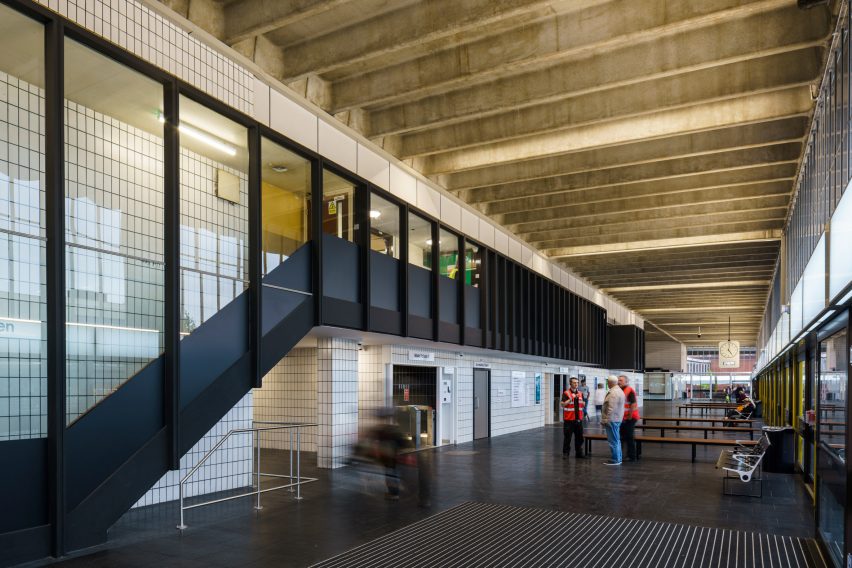
Beneath layers of chewing gum and grime, the original Pirelli rubber floors were still in excellent condition.
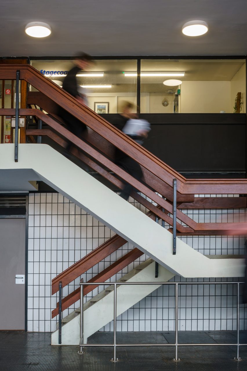
The white tile work running through the central spine of the building are the originals, and signs with Helvetica typeface have been reinstated.
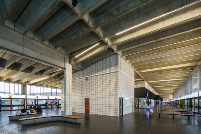
Durable Iroko timber used for benches and dividing barriers had scratches and scuff marks buffed out. On the west side of the building where the architects removed the barriers, Iroko was repurposed to create more benches and for the trimming on the information desk.
"They tended to use that Iroko in the elements of the building you interact with closely, that you touch," explained Puttick. "All the benches, some of the doors and the handrails on the stairs. So we tried to take the same approach where we designed new things."
Some benches have been kept in situ, and one of the curved ones – Puttick's personal favourites – has been relocated to the new 24-hour bus station lounge. When the station was originally built in the car-mad 1960s it was designed to be accessed primarily by four wheels, but now it prioritises its pedestrian visitors.
"When you get in the building it's much more comfortable as a person waiting for a bus or just generally enjoying the building, compared to how it was before," said Puttick.
"But we've tried to bring that about without really changing the character of the architecture itself, because it was so strong in the first place."
Following an adjustment of the original competition-winning design, the Youth Zone is due to begin construction soon. Set to one side of the station, the 2,600 square metre Youth Zone will be a stepped zinc-clad ziggurat housing sport and culture facilities and rooftop pitches.
Photographs by Gareth Gardener.